Willkommen bei den Top‑Schriften – hier treffen Beliebtheit und Qualität aufeinander. Das sind die in diesem Jahr am häufigsten heruntergeladenen und genutzten Fonts. Wenn Sie sichere Optionen für Logo, Web oder Social suchen, starten Sie hier.
Jeder Top‑Font überzeugt durch Balance, Lesbarkeit und Vielseitigkeit. Sie finden moderne Sans‑Serifs, elegante Scripts, Vintage‑Serifs und minimalistische Displays.
-
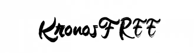
( Fonts by Vunira Design - Personal-use only. For commercial use please contact owner. )
A bold, expressive brush script font with dynamic strokes and decorative flourishes.
 Herunterladen 45 Downloads@WebFont
 -
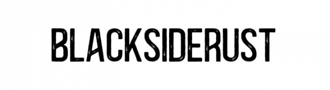
( Fonts by vilogsign - Nur Kholis - Personal-use only. For commercial use please contact owner. )
A bold, distressed font with a rugged, vintage texture.
![BlacksideRust Frei Schriftart Herunterladen]() Herunterladen 45 Downloads@WebFont
Herunterladen 45 Downloads@WebFont -
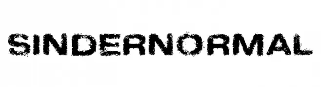
( Fonts by Fontry - M.G. Adkins - Personal-use only. For commercial use please contact owner. )
A bold, distressed font with a grunge texture for an edgy, urban look.
![Sinder Normal Frei Schriftart Herunterladen]() Herunterladen 45 Downloads@WebFont
Herunterladen 45 Downloads@WebFont -
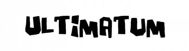
( Fonts by Pizzadude - Jakob Fischer - Personal-use only. For commercial use please contact owner. )
A bold, jagged font with an edgy and dynamic style.
![Ultimatum Frei Schriftart Herunterladen]() Herunterladen 45 Downloads@WebFont
Herunterladen 45 Downloads@WebFont -
( Fonts by Syaf Rizal - Khurasan - Personal-use only. For commercial use please contact owner. )
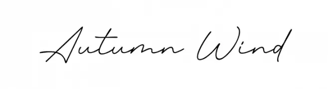
A graceful, cursive script font with a natural handwriting style.
![Autumn Wind Frei Schriftart Herunterladen]() Herunterladen 45 Downloads@WebFont
Herunterladen 45 Downloads@WebFont -
-
( Fonts by DN Creative )
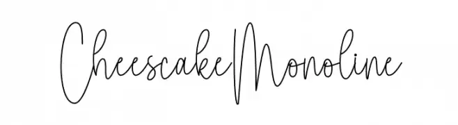
Tall, thin monoline handwritten script with playful, casual style.
![Cheescake Monoline Frei Schriftart Herunterladen]() Herunterladen 45 Downloads@WebFont
Herunterladen 45 Downloads@WebFont -
( Fonts by Letterara - Thomas Aradea - Personal-use only. For commercial use please contact owner. )
An elegant, flowing script font with graceful curves and loops.
![Alleffra Frei Schriftart Herunterladen]() Herunterladen 45 Downloads@WebFont
Herunterladen 45 Downloads@WebFont -
( Fonts by WolfBainX - Personal-use only. For commercial use please contact owner. )
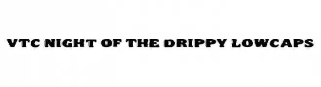
A bold, dripping font with a playful, liquid-like appearance.
![VTC Night Of The Drippy LowCaps Frei Schriftart Herunterladen]() Herunterladen 45 Downloads@WebFont
Herunterladen 45 Downloads@WebFont -
( Fonts by Daniel Zadorozny - www.iconian.com - Personal-use only. For commercial use please contact owner. )
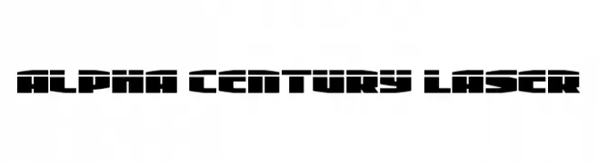
A futuristic, bold font with geometric and angular shapes.
![Alpha Century Laser Frei Schriftart Herunterladen]() Herunterladen 45 Downloads@WebFont
Herunterladen 45 Downloads@WebFont -
( Fonts by selawetype - Personal-use only. For commercial use please contact owner. )
A delicate, flowing script font with elegant, continuous strokes.
![moonlove Frei Schriftart Herunterladen]() Herunterladen 45 Downloads@WebFont
Herunterladen 45 Downloads@WebFont -
( Aaron Amar - www.behance.net/aaronamar )
A pixelated, retro-style font with a tech-inspired aesthetic.
![XOX Frei Schriftart Herunterladen]() Herunterladen 45 Downloads@WebFont
Herunterladen 45 Downloads@WebFont -
( Fonts by Billy Argel Fonts - www.billyargel.com - Personal-use only. For commercial use please contact owner. )
A bold, dynamic script font with interconnected letters and elegant flourishes.
![Limousines Personal Use Frei Schriftart Herunterladen]() Herunterladen 45 Downloads@WebFont
Herunterladen 45 Downloads@WebFont -
( Fonts by Mr.Soon Design )
A bold, spooky font with irregular edges, perfect for Halloween themes.
![Amazing Halloween Frei Schriftart Herunterladen]() Herunterladen 45 Downloads@WebFont
Herunterladen 45 Downloads@WebFont -
( Fonts by www.selawetype.com - Personal-use only. FOR DONATION https://www.paypal.me/selawe . For commercial use please contact owner. )
A playful, handwritten cursive font with a fluid and organic style.
![Signatural Frei Schriftart Herunterladen]() Herunterladen 45 Downloads@WebFont
Herunterladen 45 Downloads@WebFont -
( Fonts by Aditya Rezki Apriyadi - Personal-use only. For commercial use please contact owner. )
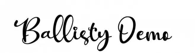
A lively and expressive script font with flowing, interconnected letters.
![Ballisty Demo Frei Schriftart Herunterladen]() Herunterladen 45 Downloads@WebFont
Herunterladen 45 Downloads@WebFont -
( Fonts by Deni Dessastra - Personal-use only. For commercial use please contact owner. )
An ornate and decorative font with elongated serifs and intricate details.
![Blackborneo Frei Schriftart Herunterladen]() Herunterladen 45 Downloads@WebFont
Herunterladen 45 Downloads@WebFont -
( Fonts by Fiqiart - Fiqi Febriyanto - Personal-use only. For commercial use please contact owner. )
An elegant script font with flowing, decorative strokes.
![Majorette Frei Schriftart Herunterladen]() Herunterladen 45 Downloads@WebFont
Herunterladen 45 Downloads@WebFont -
( Fonts by Haksen Studio - Sarwo Edhi Prayitno - Personal-use only. For commercial use please contact owner. )
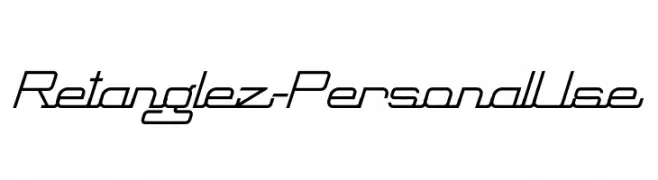
A modern, geometric font with angular lines and a futuristic style.
![Retanglez - Personal Use Frei Schriftart Herunterladen]() Herunterladen 45 Downloads@WebFont
Herunterladen 45 Downloads@WebFont -
( Fonts by Perspectype Studio - Personal-use only. For commercial use please contact owner. )
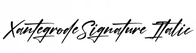
A dynamic, cursive handwritten font with elegant slant and fluid strokes.
![Xantegrode Signature Italic Frei Schriftart Herunterladen]() Herunterladen 45 Downloads@WebFont
Herunterladen 45 Downloads@WebFont -
( Fonts by Vunira Design - Personal-use only. For commercial use please contact owner. )
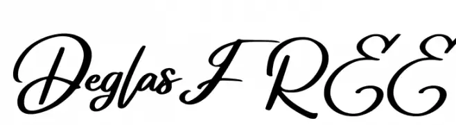
A dynamic and expressive script font with fluid, elegant letterforms.
![Deglas FREE Frei Schriftart Herunterladen]() Herunterladen 45 Downloads@WebFont
Herunterladen 45 Downloads@WebFont -
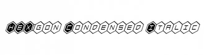
( Iconian Fonts - Daniel Zadorozny - www.iconian.com )
A bold, hexagonal, condensed italic font with high contrast and geometric style.
![HEX:gon Condensed Italic Frei Schriftart Herunterladen]() Herunterladen 45 Downloads@WebFont
Herunterladen 45 Downloads@WebFont -
( Fonts by Daniel Zadorozny - www.iconian.com - Personal-use only. For commercial use please contact owner. )
A bold, geometric, and italicized font with a futuristic style.
![American Grain Laser Italic Frei Schriftart Herunterladen]() Herunterladen 45 Downloads@WebFont
Herunterladen 45 Downloads@WebFont -
( Fonts by AminMario - Amin Mario - Personal-use only. For commercial use please contact owner. )
An elegant script font with flowing, cursive letterforms and high contrast.
![The Himalaya Frei Schriftart Herunterladen]() Herunterladen 45 Downloads@WebFont
Herunterladen 45 Downloads@WebFont -
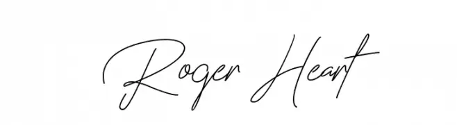
( Fonts by Fiqiart - Fiqi Febriyanto - Personal-use only. For commercial use please contact owner. )
A graceful, handwritten script font with elegant curves and fluid connections.
![Roger Heart Frei Schriftart Herunterladen]() Herunterladen 45 Downloads@WebFont
Herunterladen 45 Downloads@WebFont -
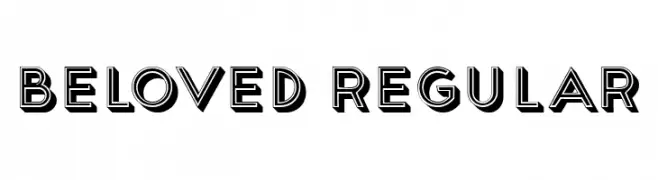
( Fonts by Vladimir Nikolic - Personal-use only. For commercial use please contact owner. )
A bold, three-dimensional font with a modern yet vintage flair.
![Beloved Regular Frei Schriftart Herunterladen]() Herunterladen 45 Downloads@WebFont
Herunterladen 45 Downloads@WebFont -
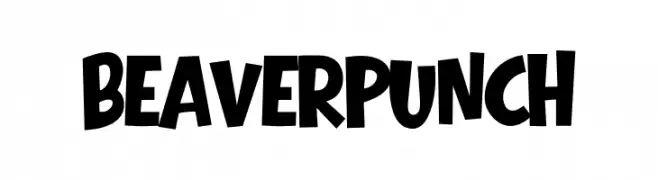
( Fonts by Eko Bimantara )
Bold, playful display font with a hand-drawn look.
![Beaver Punch Frei Schriftart Herunterladen]() Herunterladen 45 Downloads@WebFont
Herunterladen 45 Downloads@WebFont -
( Fonts by Roland Huse Design - Roland Huse - Personal-use only. For commercial use please contact owner. )
A bold, rounded font with a strong, uniform appearance.
![YellowPeasDemo-Black Frei Schriftart Herunterladen]() Herunterladen 45 Downloads@WebFont
Herunterladen 45 Downloads@WebFont -
( Fonts by Daniel Zadorozny - www.iconian.com - Personal-use only. For commercial use please contact owner. )
A futuristic, geometric font with bold, blocky characters.
![Early Warning Laser Frei Schriftart Herunterladen]() Herunterladen 45 Downloads@WebFont
Herunterladen 45 Downloads@WebFont -
( Fonts by Golder Jagat - Jagatsheth Golder - Personal-use only. For commercial use please contact owner. )
A whimsical, hand-drawn font with thin, elongated strokes and a playful style.
![Hair Thinned Regular Frei Schriftart Herunterladen]() Herunterladen 45 Downloads@WebFont
Herunterladen 45 Downloads@WebFont -
( Fonts by Josh Entwistle - Personal-use only. For commercial use please contact owner. )
A bold, geometric font with a modern and futuristic style.
![MotusPartem-Bold Frei Schriftart Herunterladen]() Herunterladen 45 Downloads@WebFont
Herunterladen 45 Downloads@WebFont -
( Fonts by Letterara - Thomas Aradea - Personal-use only. For commercial use please contact owner. )
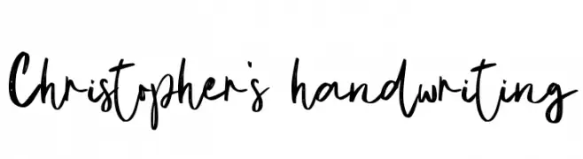
A lively, modern handwritten font with dynamic strokes and expressive characters.
![Christopher's handwriting Frei Schriftart Herunterladen]() Herunterladen 45 Downloads@WebFont
Herunterladen 45 Downloads@WebFont -
( Fonts by Iconian Fonts )
A bold, italicized font with a gradient effect created by horizontal lines, offering a dynamic and modern appearance.
![Master Breaker Gradient Italic Frei Schriftart Herunterladen]() Herunterladen 45 Downloads@WebFont
Herunterladen 45 Downloads@WebFont -
( Fonts by TracerTong Fontworks - Paul Reid - Personal-use only. For commercial use please contact owner. )
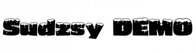
A bold, snow-capped decorative font ideal for festive designs.
![Sudzsy DEMO Frei Schriftart Herunterladen]() Herunterladen 45 Downloads@WebFont
Herunterladen 45 Downloads@WebFont -
( Gaelleing )
A playful and whimsical script font with flowing, interconnected letters.
![Papoune Frei Schriftart Herunterladen]() Herunterladen 45 Downloads@WebFont
Herunterladen 45 Downloads@WebFont -
( Fonts by Noah Type - noahtype.com - Personal-use only. For commercial use please contact owner. )
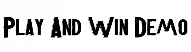
A bold, hand-drawn style font with a dynamic and energetic appearance.
![Play And Win Demo Frei Schriftart Herunterladen]() Herunterladen 45 Downloads@WebFont
Herunterladen 45 Downloads@WebFont


Welche Schriften sind gerade am populärsten?
Poppins, Roboto, Montserrat, Open Sans und Lato sind wegen ihrer klaren Formen und breiten Einsetzbarkeit sehr gefragt – von Markenauftritt über Landingpages bis hin zu Postern.
Welche Fonts eignen sich für Logos?
Geometrische Sans‑Serifs (z. B. Poppins, Familien im Gotham‑Stil) sind ein häufiger Griff für sauberes, skalierbares Branding. Für eine persönlichere Note bleiben Scripts und Handschrift‑Stile beliebt. Kombinieren Sie einen prägnanten Headline‑Font mit einer neutralen Brotschrift für Wiedererkennung und Harmonie.
Wie oft wird die Top‑Liste aktualisiert?
Regelmäßig – basierend auf realen Downloads und Interaktionen. Schauen Sie öfter vorbei, um aufstrebende Favoriten früh zu entdecken.
💡 Tipp: Seite bookmarken – Trends wechseln schnell, und heutige Top‑Schriften inspirieren morgen vielleicht das Rebranding.