Willkommen bei den Top‑Schriften – hier treffen Beliebtheit und Qualität aufeinander. Das sind die in diesem Jahr am häufigsten heruntergeladenen und genutzten Fonts. Wenn Sie sichere Optionen für Logo, Web oder Social suchen, starten Sie hier.
Jeder Top‑Font überzeugt durch Balance, Lesbarkeit und Vielseitigkeit. Sie finden moderne Sans‑Serifs, elegante Scripts, Vintage‑Serifs und minimalistische Displays.
-
( Fonts by Daniel Zadorozny - www.iconian.com - Free for personal use )
A bold, futuristic font with geometric shapes and sharp angles.
 Herunterladen 393 Downloads@WebFont
 -
( Fonts by Belina Studio )
Bold, playful handwritten font.
![MyBook Frei Schriftart Herunterladen]() Herunterladen 393 Downloads@WebFont
Herunterladen 393 Downloads@WebFont -
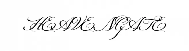
![HEAVENGATE Frei Schriftart Herunterladen]() Herunterladen 393 Downloads@WebFont
Herunterladen 393 Downloads@WebFont -
( Fonts by Daniel Zadorozny - www.iconian.com - Free for personal use )
A bold, futuristic font with geometric, rounded characters.
![Airstrip One Bold Frei Schriftart Herunterladen]() Herunterladen 393 Downloads@WebFont
Herunterladen 393 Downloads@WebFont -
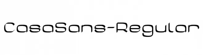
( Fonts by Peter Wiegel - www.peter-wiegel.de )
A modern, angular font with a futuristic and sleek design.
![CasaSans-Regular Frei Schriftart Herunterladen]() Herunterladen 393 Downloads@WebFont
Herunterladen 393 Downloads@WebFont -
-
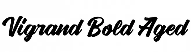
( Fonts by Aluyeah Studio - Personal-use only. For commercial use please contact owner. )
A bold, textured script font with a vintage, handcrafted feel.
![Vigrand Bold Aged Frei Schriftart Herunterladen]() Herunterladen 393 Downloads@WebFont
Herunterladen 393 Downloads@WebFont -
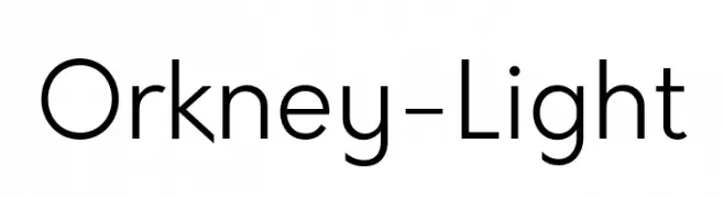
( Fonts by Hanken Design Co. )
A modern, geometric sans-serif font with uniform stroke width and clear legibility.
![Orkney-Light Frei Schriftart Herunterladen]() Herunterladen 393 Downloads@WebFont
Herunterladen 393 Downloads@WebFont -
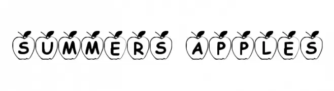
![Summers Apples Frei Schriftart Herunterladen]() Herunterladen 393 Downloads@WebFont
Herunterladen 393 Downloads@WebFont -
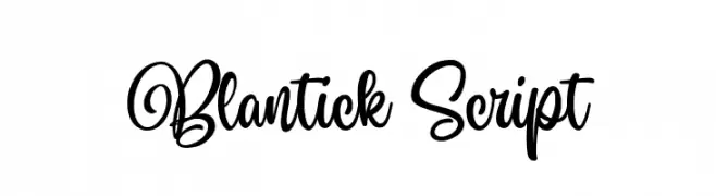
( Fonts by Damarletter )
A flowing, elegant cursive font with interconnected strokes and a handwritten appearance.
![Blantick Script Frei Schriftart Herunterladen]() Herunterladen 393 Downloads@WebFont
Herunterladen 393 Downloads@WebFont -
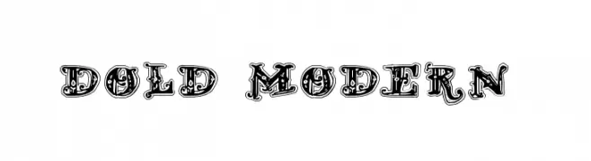
( Fonts by Douglas Vitkauskas - www.vtksdesign.com. Personal-use only. For commercial use please contact owner. )
An ornate, vintage-style font with intricate decorative details.
![D_OLD MODERN 2 Frei Schriftart Herunterladen]() Herunterladen 393 Downloads@WebFont
Herunterladen 393 Downloads@WebFont


Welche Schriften sind gerade am populärsten?
Poppins, Roboto, Montserrat, Open Sans und Lato sind wegen ihrer klaren Formen und breiten Einsetzbarkeit sehr gefragt – von Markenauftritt über Landingpages bis hin zu Postern.
Welche Fonts eignen sich für Logos?
Geometrische Sans‑Serifs (z. B. Poppins, Familien im Gotham‑Stil) sind ein häufiger Griff für sauberes, skalierbares Branding. Für eine persönlichere Note bleiben Scripts und Handschrift‑Stile beliebt. Kombinieren Sie einen prägnanten Headline‑Font mit einer neutralen Brotschrift für Wiedererkennung und Harmonie.
Wie oft wird die Top‑Liste aktualisiert?
Regelmäßig – basierend auf realen Downloads und Interaktionen. Schauen Sie öfter vorbei, um aufstrebende Favoriten früh zu entdecken.
💡 Tipp: Seite bookmarken – Trends wechseln schnell, und heutige Top‑Schriften inspirieren morgen vielleicht das Rebranding.