Willkommen bei den Top‑Schriften – hier treffen Beliebtheit und Qualität aufeinander. Das sind die in diesem Jahr am häufigsten heruntergeladenen und genutzten Fonts. Wenn Sie sichere Optionen für Logo, Web oder Social suchen, starten Sie hier.
Jeder Top‑Font überzeugt durch Balance, Lesbarkeit und Vielseitigkeit. Sie finden moderne Sans‑Serifs, elegante Scripts, Vintage‑Serifs und minimalistische Displays.
-
( Fonts by Zetafonts - Personal-use only. For commercial use please contact owner. )
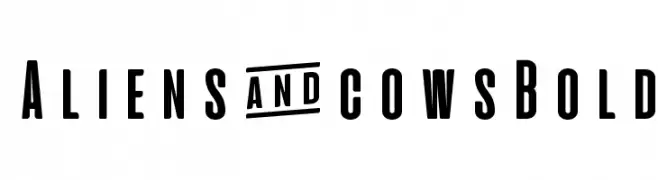
A bold, condensed font with geometric letterforms and uniform stroke width.
 Herunterladen 393 Downloads@WebFont
 -
( Fonts by Alde Saputro - aldedesign - https://www.creativefabrica.com/product/the-crafty-holiday-font-bundle/ref/125925/ - Personal-use only. For commercial use please contact owner. )
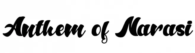
A bold, flowing script font with interconnected, ornate characters.
![Anthem of Narasi Frei Schriftart Herunterladen]() Herunterladen 393 Downloads@WebFont
Herunterladen 393 Downloads@WebFont -
( Fonts by a Max Infeld - XEROGRAPHER FONTS - xerographer.blogspot.com . Personal-use only. For commercial use please contact owner. )
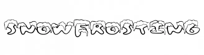
A playful, snow-capped font perfect for winter-themed designs.
![SnowFrosting Frei Schriftart Herunterladen]() Herunterladen 393 Downloads@WebFont
Herunterladen 393 Downloads@WebFont -
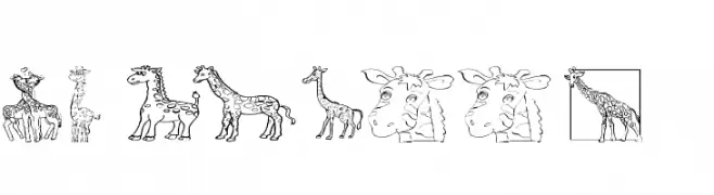
![AEZ giraffes Frei Schriftart Herunterladen]() Herunterladen 393 Downloads@WebFont
Herunterladen 393 Downloads@WebFont -
( Fonts by www.selawetype.com - Personal-use only. FOR DONATION https://www.paypal.me/selawe . For commercial use please contact owner. )
A modern, elegant script font with flowing, cursive strokes and high contrast.
![NalikaSignature Frei Schriftart Herunterladen]() Herunterladen 393 Downloads@WebFont
Herunterladen 393 Downloads@WebFont -
-
( Fonts by Situjuh Nazara - 7ntypes.com - Personal-use only. For commercial use please contact owner. )
A flowing, cursive script with smooth, rounded edges and consistent stroke width.
![Pre Frei Schriftart Herunterladen]() Herunterladen 393 Downloads@WebFont
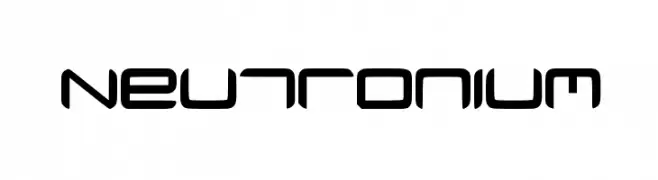
Herunterladen 393 Downloads@WebFont -
![Neutronium Frei Schriftart Herunterladen]() Herunterladen 393 Downloads@WebFont
Herunterladen 393 Downloads@WebFont -
( Free for a personal use. For a commercial use please visit www.kevinandamanda.com )
A playful, handwritten font with an informal and whimsical style.
![Pea Hunny Frei Schriftart Herunterladen]() Herunterladen 393 Downloads@WebFont
Herunterladen 393 Downloads@WebFont -
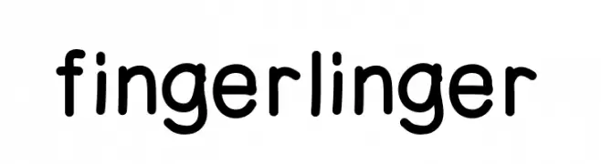
( hypoetical.net )
A playful, hand-drawn font with rounded, uniform strokes.
![fingerlinger Frei Schriftart Herunterladen]() Herunterladen 393 Downloads@WebFont
Herunterladen 393 Downloads@WebFont -
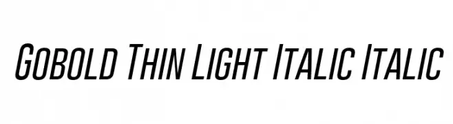
( Fonts by a Situjuh Nazara - c7n1.wordpress.com. Personal-use only. For commercial use please contact owner. )
A sleek, modern, and italicized font with thin, consistent strokes and a condensed form.
![Gobold Thin Light Italic Italic Frei Schriftart Herunterladen]() Herunterladen 393 Downloads@WebFont
Herunterladen 393 Downloads@WebFont


Welche Schriften sind gerade am populärsten?
Poppins, Roboto, Montserrat, Open Sans und Lato sind wegen ihrer klaren Formen und breiten Einsetzbarkeit sehr gefragt – von Markenauftritt über Landingpages bis hin zu Postern.
Welche Fonts eignen sich für Logos?
Geometrische Sans‑Serifs (z. B. Poppins, Familien im Gotham‑Stil) sind ein häufiger Griff für sauberes, skalierbares Branding. Für eine persönlichere Note bleiben Scripts und Handschrift‑Stile beliebt. Kombinieren Sie einen prägnanten Headline‑Font mit einer neutralen Brotschrift für Wiedererkennung und Harmonie.
Wie oft wird die Top‑Liste aktualisiert?
Regelmäßig – basierend auf realen Downloads und Interaktionen. Schauen Sie öfter vorbei, um aufstrebende Favoriten früh zu entdecken.
💡 Tipp: Seite bookmarken – Trends wechseln schnell, und heutige Top‑Schriften inspirieren morgen vielleicht das Rebranding.