Willkommen bei den Top‑Schriften – hier treffen Beliebtheit und Qualität aufeinander. Das sind die in diesem Jahr am häufigsten heruntergeladenen und genutzten Fonts. Wenn Sie sichere Optionen für Logo, Web oder Social suchen, starten Sie hier.
Jeder Top‑Font überzeugt durch Balance, Lesbarkeit und Vielseitigkeit. Sie finden moderne Sans‑Serifs, elegante Scripts, Vintage‑Serifs und minimalistische Displays.
-
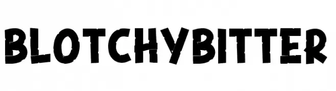
( Fonts by DumadiStyle )
A bold, playful font with a distressed, hand-crafted appearance.
 Herunterladen 392 Downloads@WebFont
 -
( Fonts by weknow - Wino S Kadir )
A modern, geometric font with rounded elements and consistent stroke width.
![Grass Hopper Frei Schriftart Herunterladen]() Herunterladen 392 Downloads@WebFont
Herunterladen 392 Downloads@WebFont -
![Dinamika Black Frei Schriftart Herunterladen]() Herunterladen 392 Downloads@WebFont
Herunterladen 392 Downloads@WebFont -
![Tesh Frei Schriftart Herunterladen]() Herunterladen 392 Downloads@WebFont
Herunterladen 392 Downloads@WebFont -
( Fonts by a Max Infeld - XEROGRAPHER FONTS - xerographer.blogspot.com . Personal-use only. For commercial use please contact owner. )
A playful, hand-drawn font with a scribbled texture and bold, sketch-like letters.
![CollegeScribble Frei Schriftart Herunterladen]() Herunterladen 392 Downloads@WebFont
Herunterladen 392 Downloads@WebFont -
-
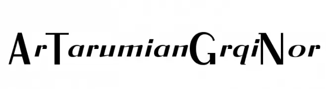
![ArTarumianGrqiNor Frei Schriftart Herunterladen]() Herunterladen 392 Downloads@WebFont
Herunterladen 392 Downloads@WebFont -
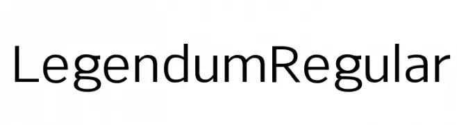
( Rogier van Dalen - home.kabelfoon.nl/~slam/fonts/fonts.html )
A modern, geometric sans-serif font with balanced proportions and high readability.
![Legendum Regular Frei Schriftart Herunterladen]() Herunterladen 392 Downloads@WebFont
Herunterladen 392 Downloads@WebFont -
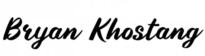
( Fonts by Fenny Wiryani - Personal-use only. For commercial use please contact owner. )
A bold, flowing script font with elegant, interconnected strokes.
![Bryan Khostang Frei Schriftart Herunterladen]() Herunterladen 392 Downloads@WebFont
Herunterladen 392 Downloads@WebFont -
( Fonts by Ramli Setiadi - Personal-use only. For commercial use please contact owner. )
A lively, handwritten font with fluid, connected letters and a playful yet sophisticated style.
![Strong Girl Frei Schriftart Herunterladen]() Herunterladen 392 Downloads@WebFont
Herunterladen 392 Downloads@WebFont -
![Secret Love Frei Schriftart Herunterladen]() Herunterladen 392 Downloads@WebFont
Herunterladen 392 Downloads@WebFont


Welche Schriften sind gerade am populärsten?
Poppins, Roboto, Montserrat, Open Sans und Lato sind wegen ihrer klaren Formen und breiten Einsetzbarkeit sehr gefragt – von Markenauftritt über Landingpages bis hin zu Postern.
Welche Fonts eignen sich für Logos?
Geometrische Sans‑Serifs (z. B. Poppins, Familien im Gotham‑Stil) sind ein häufiger Griff für sauberes, skalierbares Branding. Für eine persönlichere Note bleiben Scripts und Handschrift‑Stile beliebt. Kombinieren Sie einen prägnanten Headline‑Font mit einer neutralen Brotschrift für Wiedererkennung und Harmonie.
Wie oft wird die Top‑Liste aktualisiert?
Regelmäßig – basierend auf realen Downloads und Interaktionen. Schauen Sie öfter vorbei, um aufstrebende Favoriten früh zu entdecken.
💡 Tipp: Seite bookmarken – Trends wechseln schnell, und heutige Top‑Schriften inspirieren morgen vielleicht das Rebranding.