Willkommen bei den Top‑Schriften – hier treffen Beliebtheit und Qualität aufeinander. Das sind die in diesem Jahr am häufigsten heruntergeladenen und genutzten Fonts. Wenn Sie sichere Optionen für Logo, Web oder Social suchen, starten Sie hier.
Jeder Top‑Font überzeugt durch Balance, Lesbarkeit und Vielseitigkeit. Sie finden moderne Sans‑Serifs, elegante Scripts, Vintage‑Serifs und minimalistische Displays.
-
( Fonts by Darcy Baldwin - darcybaldwin.com. Free for personal use only )
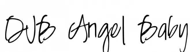
A playful, whimsical handwritten font with loose, flowing strokes.
 Herunterladen 381 Downloads@WebFont
 -
![FractionsFat Frei Schriftart Herunterladen]() Herunterladen 381 Downloads@WebFont
Herunterladen 381 Downloads@WebFont -
( Fonts by Dan Steinbok - Out Of Step Font Company - outofstepfontco.com - Personal-use only. For commercial use please contact owner. )
A bold, brush-style script font with textured, hand-painted strokes.
![Bristle Brush Script Demo Frei Schriftart Herunterladen]() Herunterladen 381 Downloads@WebFont
Herunterladen 381 Downloads@WebFont -
( Fonts by YolandaBomfim )
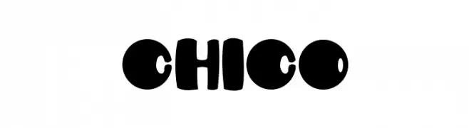
A playful, bold font with rounded, bubbly characters and a whimsical flair.
![CHICO Frei Schriftart Herunterladen]() Herunterladen 381 Downloads@WebFont
Herunterladen 381 Downloads@WebFont -
( Fonts by Khurasan )
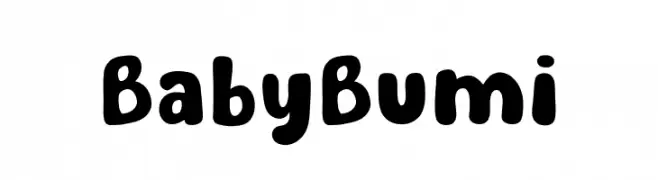
A playful, rounded font with bold, whimsical characters.
![Baby Bumi Frei Schriftart Herunterladen]() Herunterladen 381 Downloads@WebFont
Herunterladen 381 Downloads@WebFont -
-
![21 Kana Frei Schriftart Herunterladen]() Herunterladen 381 Downloads@WebFont
Herunterladen 381 Downloads@WebFont -
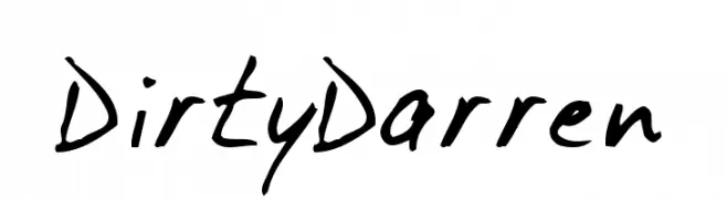
( Fonts by Daniel Gauthier )
A bold, hand-drawn font with energetic, brush-like strokes.
![DirtyDarren Frei Schriftart Herunterladen]() Herunterladen 381 Downloads@WebFont
Herunterladen 381 Downloads@WebFont -
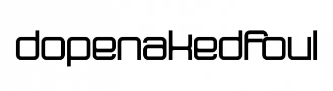
![dopenakedfoul Frei Schriftart Herunterladen]() Herunterladen 381 Downloads@WebFont
Herunterladen 381 Downloads@WebFont -
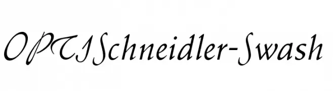
( Fonts by Castcraft Software - OPTI Fonts Archive - opti.netii.net - Personal-use only. For commercial use please contact owner. )
An elegant cursive font with swash elements, perfect for adding sophistication.
![OPTISchneidler-Swash Frei Schriftart Herunterladen]() Herunterladen 381 Downloads@WebFont
Herunterladen 381 Downloads@WebFont -
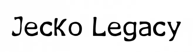
( Fonts by Jecko Development - www.jeckodevelopment.com )
A playful, hand-drawn font with a whimsical and organic style.
![Jecko Legacy Frei Schriftart Herunterladen]() Herunterladen 381 Downloads@WebFont
Herunterladen 381 Downloads@WebFont


Welche Schriften sind gerade am populärsten?
Poppins, Roboto, Montserrat, Open Sans und Lato sind wegen ihrer klaren Formen und breiten Einsetzbarkeit sehr gefragt – von Markenauftritt über Landingpages bis hin zu Postern.
Welche Fonts eignen sich für Logos?
Geometrische Sans‑Serifs (z. B. Poppins, Familien im Gotham‑Stil) sind ein häufiger Griff für sauberes, skalierbares Branding. Für eine persönlichere Note bleiben Scripts und Handschrift‑Stile beliebt. Kombinieren Sie einen prägnanten Headline‑Font mit einer neutralen Brotschrift für Wiedererkennung und Harmonie.
Wie oft wird die Top‑Liste aktualisiert?
Regelmäßig – basierend auf realen Downloads und Interaktionen. Schauen Sie öfter vorbei, um aufstrebende Favoriten früh zu entdecken.
💡 Tipp: Seite bookmarken – Trends wechseln schnell, und heutige Top‑Schriften inspirieren morgen vielleicht das Rebranding.