Willkommen bei den Top‑Schriften – hier treffen Beliebtheit und Qualität aufeinander. Das sind die in diesem Jahr am häufigsten heruntergeladenen und genutzten Fonts. Wenn Sie sichere Optionen für Logo, Web oder Social suchen, starten Sie hier.
Jeder Top‑Font überzeugt durch Balance, Lesbarkeit und Vielseitigkeit. Sie finden moderne Sans‑Serifs, elegante Scripts, Vintage‑Serifs und minimalistische Displays.
-
( Fonts by Darcy Baldwin - darcybaldwin.com. Free for personal use only )
A playful, star-embellished font with a hand-drawn feel.
 Herunterladen 380 Downloads@WebFont
 -
( Fonts by www.fontdiner.com )
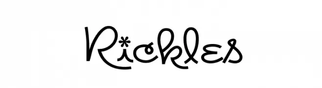
A playful and whimsical font with curly, looping strokes and decorative elements.
![Rickles Frei Schriftart Herunterladen]() Herunterladen 380 Downloads@WebFont
Herunterladen 380 Downloads@WebFont -
( Fonts by Style-7 - www.styleseven.com - Personal-use only. For commercial use please contact owner. )
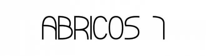
A modern, geometric font with clean, rounded edges and consistent stroke width.
![ABRICOS 7 Frei Schriftart Herunterladen]() Herunterladen 380 Downloads@WebFont
Herunterladen 380 Downloads@WebFont -
( Fonts by Daniel Zadorozny - www.iconian.com - Personal-use only. For commercial use please contact owner. )
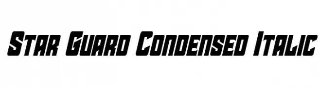
A bold, condensed, and italic font with a modern, dynamic style.
![Star Guard Condensed Italic Frei Schriftart Herunterladen]() Herunterladen 380 Downloads@WebFont
Herunterladen 380 Downloads@WebFont -
( Fonts by www.studiotypo.com - Personal-use only. For commercial use please contact owner. )
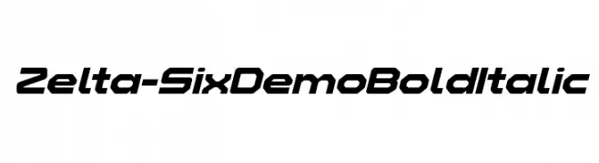
A bold, italicized font with a futuristic, angular design.
![Zelta-Six Demo Bold Italic Frei Schriftart Herunterladen]() Herunterladen 380 Downloads@WebFont
Herunterladen 380 Downloads@WebFont -
-
![Quattro Frei Schriftart Herunterladen]() Herunterladen 380 Downloads@WebFont
Herunterladen 380 Downloads@WebFont -
( Fonts by Roland Huse - rolandhuse.com )
A charming handwritten font with fluid, connected characters and a nostalgic feel.
![Granny's Handwriting Frei Schriftart Herunterladen]() Herunterladen 380 Downloads@WebFont
Herunterladen 380 Downloads@WebFont -
( Font by Jonathan Harris - www.tattoowoo.com )
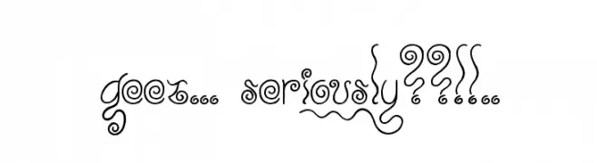
A whimsical and decorative font with swirling, curly embellishments.
![Geez... Seriously??!!.. Frei Schriftart Herunterladen]() Herunterladen 380 Downloads@WebFont
Herunterladen 380 Downloads@WebFont -
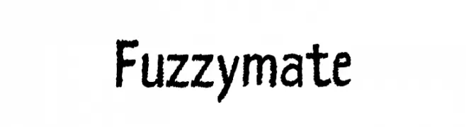
![Fuzzymate Frei Schriftart Herunterladen]() Herunterladen 380 Downloads@WebFont
Herunterladen 380 Downloads@WebFont -
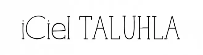
![iCiel TALUHLA Frei Schriftart Herunterladen]() Herunterladen 380 Downloads@WebFont
Herunterladen 380 Downloads@WebFont


Welche Schriften sind gerade am populärsten?
Poppins, Roboto, Montserrat, Open Sans und Lato sind wegen ihrer klaren Formen und breiten Einsetzbarkeit sehr gefragt – von Markenauftritt über Landingpages bis hin zu Postern.
Welche Fonts eignen sich für Logos?
Geometrische Sans‑Serifs (z. B. Poppins, Familien im Gotham‑Stil) sind ein häufiger Griff für sauberes, skalierbares Branding. Für eine persönlichere Note bleiben Scripts und Handschrift‑Stile beliebt. Kombinieren Sie einen prägnanten Headline‑Font mit einer neutralen Brotschrift für Wiedererkennung und Harmonie.
Wie oft wird die Top‑Liste aktualisiert?
Regelmäßig – basierend auf realen Downloads und Interaktionen. Schauen Sie öfter vorbei, um aufstrebende Favoriten früh zu entdecken.
💡 Tipp: Seite bookmarken – Trends wechseln schnell, und heutige Top‑Schriften inspirieren morgen vielleicht das Rebranding.