Willkommen bei den Top‑Schriften – hier treffen Beliebtheit und Qualität aufeinander. Das sind die in diesem Jahr am häufigsten heruntergeladenen und genutzten Fonts. Wenn Sie sichere Optionen für Logo, Web oder Social suchen, starten Sie hier.
Jeder Top‑Font überzeugt durch Balance, Lesbarkeit und Vielseitigkeit. Sie finden moderne Sans‑Serifs, elegante Scripts, Vintage‑Serifs und minimalistische Displays.
-
( Fonts by Runsell Studio - Personal-use only. For commercial use please contact owner. )
A flowing, cursive handwritten font with elegant connections and smooth strokes.
 Herunterladen 44 Downloads@WebFont
 -
( Fonts by Pria Admaja - Personal-use only. For commercial use please contact owner. )
A flowing, handwritten font with elegant cursive characters.
![Port Harcourt Frei Schriftart Herunterladen]() Herunterladen 44 Downloads@WebFont
Herunterladen 44 Downloads@WebFont -
( Fonts by Angin Studio - David Novrian - Personal-use only. For commercial use please contact owner. )
An elegant, flowing script font with ornate, cursive letterforms.
![Gillnord Frei Schriftart Herunterladen]() Herunterladen 44 Downloads@WebFont
Herunterladen 44 Downloads@WebFont -
( Fonts by deFharo - Fernando Haro - Personal-use only. For commercial use please contact owner. )
A modern, geometric font with rounded edges and a clean, streamlined appearance.
![lerotica-semilight Frei Schriftart Herunterladen]() Herunterladen 44 Downloads@WebFont
Herunterladen 44 Downloads@WebFont -
( Fonts by GGBot - www.ggbot.net - Personal-use only. For commercial use please contact owner. )
A bold, brush-textured font with an artistic and dynamic appearance.
![Correction Brush Frei Schriftart Herunterladen]() Herunterladen 44 Downloads@WebFont
Herunterladen 44 Downloads@WebFont -
( Fonts by EkoZero7 - Personal-use only. For commercial use please contact owner. )
A futuristic, geometric font with angular and sharp-edged letterforms.
![Hello Space Frei Schriftart Herunterladen]() Herunterladen 44 Downloads@WebFont
Herunterladen 44 Downloads@WebFont -
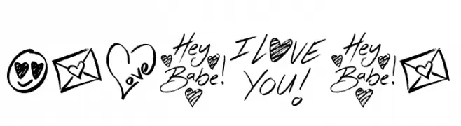
( Fonts by Jonathan S. Harris - Personal-use only. For commercial use please contact owner. )
A playful, hand-drawn font with romantic doodles and heart motifs.
![Hey Babe Frei Schriftart Herunterladen]() Herunterladen 44 Downloads@WebFont
Herunterladen 44 Downloads@WebFont -
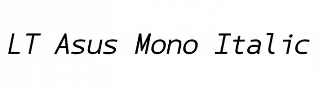
( Fonts by LyonsType - Daniel Lyons - Personal-use only. For commercial use please contact owner. )
A modern, monospaced italic font with consistent stroke weight and clear readability.
![LT Asus Mono Italic Frei Schriftart Herunterladen]() Herunterladen 44 Downloads@WebFont
Herunterladen 44 Downloads@WebFont -
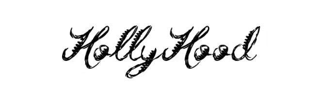
( Fonts by Jonathan S. Harris - Personal-use only. For commercial use please contact owner. )
An ornate, decorative script font with feather-like embellishments.
![Holly Hood Frei Schriftart Herunterladen]() Herunterladen 44 Downloads@WebFont
Herunterladen 44 Downloads@WebFont -
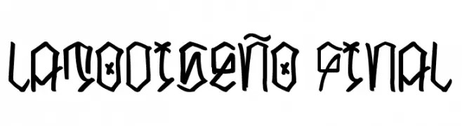
( Fonts by Latomani Otravez - Personal-use only. For commercial use please contact owner. )
A bold, angular font with a graffiti-inspired, edgy design.
![LATODISEÑO FINAL Frei Schriftart Herunterladen]() Herunterladen 44 Downloads@WebFont
Herunterladen 44 Downloads@WebFont -
( Fonts by Khurasan - Syaf Rizal - Personal-use only. For commercial use please contact owner. )
A dynamic and elegant script font with fluid, cursive strokes.
![Maytra Frei Schriftart Herunterladen]() Herunterladen 44 Downloads@WebFont
Herunterladen 44 Downloads@WebFont -
( Fonts by Neogrey Creative - Ivan Filipov - Personal-use only. For commercial use please contact owner. )
A modern, geometric font with rounded edges and a futuristic style.
![Syntha Frei Schriftart Herunterladen]() Herunterladen 44 Downloads@WebFont
Herunterladen 44 Downloads@WebFont -
( Fonts by Beautypes - Bhakti Al Akbar Pasaribu - Personal-use only. For commercial use please contact owner. )
An elegant script font with flowing, cursive letterforms and a sophisticated style.
![JustSweet Frei Schriftart Herunterladen]() Herunterladen 44 Downloads@WebFont
Herunterladen 44 Downloads@WebFont -
( Fonts by Almarkhatype - Abdul Malik Wisnu - Personal-use only. For commercial use please contact owner. )
A playful, handwritten-style font with a whimsical and charming design.
![Wonder Knight Frei Schriftart Herunterladen]() Herunterladen 44 Downloads@WebFont
Herunterladen 44 Downloads@WebFont -
( Fonts by Fikryal studio - Fikry Alif - Personal-use only. For commercial use please contact owner. )
A lively handwritten font with fluid, cursive letterforms and a playful style.
![Supersonic Frei Schriftart Herunterladen]() Herunterladen 44 Downloads@WebFont
Herunterladen 44 Downloads@WebFont -
( Fonts by Khurasan - Syaf Rizal - Personal-use only. For commercial use please contact owner. )
A lively handwritten script with fluid, continuous strokes and a personal touch.
![Rumpi Frei Schriftart Herunterladen]() Herunterladen 44 Downloads@WebFont
Herunterladen 44 Downloads@WebFont -
( Fonts by Typodermic Fonts - Raymond Larabie - Personal-use only. For commercial use please contact owner. )
A futuristic, geometric font with bold, angular lines and unique cutouts.
![YonderRecoil-Regular Frei Schriftart Herunterladen]() Herunterladen 44 Downloads@WebFont
Herunterladen 44 Downloads@WebFont -
( Noto is a trademark of Google Inc. Noto fonts are open source. All Noto fonts are published under the SIL Open Font License, Version 1.1 )
Modern sans-serif font, condensed and light.
![Noto Sans Thai UI Condensed Light Frei Schriftart Herunterladen]() Herunterladen 44 Downloads@WebFont
Herunterladen 44 Downloads@WebFont -
( Fonts by Balpirick - Personal-use only. For commercial use please contact owner. )
A playful, cursive script font with a whimsical, hand-drawn style.
![Sweetie Autumn Frei Schriftart Herunterladen]() Herunterladen 44 Downloads@WebFont
Herunterladen 44 Downloads@WebFont -
( Fonts by Edric Studio - Personal-use only. For commercial use please contact owner. )
A playful, hand-drawn font with a whimsical and artistic style.
![Blankspot Demo Frei Schriftart Herunterladen]() Herunterladen 44 Downloads@WebFont
Herunterladen 44 Downloads@WebFont -
( Fonts by FallenGraphic Studio - Vava Aryanto - Personal-use only. For commercial use please contact owner. )
A bold, playful font with rounded edges and unique curves.
![Milbong Frei Schriftart Herunterladen]() Herunterladen 44 Downloads@WebFont
Herunterladen 44 Downloads@WebFont -
( Fonts by Rafantype Studio - Ahmad Saiful Mutohhar - Personal-use only. For commercial use please contact owner. )
A lively, flowing script font with smooth, continuous strokes and elegant curves.
![Strong Heart Frei Schriftart Herunterladen]() Herunterladen 44 Downloads@WebFont
Herunterladen 44 Downloads@WebFont -
( Fonts by zone108.main.jp - Personal-use only. For commercial use please contact owner. )
A decorative serif font with playful curls and elegant details.
![Yourin Regular Frei Schriftart Herunterladen]() Herunterladen 44 Downloads@WebFont
Herunterladen 44 Downloads@WebFont -
( Fonts by Insan Nurbahagia )
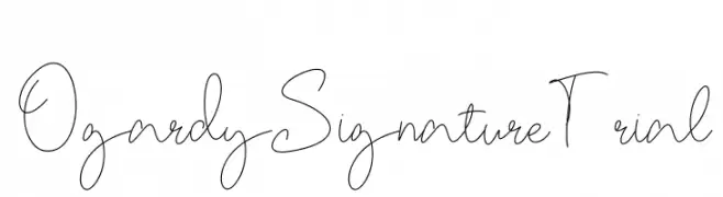
A graceful, handwritten script font with a signature-like elegance.
![OgardySignature-Trial Frei Schriftart Herunterladen]() Herunterladen 44 Downloads@WebFont
Herunterladen 44 Downloads@WebFont -
( Fonts by Daniel Zadorozny - www.iconian.com - Personal-use only. For commercial use please contact owner. )
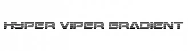
A bold, futuristic font with a gradient effect and sharp, angular design.
![Hyper Viper Gradient Frei Schriftart Herunterladen]() Herunterladen 44 Downloads@WebFont
Herunterladen 44 Downloads@WebFont -
( Fonts by Bross Workshop - Iim Maulana Ibrahim - Personal-use only. For commercial use please contact owner. )
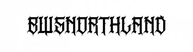
A bold, blackletter font with sharp, angular lines and high contrast.
![BWSNORTHLAND Frei Schriftart Herunterladen]() Herunterladen 44 Downloads@WebFont
Herunterladen 44 Downloads@WebFont -
( Fonts by JunCreative - Personal-use only. For commercial use please contact owner. )
An elegant script font with flowing, cursive strokes and intricate loops.
![beauty friday Frei Schriftart Herunterladen]() Herunterladen 44 Downloads@WebFont
Herunterladen 44 Downloads@WebFont -
( Fonts by Almarkhatype - Abdul Malik Wisnu - Personal-use only. For commercial use please contact owner. )
A lively and expressive handwritten font with fluid, dynamic strokes.
![Autumnilla Frei Schriftart Herunterladen]() Herunterladen 44 Downloads@WebFont
Herunterladen 44 Downloads@WebFont -
( Fonts by Wondoo - Personal-use only. For commercial use please contact owner. )
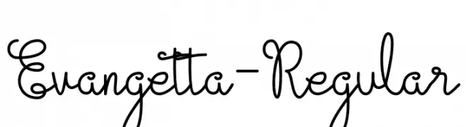
A playful and whimsical script font with looping, flowing letterforms.
![Evangetta-Regular Frei Schriftart Herunterladen]() Herunterladen 44 Downloads@WebFont
Herunterladen 44 Downloads@WebFont -
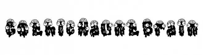
( Fonts by PutraCetol Studio )
A bold, dripping horror display font with cartoon brains and eyes.
![Gothic Haunt Brain Frei Schriftart Herunterladen]() Herunterladen 44 Downloads@WebFont
Herunterladen 44 Downloads@WebFont -
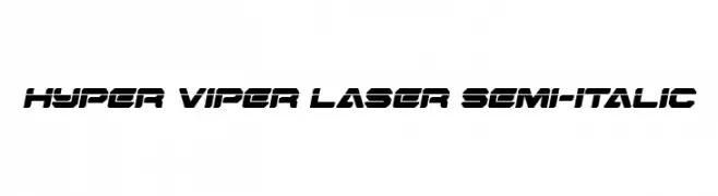
( Fonts by Daniel Zadorozny - www.iconian.com - Personal-use only. For commercial use please contact owner. )
A bold, futuristic font with sharp angles and a semi-italic slant.
![Hyper Viper Laser Semi-Italic Frei Schriftart Herunterladen]() Herunterladen 44 Downloads@WebFont
Herunterladen 44 Downloads@WebFont -
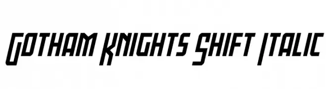
( Fonts by Iconian Fonts - Daniel Zadorozny - Personal-use only. For commercial use please contact owner. )
A bold, italic font with sharp angles and a modern, dynamic style.
![Gotham Knights Shift Italic Frei Schriftart Herunterladen]() Herunterladen 44 Downloads@WebFont
Herunterladen 44 Downloads@WebFont -
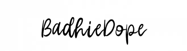
( Fonts by Vunira Design - Personal-use only. For commercial use please contact owner. )
A lively, expressive handwritten font with fluid strokes and a casual elegance.
![BadhieDope Frei Schriftart Herunterladen]() Herunterladen 44 Downloads@WebFont
Herunterladen 44 Downloads@WebFont -
( Fonts by Vz Type - Personal-use only. For commercial use please contact owner. )
A bold, expressive brush script font with dynamic, fluid strokes.
![Bougher Regular Frei Schriftart Herunterladen]() Herunterladen 44 Downloads@WebFont
Herunterladen 44 Downloads@WebFont -
( Fonts by Almarkhatype - Abdul Malik Wisnu - Personal-use only. For commercial use please contact owner. )
An elegant, flowing script font with a handwritten appearance.
![Bouncyland Frei Schriftart Herunterladen]() Herunterladen 44 Downloads@WebFont
Herunterladen 44 Downloads@WebFont


Welche Schriften sind gerade am populärsten?
Poppins, Roboto, Montserrat, Open Sans und Lato sind wegen ihrer klaren Formen und breiten Einsetzbarkeit sehr gefragt – von Markenauftritt über Landingpages bis hin zu Postern.
Welche Fonts eignen sich für Logos?
Geometrische Sans‑Serifs (z. B. Poppins, Familien im Gotham‑Stil) sind ein häufiger Griff für sauberes, skalierbares Branding. Für eine persönlichere Note bleiben Scripts und Handschrift‑Stile beliebt. Kombinieren Sie einen prägnanten Headline‑Font mit einer neutralen Brotschrift für Wiedererkennung und Harmonie.
Wie oft wird die Top‑Liste aktualisiert?
Regelmäßig – basierend auf realen Downloads und Interaktionen. Schauen Sie öfter vorbei, um aufstrebende Favoriten früh zu entdecken.
💡 Tipp: Seite bookmarken – Trends wechseln schnell, und heutige Top‑Schriften inspirieren morgen vielleicht das Rebranding.