Willkommen bei den Top‑Schriften – hier treffen Beliebtheit und Qualität aufeinander. Das sind die in diesem Jahr am häufigsten heruntergeladenen und genutzten Fonts. Wenn Sie sichere Optionen für Logo, Web oder Social suchen, starten Sie hier.
Jeder Top‑Font überzeugt durch Balance, Lesbarkeit und Vielseitigkeit. Sie finden moderne Sans‑Serifs, elegante Scripts, Vintage‑Serifs und minimalistische Displays.
-
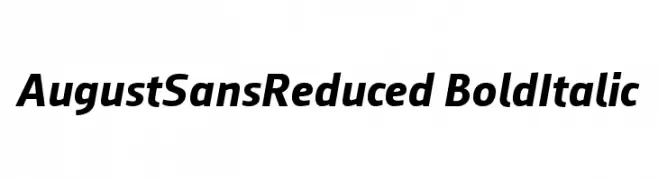
( ingoFonts - Ingo Zimmermann - www.ingofonts.com )
A bold, italicized font with a modern and dynamic style.
 Herunterladen 361 Downloads@WebFont
 -
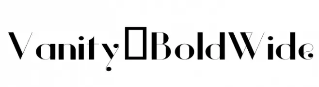
( Fonts by Hendrick Rolandez - Personal-use only. For commercial use please contact owner. )
A bold, wide font with high contrast and modern elegance.
![Vanity-BoldWide Frei Schriftart Herunterladen]() Herunterladen 361 Downloads@WebFont
Herunterladen 361 Downloads@WebFont -
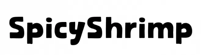
( Fonts by Khurasan )
A bold, playful font with rounded edges and a modern vibe.
![Spicy Shrimp Frei Schriftart Herunterladen]() Herunterladen 361 Downloads@WebFont
Herunterladen 361 Downloads@WebFont -
![Nordica Classic Light Outline Frei Schriftart Herunterladen]() Herunterladen 361 Downloads@WebFont
Herunterladen 361 Downloads@WebFont -
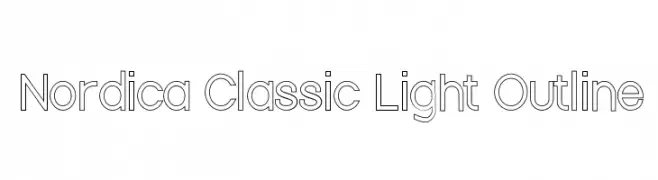
( Fonts by Manfred Klein. Free for private and charity use. Free for commercial with donation to organizations )
A bold, modern font with sharp angles and smooth curves.
![Aparta Frei Schriftart Herunterladen]() Herunterladen 361 Downloads@WebFont
Herunterladen 361 Downloads@WebFont -
-
![fs eng Regular Frei Schriftart Herunterladen]() Herunterladen 361 Downloads@WebFont
Herunterladen 361 Downloads@WebFont -
( ingoFonts - Ingo Zimmermann - www.ingofonts.com )
A clean, modern sans-serif font with consistent stroke width and elegant curvature.
![AugustSansReduced-Regular Frei Schriftart Herunterladen]() Herunterladen 361 Downloads@WebFont
Herunterladen 361 Downloads@WebFont -
( Fonts by Press Gang Studios - Andeh Pinkard - www.pressgang-studios.com )
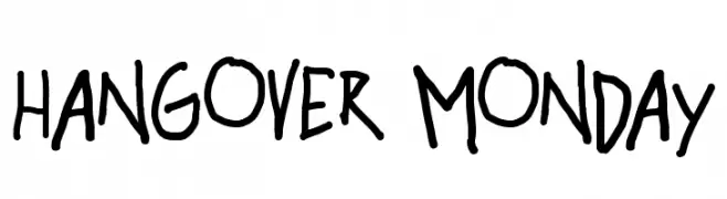
A playful, casual handwritten font with irregular strokes and a lively appearance.
![hangover monday Frei Schriftart Herunterladen]() Herunterladen 361 Downloads@WebFont
Herunterladen 361 Downloads@WebFont -
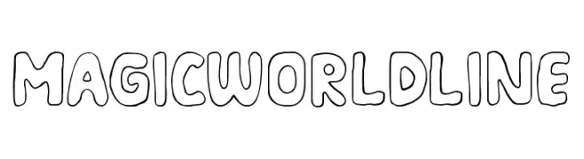
( Fonts by Mozarella Art )
A playful, hand-drawn font with bold, rounded outlines.
![MAGIC WORLD LINE Frei Schriftart Herunterladen]() Herunterladen 361 Downloads@WebFont
Herunterladen 361 Downloads@WebFont -
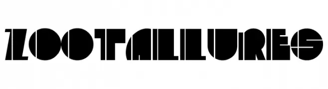
( Fonts by Daniel Gauthier )
A bold, geometric font with a modern and futuristic style.
![ZootAllures Frei Schriftart Herunterladen]() Herunterladen 361 Downloads@WebFont
Herunterladen 361 Downloads@WebFont


Welche Schriften sind gerade am populärsten?
Poppins, Roboto, Montserrat, Open Sans und Lato sind wegen ihrer klaren Formen und breiten Einsetzbarkeit sehr gefragt – von Markenauftritt über Landingpages bis hin zu Postern.
Welche Fonts eignen sich für Logos?
Geometrische Sans‑Serifs (z. B. Poppins, Familien im Gotham‑Stil) sind ein häufiger Griff für sauberes, skalierbares Branding. Für eine persönlichere Note bleiben Scripts und Handschrift‑Stile beliebt. Kombinieren Sie einen prägnanten Headline‑Font mit einer neutralen Brotschrift für Wiedererkennung und Harmonie.
Wie oft wird die Top‑Liste aktualisiert?
Regelmäßig – basierend auf realen Downloads und Interaktionen. Schauen Sie öfter vorbei, um aufstrebende Favoriten früh zu entdecken.
💡 Tipp: Seite bookmarken – Trends wechseln schnell, und heutige Top‑Schriften inspirieren morgen vielleicht das Rebranding.