Willkommen bei den Top‑Schriften – hier treffen Beliebtheit und Qualität aufeinander. Das sind die in diesem Jahr am häufigsten heruntergeladenen und genutzten Fonts. Wenn Sie sichere Optionen für Logo, Web oder Social suchen, starten Sie hier.
Jeder Top‑Font überzeugt durch Balance, Lesbarkeit und Vielseitigkeit. Sie finden moderne Sans‑Serifs, elegante Scripts, Vintage‑Serifs und minimalistische Displays.
-
( Fonts by StudioTypo - Personal-use only. For commercial use please contact owner. )
A modern, italicized font with a sleek and dynamic design.
 Herunterladen 354 Downloads@WebFont
 -
( Fonts by Letterena Studios )
Playful handwritten script font.
![Santilaria Frei Schriftart Herunterladen]() Herunterladen 354 Downloads@WebFont
Herunterladen 354 Downloads@WebFont -
( Font by Jonathan Harris - www.tattoowoo.com )
A bold, brush-style font with an artistic and dynamic appearance.
![Dysfunctional Family Frei Schriftart Herunterladen]() Herunterladen 354 Downloads@WebFont
Herunterladen 354 Downloads@WebFont -
![Garbage2 Frei Schriftart Herunterladen]() Herunterladen 354 Downloads@WebFont
Herunterladen 354 Downloads@WebFont -
( Fonts by Andrew McCluskey - nalgames.com )
A modern, geometric sans-serif font with clean lines and uniform strokes.
![Piescese Frei Schriftart Herunterladen]() Herunterladen 354 Downloads@WebFont
Herunterladen 354 Downloads@WebFont -
-
( Fonts by www.blambot.com )
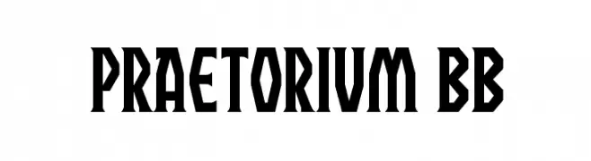
A bold, angular font with a geometric and commanding style.
![Praetorium BB Frei Schriftart Herunterladen]() Herunterladen 354 Downloads@WebFont
Herunterladen 354 Downloads@WebFont -
( twitter.com/wow5s0s )
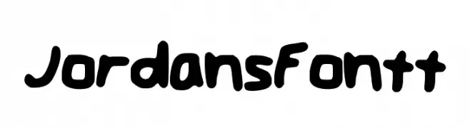
A bold, hand-drawn font with a playful and casual style.
![JordansFontt Frei Schriftart Herunterladen]() Herunterladen 354 Downloads@WebFont
Herunterladen 354 Downloads@WebFont -
( Copyright © 2017 IBM Corp. with Reserved Font Name "Plex" )
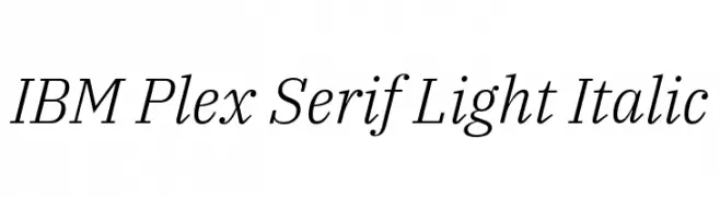
A refined serif font with a light weight and italic style, perfect for elegant designs.
![IBM Plex Serif Light Italic Frei Schriftart Herunterladen]() Herunterladen 354 Downloads@WebFont
Herunterladen 354 Downloads@WebFont -
( Fonts by Peter Wiegel - www.peter-wiegel.de )
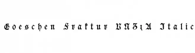
An ornate Blackletter font with intricate details and an italic style.
![Goeschen Fraktur UNZ1A Italic Frei Schriftart Herunterladen]() Herunterladen 354 Downloads@WebFont
Herunterladen 354 Downloads@WebFont -
( Fonts by Khurasan )
A playful, bold font with rounded edges and a hand-drawn feel.
![Chatkids Frei Schriftart Herunterladen]() Herunterladen 354 Downloads@WebFont
Herunterladen 354 Downloads@WebFont


Welche Schriften sind gerade am populärsten?
Poppins, Roboto, Montserrat, Open Sans und Lato sind wegen ihrer klaren Formen und breiten Einsetzbarkeit sehr gefragt – von Markenauftritt über Landingpages bis hin zu Postern.
Welche Fonts eignen sich für Logos?
Geometrische Sans‑Serifs (z. B. Poppins, Familien im Gotham‑Stil) sind ein häufiger Griff für sauberes, skalierbares Branding. Für eine persönlichere Note bleiben Scripts und Handschrift‑Stile beliebt. Kombinieren Sie einen prägnanten Headline‑Font mit einer neutralen Brotschrift für Wiedererkennung und Harmonie.
Wie oft wird die Top‑Liste aktualisiert?
Regelmäßig – basierend auf realen Downloads und Interaktionen. Schauen Sie öfter vorbei, um aufstrebende Favoriten früh zu entdecken.
💡 Tipp: Seite bookmarken – Trends wechseln schnell, und heutige Top‑Schriften inspirieren morgen vielleicht das Rebranding.