Willkommen bei den Top‑Schriften – hier treffen Beliebtheit und Qualität aufeinander. Das sind die in diesem Jahr am häufigsten heruntergeladenen und genutzten Fonts. Wenn Sie sichere Optionen für Logo, Web oder Social suchen, starten Sie hier.
Jeder Top‑Font überzeugt durch Balance, Lesbarkeit und Vielseitigkeit. Sie finden moderne Sans‑Serifs, elegante Scripts, Vintage‑Serifs und minimalistische Displays.
-
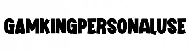
( Fonts by twinletter )
A bold, playful font with thick, blocky uppercase letters and a quirky, dynamic style.
 Herunterladen 349 Downloads@WebFont
 -
( Fonts by a Neale Davidson - www.pixelsagas.com. Personal-use only. For commercial use please contact owner. )
A bold, italicized font with a modern and dynamic style.
![Erte Bold Italic Frei Schriftart Herunterladen]() Herunterladen 349 Downloads@WebFont
Herunterladen 349 Downloads@WebFont -
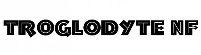
( Fonts by Nick Curtis - www.nicksfonts.com )
A bold, geometric font with a retro, angular design.
![Troglodyte NF Frei Schriftart Herunterladen]() Herunterladen 349 Downloads@WebFont
Herunterladen 349 Downloads@WebFont -
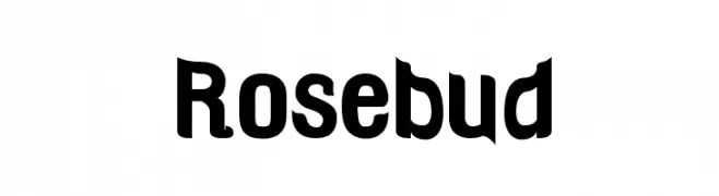
( Fonts by Barry Bujol - theoriginal19.blogspot.com )
A bold, playful font with rounded and angular elements, offering a modern yet retro charm.
![Rosebud Frei Schriftart Herunterladen]() Herunterladen 349 Downloads@WebFont
Herunterladen 349 Downloads@WebFont -
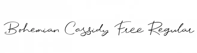
Schriftart von letterhanna. For commercial use please contact the owner.
( But please be aware that this font is free for personal use only. No promotional or commercial use allowed! You require a license for promotional or commercial use. This font is also limited, without some swash, alternate, and some numbers or punctuation )
A cursive, handwritten font with elegant, flowing strokes.
![Bohemian Cassidy Free Regular Frei Schriftart Herunterladen]() Herunterladen 349 Downloads@WebFont
Herunterladen 349 Downloads@WebFont -
-
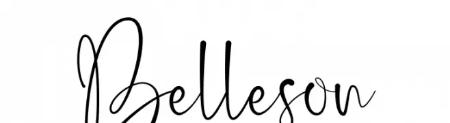
( Haksen Letters - Sarwo Edhi Prayitno )
A whimsical, handwritten font with playful loops and curves.
![Belleson Frei Schriftart Herunterladen]() Herunterladen 349 Downloads@WebFont
Herunterladen 349 Downloads@WebFont -
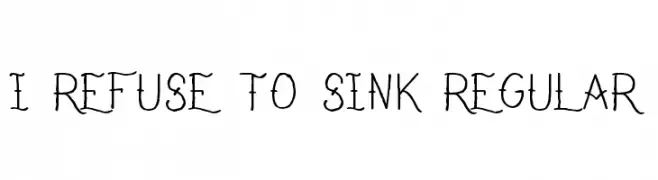
![I Refuse To Sink Regular Frei Schriftart Herunterladen]() Herunterladen 349 Downloads@WebFont
Herunterladen 349 Downloads@WebFont -
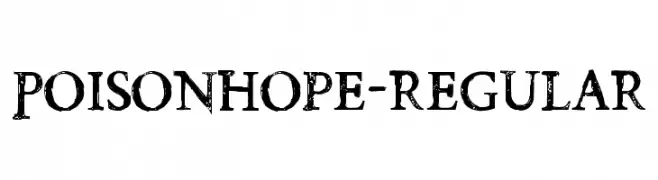
( Fonts by Chris Vile )
A distressed, grunge-style font with a rough, textured appearance.
![PoisonHope-Regular Frei Schriftart Herunterladen]() Herunterladen 349 Downloads@WebFont
Herunterladen 349 Downloads@WebFont -
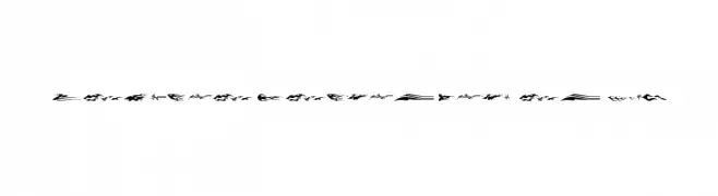
![Vehicle Decals Flames Art Frei Schriftart Herunterladen]() Herunterladen 349 Downloads@WebFont
Herunterladen 349 Downloads@WebFont -
![Political Graft Fill Frei Schriftart Herunterladen]() Herunterladen 349 Downloads@WebFont
Herunterladen 349 Downloads@WebFont


Welche Schriften sind gerade am populärsten?
Poppins, Roboto, Montserrat, Open Sans und Lato sind wegen ihrer klaren Formen und breiten Einsetzbarkeit sehr gefragt – von Markenauftritt über Landingpages bis hin zu Postern.
Welche Fonts eignen sich für Logos?
Geometrische Sans‑Serifs (z. B. Poppins, Familien im Gotham‑Stil) sind ein häufiger Griff für sauberes, skalierbares Branding. Für eine persönlichere Note bleiben Scripts und Handschrift‑Stile beliebt. Kombinieren Sie einen prägnanten Headline‑Font mit einer neutralen Brotschrift für Wiedererkennung und Harmonie.
Wie oft wird die Top‑Liste aktualisiert?
Regelmäßig – basierend auf realen Downloads und Interaktionen. Schauen Sie öfter vorbei, um aufstrebende Favoriten früh zu entdecken.
💡 Tipp: Seite bookmarken – Trends wechseln schnell, und heutige Top‑Schriften inspirieren morgen vielleicht das Rebranding.