Willkommen bei den Top‑Schriften – hier treffen Beliebtheit und Qualität aufeinander. Das sind die in diesem Jahr am häufigsten heruntergeladenen und genutzten Fonts. Wenn Sie sichere Optionen für Logo, Web oder Social suchen, starten Sie hier.
Jeder Top‑Font überzeugt durch Balance, Lesbarkeit und Vielseitigkeit. Sie finden moderne Sans‑Serifs, elegante Scripts, Vintage‑Serifs und minimalistische Displays.
-
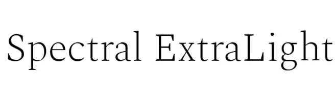
( Copyright 2017 The Spectral Project Authors (http://github.com/productiontype/spectral) )
A refined serif font with thin strokes and high contrast, exuding elegance.
 Herunterladen 1283 Downloads@WebFont
 -
( Demo font. To purchase the full version, you can order it online at www.schoolhousefonts.com )
A dotted line instructional font for handwriting practice with stroke guides.
![DmoZBPrintArrowDotLine Frei Schriftart Herunterladen]() Herunterladen 1283 Downloads@WebFont
Herunterladen 1283 Downloads@WebFont -
![AzoftSans-Bold Frei Schriftart Herunterladen]() Herunterladen 1283 Downloads@WebFont
Herunterladen 1283 Downloads@WebFont -
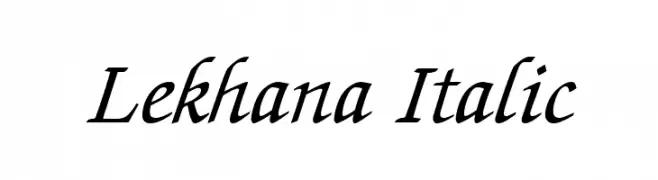
( Fonts by softerviews.org )
An elegant italic serif font with flowing lines and moderate contrast.
![Lekhana Italic Frei Schriftart Herunterladen]() Herunterladen 1283 Downloads@WebFont
Herunterladen 1283 Downloads@WebFont -
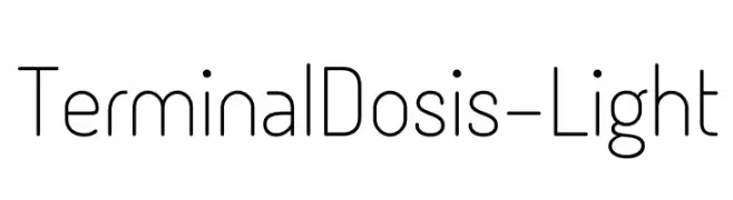
( Fonts by www.impallari.com )
A modern, geometric font with rounded edges and a light weight.
![TerminalDosis-Light Frei Schriftart Herunterladen]() Herunterladen 1283 Downloads@WebFont
Herunterladen 1283 Downloads@WebFont -
-
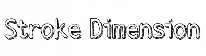
( Fonts by Mans Greback - www.mawns.com )
A playful, three-dimensional font with a hand-drawn, shadowed outline.
![Stroke Dimension Frei Schriftart Herunterladen]() Herunterladen 1283 Downloads@WebFont
Herunterladen 1283 Downloads@WebFont -
( Download for Personal Use. For Commercial: http://www.k-type.com )
A bold, playful font with dynamic and slightly irregular letterforms.
![Adventuring Frei Schriftart Herunterladen]() Herunterladen 1283 Downloads@WebFont
Herunterladen 1283 Downloads@WebFont -
![Elite Bold Frei Schriftart Herunterladen]() Herunterladen 1283 Downloads@WebFont
Herunterladen 1283 Downloads@WebFont -
![MB-Lords Of Evil Frei Schriftart Herunterladen]() Herunterladen 1283 Downloads@WebFont
Herunterladen 1283 Downloads@WebFont -
![Giraffe Frei Schriftart Herunterladen]() Herunterladen 1283 Downloads@WebFont
Herunterladen 1283 Downloads@WebFont -
( Fonts by or from www.graffitifonts.net )
A playful, bold outline font with a hand-drawn, cartoonish style.
![SkinnyCapKick Frei Schriftart Herunterladen]() Herunterladen 1283 Downloads@WebFont
Herunterladen 1283 Downloads@WebFont -
( Fonts by Situjuh Nazara - 7ntypes.com - Personal-use only. For commercial use please contact owner. )
A bold, rounded, and italic font with a playful and dynamic style.
![Robaga Rounded Black Italic Frei Schriftart Herunterladen]() Herunterladen 1282 Downloads@WebFont
Herunterladen 1282 Downloads@WebFont -
![ESPN Frei Schriftart Herunterladen]() Herunterladen 1282 Downloads@WebFont
Herunterladen 1282 Downloads@WebFont -
( Fonts by Castcraft Software - opti.netii.net - check the website before use )
A bold, classic serif font with strong, authoritative strokes.
![OPTIAdministerBoldAd Frei Schriftart Herunterladen]() Herunterladen 1282 Downloads@WebFont
Herunterladen 1282 Downloads@WebFont -
![VI Phong Lan Frei Schriftart Herunterladen]() Herunterladen 1282 Downloads@WebFont
Herunterladen 1282 Downloads@WebFont -
![Clearwerkkraftremix Frei Schriftart Herunterladen]() Herunterladen 1282 Downloads@WebFont
Herunterladen 1282 Downloads@WebFont -
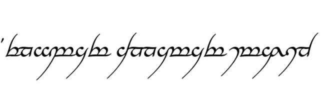
![Tengwar Annatar Italic Frei Schriftart Herunterladen]() Herunterladen 1282 Downloads@WebFont
Herunterladen 1282 Downloads@WebFont -
![208 Frei Schriftart Herunterladen]() Herunterladen 1282 Downloads@WebFont
Herunterladen 1282 Downloads@WebFont -
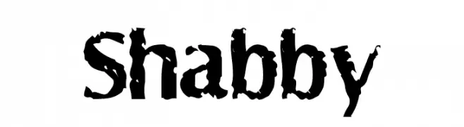
![Shabby Frei Schriftart Herunterladen]() Herunterladen 1282 Downloads@WebFont
Herunterladen 1282 Downloads@WebFont -
( Fonts by armenia.renderforest.com - Personal-use only. For commercial use please contact owner. )
A bold, modern sans-serif font with uniform stroke width and geometric design.
![Nortar-Bold Frei Schriftart Herunterladen]() Herunterladen 1281 Downloads@WebFont
Herunterladen 1281 Downloads@WebFont -
( Fonts by Alexa )
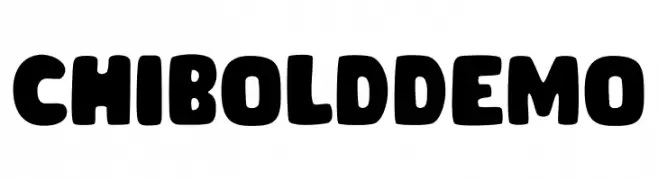
A bold, rounded font with a playful and friendly style.
![CHIBOLDdemo Frei Schriftart Herunterladen]() Herunterladen 1281 Downloads@WebFont
Herunterladen 1281 Downloads@WebFont -
( Noto is a trademark of Google Inc. Noto fonts are open source. All Noto fonts are published under the SIL Open Font License, Version 1.1 )
A bold, condensed serif typeface with a classic yet modern appeal.
![Noto Serif Condensed Bold Frei Schriftart Herunterladen]() Herunterladen 1281 Downloads@WebFont
Herunterladen 1281 Downloads@WebFont -
![Fear Factor Black Frei Schriftart Herunterladen]() Herunterladen 1281 Downloads@WebFont
Herunterladen 1281 Downloads@WebFont -
( Fonts by Bartek Nowak - www.nowak.tv/fontoholic/ )
A bold, condensed font with a modern and impactful style.
![Establo Frei Schriftart Herunterladen]() Herunterladen 1281 Downloads@WebFont
Herunterladen 1281 Downloads@WebFont -
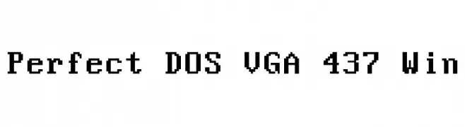
![Perfect DOS VGA 437 Win Frei Schriftart Herunterladen]() Herunterladen 1281 Downloads@WebFont
Herunterladen 1281 Downloads@WebFont -
( Fonts by www.blambot.com )
A playful, bold, handwritten-style font with thick, rounded strokes.
![SmackAttack BB Frei Schriftart Herunterladen]() Herunterladen 1281 Downloads@WebFont
Herunterladen 1281 Downloads@WebFont -
( Fonts by www.fugit-tempus.de )
An ornate blackletter font with sharp, angular lines and decorative flourishes.
![LaBrit Frei Schriftart Herunterladen]() Herunterladen 1281 Downloads@WebFont
Herunterladen 1281 Downloads@WebFont -
( Fonts by RaffaSyad Studio - www.creativefabrica.com/designer/r-studio/ - Personal-use only. For commercial use please contact owner. )
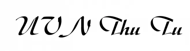
A sophisticated script font with elegant loops and swashes, perfect for decorative use.
![Angelita Frei Schriftart Herunterladen]() Herunterladen 1280 Downloads@WebFont
Herunterladen 1280 Downloads@WebFont -
![UVN Thu Tu Frei Schriftart Herunterladen]() Herunterladen 1280 Downloads@WebFont
Herunterladen 1280 Downloads@WebFont -
( Copyright 2016 The Asap Project Authors (omnibus.type@gmail.com) )
A modern, condensed sans-serif font with clean lines and excellent legibility.
![Asap Condensed VF Beta Regular Frei Schriftart Herunterladen]() Herunterladen 1280 Downloads@WebFont
Herunterladen 1280 Downloads@WebFont -
![Viafont Frei Schriftart Herunterladen]() Herunterladen 1280 Downloads@WebFont
Herunterladen 1280 Downloads@WebFont -
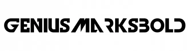
![GeniusMarksBold Frei Schriftart Herunterladen]() Herunterladen 1280 Downloads@WebFont
Herunterladen 1280 Downloads@WebFont -
![Mechanical Pencil Frei Schriftart Herunterladen]() Herunterladen 1280 Downloads@WebFont
Herunterladen 1280 Downloads@WebFont -
( Fonts by Dieter Steffmann )
An ornate Blackletter font with intricate details and a gothic aesthetic.
![KaiserzeitGotisch Frei Schriftart Herunterladen]() Herunterladen 1280 Downloads@WebFont
Herunterladen 1280 Downloads@WebFont -
![Mechanical works Frei Schriftart Herunterladen]() Herunterladen 1280 Downloads@WebFont
Herunterladen 1280 Downloads@WebFont


Welche Schriften sind gerade am populärsten?
Poppins, Roboto, Montserrat, Open Sans und Lato sind wegen ihrer klaren Formen und breiten Einsetzbarkeit sehr gefragt – von Markenauftritt über Landingpages bis hin zu Postern.
Welche Fonts eignen sich für Logos?
Geometrische Sans‑Serifs (z. B. Poppins, Familien im Gotham‑Stil) sind ein häufiger Griff für sauberes, skalierbares Branding. Für eine persönlichere Note bleiben Scripts und Handschrift‑Stile beliebt. Kombinieren Sie einen prägnanten Headline‑Font mit einer neutralen Brotschrift für Wiedererkennung und Harmonie.
Wie oft wird die Top‑Liste aktualisiert?
Regelmäßig – basierend auf realen Downloads und Interaktionen. Schauen Sie öfter vorbei, um aufstrebende Favoriten früh zu entdecken.
💡 Tipp: Seite bookmarken – Trends wechseln schnell, und heutige Top‑Schriften inspirieren morgen vielleicht das Rebranding.