Willkommen bei den Top‑Schriften – hier treffen Beliebtheit und Qualität aufeinander. Das sind die in diesem Jahr am häufigsten heruntergeladenen und genutzten Fonts. Wenn Sie sichere Optionen für Logo, Web oder Social suchen, starten Sie hier.
Jeder Top‑Font überzeugt durch Balance, Lesbarkeit und Vielseitigkeit. Sie finden moderne Sans‑Serifs, elegante Scripts, Vintage‑Serifs und minimalistische Displays.
-
 Herunterladen 1273 Downloads@WebFont
 -
( Fonts by Manfred Klein - manfred-klein.ina-mar.com )
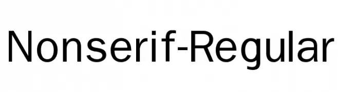
A clean, modern sans-serif typeface with balanced proportions and consistent stroke widths.
![Nonserif-Regular Frei Schriftart Herunterladen]() Herunterladen 1273 Downloads@WebFont
Herunterladen 1273 Downloads@WebFont -
( Fonts by ShyFonts )
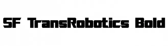
A bold, geometric font with a futuristic, robotic style.
![SF TransRobotics Bold Frei Schriftart Herunterladen]() Herunterladen 1273 Downloads@WebFont
Herunterladen 1273 Downloads@WebFont -
![Calligula Frei Schriftart Herunterladen]() Herunterladen 1273 Downloads@WebFont
Herunterladen 1273 Downloads@WebFont -
( Fonts by Utopiafonts )
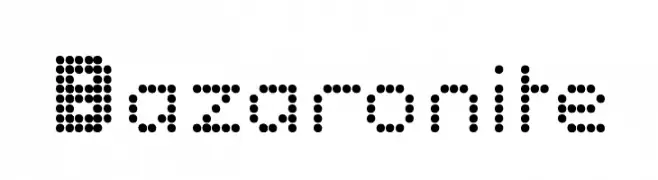
A dot matrix font with a futuristic, digital display style.
![Bazaronite Frei Schriftart Herunterladen]() Herunterladen 1273 Downloads@WebFont
Herunterladen 1273 Downloads@WebFont -
-
( Kyon - www.geocities.jp/zofykyon/ )
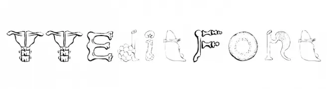
A decorative and whimsical font with intricate, playful designs in each character.
![TTEditFont Frei Schriftart Herunterladen]() Herunterladen 1272 Downloads@WebFont
Herunterladen 1272 Downloads@WebFont -
( Fonts by Luke Owens - Personal-use only. For commercial use please contact owner. )
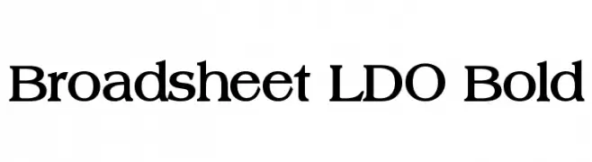
A bold serif font with classic styling and moderate stroke contrast.
![Broadsheet LDO Bold Frei Schriftart Herunterladen]() Herunterladen 1272 Downloads@WebFont
Herunterladen 1272 Downloads@WebFont -
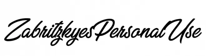
![Zabritzkyes Personal Use Frei Schriftart Herunterladen]() Herunterladen 1272 Downloads@WebFont
Herunterladen 1272 Downloads@WebFont -
( Fonts by Chris Vile - fontmonger.com - Personal-use only. For commercial use please contact owner. )
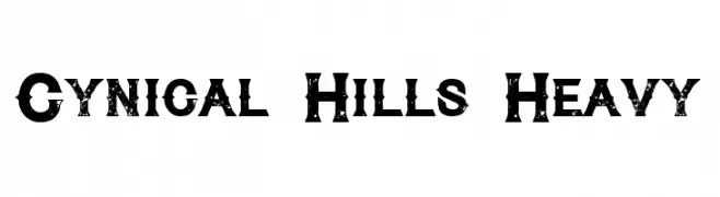
A bold, distressed font with a rugged, vintage appearance.
![Cynical Hills Heavy Frei Schriftart Herunterladen]() Herunterladen 1272 Downloads@WebFont
Herunterladen 1272 Downloads@WebFont -
( Copyright (c) 2015 Dan Reynolds. )
A clean, modern sans-serif font with a light weight and balanced proportions.
![Biryani Light Frei Schriftart Herunterladen]() Herunterladen 1272 Downloads@WebFont
Herunterladen 1272 Downloads@WebFont -
( Copyright (c) 2012 Andhrapradesh Society for Knowledge Networks (fonts.siliconandhra.org). )
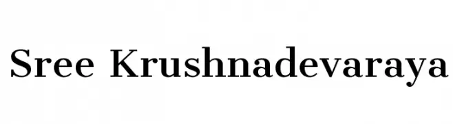
A classic serif font with elegant strokes and refined serifs.
![Sree Krushnadevaraya Frei Schriftart Herunterladen]() Herunterladen 1272 Downloads@WebFont
Herunterladen 1272 Downloads@WebFont -
( Fonts by Arkandis Digital Foundry )
A modern, geometric sans-serif font with excellent readability and balance.
![UniversalisADFStd-Regular Frei Schriftart Herunterladen]() Herunterladen 1272 Downloads@WebFont
Herunterladen 1272 Downloads@WebFont -
( Fonts by Rick Mueller )
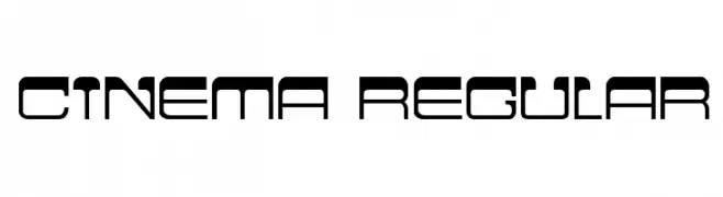
A futuristic, geometric font with clean lines and a modern aesthetic.
![Cinema Regular Frei Schriftart Herunterladen]() Herunterladen 1272 Downloads@WebFont
Herunterladen 1272 Downloads@WebFont -
![Communist Frei Schriftart Herunterladen]() Herunterladen 1272 Downloads@WebFont
Herunterladen 1272 Downloads@WebFont -
( Fonts by Jacob Fisher - www.pizzadude.dk )
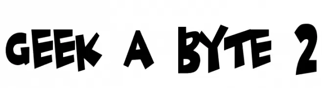
A bold, playful font with exaggerated, irregular shapes and a dynamic feel.
![Geek a byte 2 Frei Schriftart Herunterladen]() Herunterladen 1272 Downloads@WebFont
Herunterladen 1272 Downloads@WebFont -
( Fonts by The Scriptorium - Dave Nalle )
A modern, geometric sans-serif font with clean lines and uniform strokes.
![Onuava Frei Schriftart Herunterladen]() Herunterladen 1272 Downloads@WebFont
Herunterladen 1272 Downloads@WebFont -
( Fonts by Holydie Studio - Personal-use only. For commercial use please contact owner. )
A bold, flowing script font with elegant curves and connected characters.
![Bellynice Frei Schriftart Herunterladen]() Herunterladen 1271 Downloads@WebFont
Herunterladen 1271 Downloads@WebFont -
( aldedesign - Alde Saputro - creativemarket.com/aldedesign?u=aldedesign )
An elegant script font with flowing lines and high contrast, perfect for sophisticated designs.
![American Frei Schriftart Herunterladen]() Herunterladen 1271 Downloads@WebFont
Herunterladen 1271 Downloads@WebFont -
![Dsignes Light Frei Schriftart Herunterladen]() Herunterladen 1271 Downloads@WebFont
Herunterladen 1271 Downloads@WebFont -
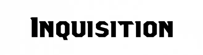
![Inquisition Frei Schriftart Herunterladen]() Herunterladen 1271 Downloads@WebFont
Herunterladen 1271 Downloads@WebFont -
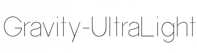
![Gravity-UltraLight Frei Schriftart Herunterladen]() Herunterladen 1271 Downloads@WebFont
Herunterladen 1271 Downloads@WebFont -
![Babylove Frei Schriftart Herunterladen]() Herunterladen 1271 Downloads@WebFont
Herunterladen 1271 Downloads@WebFont -
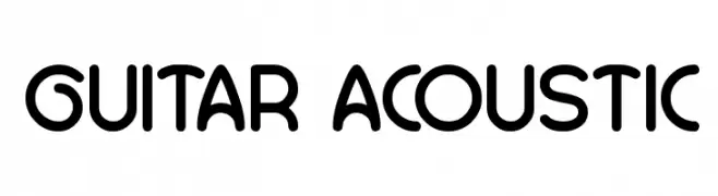
![GUITAR ACOUSTIC Frei Schriftart Herunterladen]() Herunterladen 1271 Downloads@WebFont
Herunterladen 1271 Downloads@WebFont -
![Slam Frei Schriftart Herunterladen]() Herunterladen 1271 Downloads@WebFont
Herunterladen 1271 Downloads@WebFont -
( Fonts by www.kimberlygeswein.com - Kimberly Geswein )
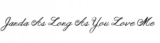
An elegant, cursive font with a sophisticated, handwritten style.
![Janda As Long As You Love Me Frei Schriftart Herunterladen]() Herunterladen 1271 Downloads@WebFont
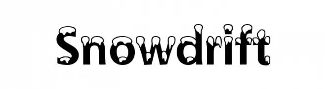
Herunterladen 1271 Downloads@WebFont -
![Snowdrift Frei Schriftart Herunterladen]() Herunterladen 1271 Downloads@WebFont
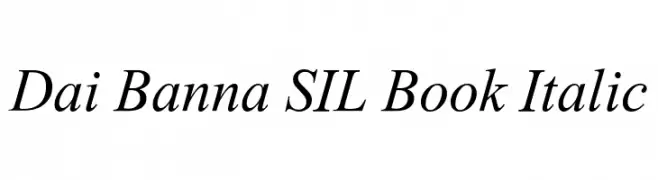
Herunterladen 1271 Downloads@WebFont -
![Dai Banna SIL Book Italic Frei Schriftart Herunterladen]() Herunterladen 1271 Downloads@WebFont
Herunterladen 1271 Downloads@WebFont -
( Fonts by Manfred Klein. Free for private and charity use. Free for commercial with donation to organizations )
A modern, geometric sans-serif font with a clean and sleek design.
![Artist Frei Schriftart Herunterladen]() Herunterladen 1271 Downloads
Herunterladen 1271 Downloads -
( Free for a personal use. For a commercial use please visit www.kevinandamanda.com )
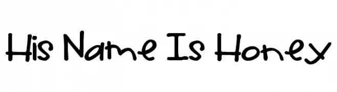
A playful handwritten font with a casual and friendly style.
![His Name Is Honey Frei Schriftart Herunterladen]() Herunterladen 1271 Downloads@WebFont
Herunterladen 1271 Downloads@WebFont -
( Fonts by Albertine Nerevan - albertinenerevan.blogspot.com )
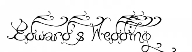
An ornate and decorative script font with elaborate swirls and flourishes.
![Edward's Wedding Frei Schriftart Herunterladen]() Herunterladen 1271 Downloads@WebFont
Herunterladen 1271 Downloads@WebFont -
![American Life Frei Schriftart Herunterladen]() Herunterladen 1271 Downloads@WebFont
Herunterladen 1271 Downloads@WebFont -
( Fonts by Nick Curtis - www.nicksfonts.com )
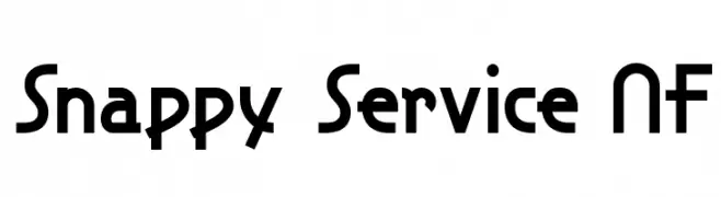
A bold, geometric font with a modern and dynamic style.
![Snappy Service NF Frei Schriftart Herunterladen]() Herunterladen 1271 Downloads@WebFont
Herunterladen 1271 Downloads@WebFont -
![Florante at Laura Italic Frei Schriftart Herunterladen]() Herunterladen 1271 Downloads@WebFont
Herunterladen 1271 Downloads@WebFont -
( Fonts by www.DigitalDreamDesign.net )
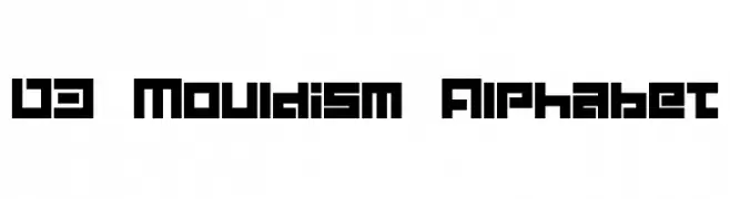
A bold, geometric font with a futuristic and digital aesthetic.
![D3 Mouldism Alphabet Frei Schriftart Herunterladen]() Herunterladen 1271 Downloads@WebFont
Herunterladen 1271 Downloads@WebFont -
![Vademecum Frei Schriftart Herunterladen]() Herunterladen 1271 Downloads@WebFont
Herunterladen 1271 Downloads@WebFont


Welche Schriften sind gerade am populärsten?
Poppins, Roboto, Montserrat, Open Sans und Lato sind wegen ihrer klaren Formen und breiten Einsetzbarkeit sehr gefragt – von Markenauftritt über Landingpages bis hin zu Postern.
Welche Fonts eignen sich für Logos?
Geometrische Sans‑Serifs (z. B. Poppins, Familien im Gotham‑Stil) sind ein häufiger Griff für sauberes, skalierbares Branding. Für eine persönlichere Note bleiben Scripts und Handschrift‑Stile beliebt. Kombinieren Sie einen prägnanten Headline‑Font mit einer neutralen Brotschrift für Wiedererkennung und Harmonie.
Wie oft wird die Top‑Liste aktualisiert?
Regelmäßig – basierend auf realen Downloads und Interaktionen. Schauen Sie öfter vorbei, um aufstrebende Favoriten früh zu entdecken.
💡 Tipp: Seite bookmarken – Trends wechseln schnell, und heutige Top‑Schriften inspirieren morgen vielleicht das Rebranding.