Willkommen bei den Top‑Schriften – hier treffen Beliebtheit und Qualität aufeinander. Das sind die in diesem Jahr am häufigsten heruntergeladenen und genutzten Fonts. Wenn Sie sichere Optionen für Logo, Web oder Social suchen, starten Sie hier.
Jeder Top‑Font überzeugt durch Balance, Lesbarkeit und Vielseitigkeit. Sie finden moderne Sans‑Serifs, elegante Scripts, Vintage‑Serifs und minimalistische Displays.
-
( Fonts by www.fontalicious.com )
A bold, decorative font with unique cut-out elements for a playful and edgy look.
 Herunterladen 339 Downloads@WebFont
 -
( Fonts by Apostrophic Lab )
A modern, rounded sans-serif font with clean lines and balanced spacing.
![Street Corner Upper Frei Schriftart Herunterladen]() Herunterladen 339 Downloads@WebFont
Herunterladen 339 Downloads@WebFont -
![Page Counter Flipper Frei Schriftart Herunterladen]() Herunterladen 339 Downloads@WebFont
Herunterladen 339 Downloads@WebFont -
( Fonts by Bumbayo Font Fabrik - bumbayo.blogspot.com )
A modern, narrow font with medium contrast and playful special characters.
![Matejino Frei Schriftart Herunterladen]() Herunterladen 339 Downloads@WebFont
Herunterladen 339 Downloads@WebFont -
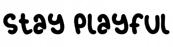
( Fonts by share font )
A playful, bold, and rounded font with a hand-drawn feel.
![Stay Playful Frei Schriftart Herunterladen]() Herunterladen 339 Downloads@WebFont
Herunterladen 339 Downloads@WebFont -
-
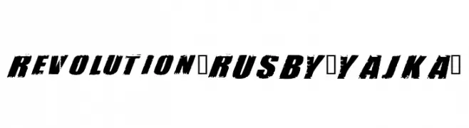
( Fonts by FONTS BY LYAJKA - Personal-use only. For commercial use please contact owner. )
A bold, distressed, and slanted font with a rugged, grunge aesthetic.
![Revolution(RUS BY LYAJKA) Frei Schriftart Herunterladen]() Herunterladen 339 Downloads@WebFont
Herunterladen 339 Downloads@WebFont -
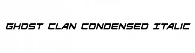
( Fonts by Daniel Zadorozny - www.iconian.com )
A dynamic, condensed italic font with a modern, sporty look.
![Ghost Clan Condensed Italic Frei Schriftart Herunterladen]() Herunterladen 339 Downloads@WebFont
Herunterladen 339 Downloads@WebFont -
( Fonts by Dieter Steffmann )
A bold, traditional blackletter font with a medieval aesthetic.
![Liturgisch Frei Schriftart Herunterladen]() Herunterladen 339 Downloads@WebFont
Herunterladen 339 Downloads@WebFont -
( Fonts by Manuel Ramos )
A sleek, elongated font with a modern, Art Deco-inspired style.
![Reason Frei Schriftart Herunterladen]() Herunterladen 339 Downloads@WebFont
Herunterladen 339 Downloads@WebFont -
![MajorL Frei Schriftart Herunterladen]() Herunterladen 339 Downloads@WebFont
Herunterladen 339 Downloads@WebFont


Welche Schriften sind gerade am populärsten?
Poppins, Roboto, Montserrat, Open Sans und Lato sind wegen ihrer klaren Formen und breiten Einsetzbarkeit sehr gefragt – von Markenauftritt über Landingpages bis hin zu Postern.
Welche Fonts eignen sich für Logos?
Geometrische Sans‑Serifs (z. B. Poppins, Familien im Gotham‑Stil) sind ein häufiger Griff für sauberes, skalierbares Branding. Für eine persönlichere Note bleiben Scripts und Handschrift‑Stile beliebt. Kombinieren Sie einen prägnanten Headline‑Font mit einer neutralen Brotschrift für Wiedererkennung und Harmonie.
Wie oft wird die Top‑Liste aktualisiert?
Regelmäßig – basierend auf realen Downloads und Interaktionen. Schauen Sie öfter vorbei, um aufstrebende Favoriten früh zu entdecken.
💡 Tipp: Seite bookmarken – Trends wechseln schnell, und heutige Top‑Schriften inspirieren morgen vielleicht das Rebranding.