Willkommen bei den Top‑Schriften – hier treffen Beliebtheit und Qualität aufeinander. Das sind die in diesem Jahr am häufigsten heruntergeladenen und genutzten Fonts. Wenn Sie sichere Optionen für Logo, Web oder Social suchen, starten Sie hier.
Jeder Top‑Font überzeugt durch Balance, Lesbarkeit und Vielseitigkeit. Sie finden moderne Sans‑Serifs, elegante Scripts, Vintage‑Serifs und minimalistische Displays.
-
 Herunterladen 338 Downloads@WebFont
 -
( Paul Lloyd Fonts )
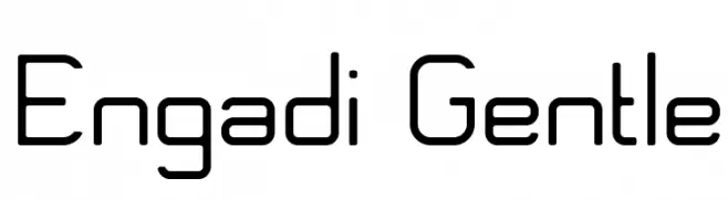
A sleek, modern italic font with smooth curves and consistent stroke width.
![NewStyle Italic Frei Schriftart Herunterladen]() Herunterladen 338 Downloads@WebFont
Herunterladen 338 Downloads@WebFont -
( Fonts by Shanaya Studio - Personal-use only. For commercial use please contact owner. )
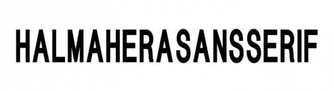
A bold, modern sans-serif font with clean lines and strong presence.
![HALMAHERA SANS SERIF Frei Schriftart Herunterladen]() Herunterladen 338 Downloads@WebFont
Herunterladen 338 Downloads@WebFont -
( Fonts by Daniel Zadorozny - www.iconian.com - Free for personal use )
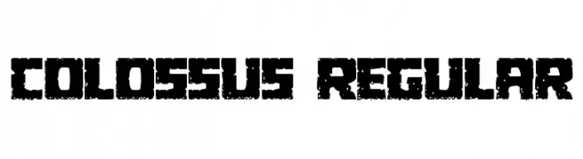
A bold, distressed font with a rugged, vintage look.
![Colossus Regular Frei Schriftart Herunterladen]() Herunterladen 338 Downloads@WebFont
Herunterladen 338 Downloads@WebFont -
( Fonts by Harold Lohner - www.haroldsfonts.com )
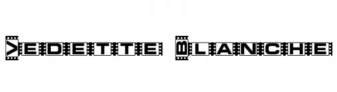
A bold, decorative font with a filmstrip border, ideal for vintage or cinematic themes.
![Vedette Blanche Frei Schriftart Herunterladen]() Herunterladen 338 Downloads@WebFont
Herunterladen 338 Downloads@WebFont -
-
![Satluj Italic Frei Schriftart Herunterladen]() Herunterladen 338 Downloads@WebFont
Herunterladen 338 Downloads@WebFont -
( Fonts by Sorkin Type Co )
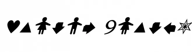
A bold, playful typeface with a slightly condensed and whimsical design.
![Wellfleet Frei Schriftart Herunterladen]() Herunterladen 338 Downloads@WebFont
Herunterladen 338 Downloads@WebFont -
![Pika Pika Frei Schriftart Herunterladen]() Herunterladen 338 Downloads@WebFont
Herunterladen 338 Downloads@WebFont -
( Fonts by JM Solé )
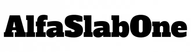
A bold, impactful slab serif font with thick, block-like serifs.
![Alfa Slab One Frei Schriftart Herunterladen]() Herunterladen 338 Downloads@WebFont
Herunterladen 338 Downloads@WebFont -
( Fonts by Apostrophic Lab )
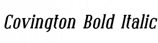
Bold, italicized serif font with a dynamic and elegant style.
![Covington Bold Italic Frei Schriftart Herunterladen]() Herunterladen 338 Downloads@WebFont
Herunterladen 338 Downloads@WebFont


Welche Schriften sind gerade am populärsten?
Poppins, Roboto, Montserrat, Open Sans und Lato sind wegen ihrer klaren Formen und breiten Einsetzbarkeit sehr gefragt – von Markenauftritt über Landingpages bis hin zu Postern.
Welche Fonts eignen sich für Logos?
Geometrische Sans‑Serifs (z. B. Poppins, Familien im Gotham‑Stil) sind ein häufiger Griff für sauberes, skalierbares Branding. Für eine persönlichere Note bleiben Scripts und Handschrift‑Stile beliebt. Kombinieren Sie einen prägnanten Headline‑Font mit einer neutralen Brotschrift für Wiedererkennung und Harmonie.
Wie oft wird die Top‑Liste aktualisiert?
Regelmäßig – basierend auf realen Downloads und Interaktionen. Schauen Sie öfter vorbei, um aufstrebende Favoriten früh zu entdecken.
💡 Tipp: Seite bookmarken – Trends wechseln schnell, und heutige Top‑Schriften inspirieren morgen vielleicht das Rebranding.