Willkommen bei den Top‑Schriften – hier treffen Beliebtheit und Qualität aufeinander. Das sind die in diesem Jahr am häufigsten heruntergeladenen und genutzten Fonts. Wenn Sie sichere Optionen für Logo, Web oder Social suchen, starten Sie hier.
Jeder Top‑Font überzeugt durch Balance, Lesbarkeit und Vielseitigkeit. Sie finden moderne Sans‑Serifs, elegante Scripts, Vintage‑Serifs und minimalistische Displays.
-
 Herunterladen 1255 Downloads@WebFont
 -
![Zero Frei Schriftart Herunterladen]() Herunterladen 1255 Downloads@WebFont
Herunterladen 1255 Downloads@WebFont -
( Fonts by Matthias Ribeaucourt )
A classic serif font with high contrast and elegant strokes.
![Kontor Display Frei Schriftart Herunterladen]() Herunterladen 1255 Downloads@WebFont
Herunterladen 1255 Downloads@WebFont -
( Fonts by Steeve Gruson )
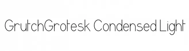
A clean, minimalist font with a condensed and light structure.
![GrutchGrotesk Condensed Light Frei Schriftart Herunterladen]() Herunterladen 1255 Downloads@WebFont
Herunterladen 1255 Downloads@WebFont -
( Paul Lloyd Fonts )
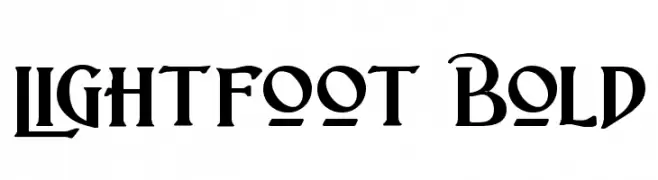
A bold, dynamic font with a medieval flair and unique serifs.
![Lightfoot Bold Frei Schriftart Herunterladen]() Herunterladen 1255 Downloads@WebFont
Herunterladen 1255 Downloads@WebFont -
-
( Fonts by Levi Halmos )
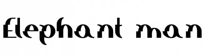
A bold, modern font with geometric and angular design elements.
![Elephant man Frei Schriftart Herunterladen]() Herunterladen 1255 Downloads@WebFont
Herunterladen 1255 Downloads@WebFont -
( Fonts by Chloe - clofont.free.fr - Personal-use only. For commercial use please contact owner. )
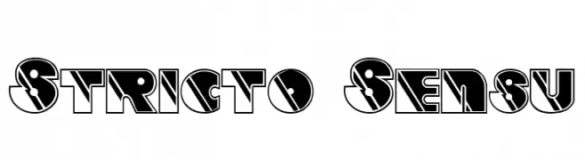
A bold, geometric font with high contrast and angular design.
![Stricto Sensu Frei Schriftart Herunterladen]() Herunterladen 1254 Downloads@WebFont
Herunterladen 1254 Downloads@WebFont -
( Fonts by Tyler Finck - Personal-use only. For commercial use please contact owner. )
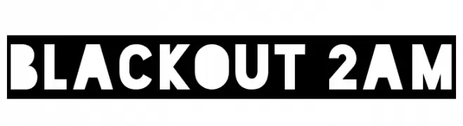
A bold, geometric font with a strong, industrial style.
![Blackout 2AM Frei Schriftart Herunterladen]() Herunterladen 1254 Downloads@WebFont
Herunterladen 1254 Downloads@WebFont -
( Zetafonts - www.zetafonts.com )
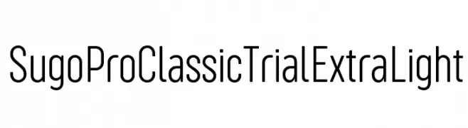
A sleek, modern font with clean lines and a minimalist aesthetic.
![Sugo Pro Classic Trial ExtraLight Frei Schriftart Herunterladen]() Herunterladen 1254 Downloads@WebFont
Herunterladen 1254 Downloads@WebFont -
( Copyright 2018 Boutros International. (http://www.boutrosfonts.com) )
A modern, clean sans-serif font with balanced proportions and excellent readability.
![Tajawal Frei Schriftart Herunterladen]() Herunterladen 1254 Downloads@WebFont
Herunterladen 1254 Downloads@WebFont -
Schriftart von spideraysfonts. For commercial use please contact the owner.
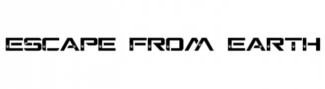
( ESCAPE FROM EARTH )
A bold, futuristic font with angular lines and decorative details.
![ESCAPE FROM EARTH Frei Schriftart Herunterladen]() Herunterladen 1254 Downloads@WebFont
Herunterladen 1254 Downloads@WebFont -
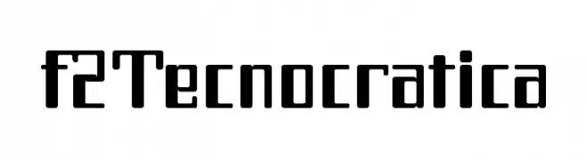
Schriftart von defharo. For commercial use please contact the owner.
![f2Tecnocratica Frei Schriftart Herunterladen]() Herunterladen 1254 Downloads@WebFont
Herunterladen 1254 Downloads@WebFont -
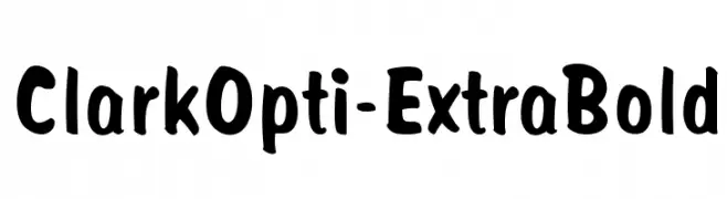
( Fonts by Castcraft Software - opti.netii.net - check the website before use )
A bold, playful font with rounded, hand-drawn strokes.
![ClarkOpti-ExtraBold Frei Schriftart Herunterladen]() Herunterladen 1254 Downloads@WebFont
Herunterladen 1254 Downloads@WebFont -
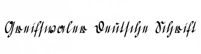
( Fonts by www.peter-wiegel.de. Personal-use only. For commercial use please contact owner. )
An ornate, historical script with intricate flourishes and a calligraphic style.
![Greifswaler Deutsche Schrift Frei Schriftart Herunterladen]() Herunterladen 1254 Downloads@WebFont
Herunterladen 1254 Downloads@WebFont -
![Flower Bold Frei Schriftart Herunterladen]() Herunterladen 1254 Downloads@WebFont
Herunterladen 1254 Downloads@WebFont -
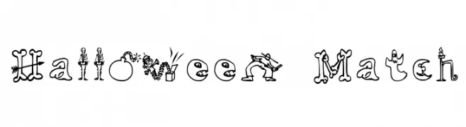
![Halloween Match Frei Schriftart Herunterladen]() Herunterladen 1254 Downloads@WebFont
Herunterladen 1254 Downloads@WebFont -
( Fonts by Jacob Fisher - www.pizzadude.dk )
A playful, bold font with exaggerated curves and whimsical style.
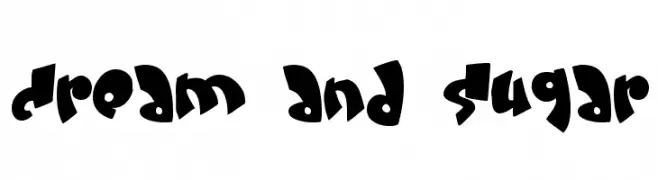
![Cream and sugar Frei Schriftart Herunterladen]() Herunterladen 1254 Downloads@WebFont
Herunterladen 1254 Downloads@WebFont -
( Fonts by Jacob Fisher - www.pizzadude.dk )
A playful, wavy font with a unique and quirky style.
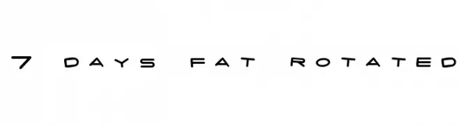
![7 days fat rotated Frei Schriftart Herunterladen]() Herunterladen 1254 Downloads@WebFont
Herunterladen 1254 Downloads@WebFont -
( Fonts by Georg Duffner - Personal-use only. For commercial use please contact owner. )
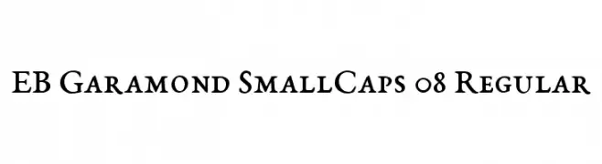
A classic serif font with small caps and moderate contrast, ideal for formal and traditional designs.
![EB Garamond SmallCaps 08 Regular Frei Schriftart Herunterladen]() Herunterladen 1253 Downloads@WebFont
Herunterladen 1253 Downloads@WebFont -
( Nght's Place - www.crosswinds.net/~nghtmvs/font/fonts1.html )
Bold, 3D block letters with shadow and hatching, offering a playful and decorative style.
![101! Block LetterZ Frei Schriftart Herunterladen]() Herunterladen 1253 Downloads@WebFont
Herunterladen 1253 Downloads@WebFont -
( Vladimir Nikolic - www.coroflot.com/vladimirnikolic )
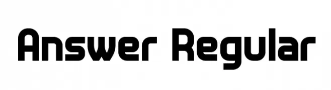
A bold, modern sans-serif font with clean lines and geometric shapes.
![Answer Regular Frei Schriftart Herunterladen]() Herunterladen 1253 Downloads@WebFont
Herunterladen 1253 Downloads@WebFont -
( Caveras - Cliff Modes - caveras.net )
A bold, geometric font with a pixelated, digital aesthetic.
![Jamboree Frei Schriftart Herunterladen]() Herunterladen 1253 Downloads@WebFont
Herunterladen 1253 Downloads@WebFont -
![DK Smiling Cat Frei Schriftart Herunterladen]() Herunterladen 1253 Downloads@WebFont
Herunterladen 1253 Downloads@WebFont -
![ClementePDai-Regular Frei Schriftart Herunterladen]() Herunterladen 1253 Downloads@WebFont
Herunterladen 1253 Downloads@WebFont -
![DejaVu Sans Mono Bold Frei Schriftart Herunterladen]() Herunterladen 1253 Downloads@WebFont
Herunterladen 1253 Downloads@WebFont -
( Fonts by softerviews.org )
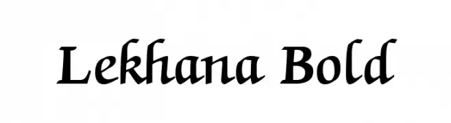
A bold, slightly italic serif font with dynamic and elegant characteristics.
![Lekhana Bold Frei Schriftart Herunterladen]() Herunterladen 1253 Downloads@WebFont
Herunterladen 1253 Downloads@WebFont -
( Fonts by ingoFonts. http://www.ingofonts.de )
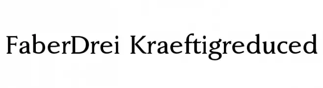
A classic serif font with elegant, slightly flared strokes and balanced proportions.
![FaberDrei-Kraeftigreduced Frei Schriftart Herunterladen]() Herunterladen 1253 Downloads@WebFont
Herunterladen 1253 Downloads@WebFont -
![AB Majik Frei Schriftart Herunterladen]() Herunterladen 1253 Downloads@WebFont
Herunterladen 1253 Downloads@WebFont -
![VTCKomixationSC Frei Schriftart Herunterladen]() Herunterladen 1253 Downloads@WebFont
Herunterladen 1253 Downloads@WebFont -
( Fonts by Flat-it )
A bold, rounded, and playful font with a chunky appearance.
![Pusab Frei Schriftart Herunterladen]() Herunterladen 1252 Downloads@WebFont
Herunterladen 1252 Downloads@WebFont -
( Fonts by Lafontype - Anugrah Pasau - Personal-use only. For commercial use please contact owner. )
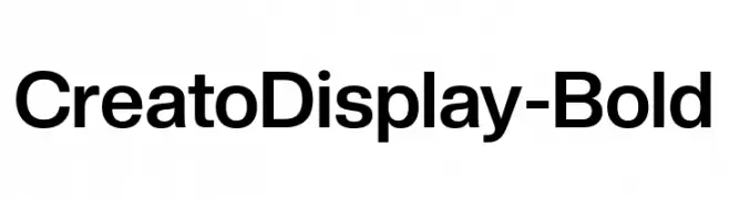
A bold, modern sans-serif font with clean lines and strong presence.
![CreatoDisplay-Bold Frei Schriftart Herunterladen]() Herunterladen 1252 Downloads@WebFont
Herunterladen 1252 Downloads@WebFont -
( Fonts by Taylor Wade )
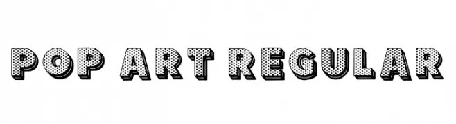
A bold, playful font with a pop art style and dotted pattern.
![Pop Art Regular Frei Schriftart Herunterladen]() Herunterladen 1252 Downloads@WebFont
Herunterladen 1252 Downloads@WebFont -
( Principal Studios )
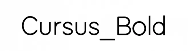
A modern sans-serif font with a geometric and balanced design.
![Cursus_Bold Frei Schriftart Herunterladen]() Herunterladen 1252 Downloads@WebFont
Herunterladen 1252 Downloads@WebFont -
![in blossom vintage Frei Schriftart Herunterladen]() Herunterladen 1252 Downloads@WebFont
Herunterladen 1252 Downloads@WebFont -
( Copyright 2016 The Saira Project Authors (omnibus.type@gmail.com), with reserved font name "Saira". )
Bold, semi-condensed font ideal for impactful headlines.
![Saira SemiCondensed Black Frei Schriftart Herunterladen]() Herunterladen 1252 Downloads@WebFont
Herunterladen 1252 Downloads@WebFont


Welche Schriften sind gerade am populärsten?
Poppins, Roboto, Montserrat, Open Sans und Lato sind wegen ihrer klaren Formen und breiten Einsetzbarkeit sehr gefragt – von Markenauftritt über Landingpages bis hin zu Postern.
Welche Fonts eignen sich für Logos?
Geometrische Sans‑Serifs (z. B. Poppins, Familien im Gotham‑Stil) sind ein häufiger Griff für sauberes, skalierbares Branding. Für eine persönlichere Note bleiben Scripts und Handschrift‑Stile beliebt. Kombinieren Sie einen prägnanten Headline‑Font mit einer neutralen Brotschrift für Wiedererkennung und Harmonie.
Wie oft wird die Top‑Liste aktualisiert?
Regelmäßig – basierend auf realen Downloads und Interaktionen. Schauen Sie öfter vorbei, um aufstrebende Favoriten früh zu entdecken.
💡 Tipp: Seite bookmarken – Trends wechseln schnell, und heutige Top‑Schriften inspirieren morgen vielleicht das Rebranding.