Willkommen bei den Top‑Schriften – hier treffen Beliebtheit und Qualität aufeinander. Das sind die in diesem Jahr am häufigsten heruntergeladenen und genutzten Fonts. Wenn Sie sichere Optionen für Logo, Web oder Social suchen, starten Sie hier.
Jeder Top‑Font überzeugt durch Balance, Lesbarkeit und Vielseitigkeit. Sie finden moderne Sans‑Serifs, elegante Scripts, Vintage‑Serifs und minimalistische Displays.
-
( www.k21.no )
A bold, modern font with clean lines and a strong presence.
 Herunterladen 330 Downloads@WebFont
 -
( Fonts by Apostrophic Lab )
A modern, ribbon-like font with smooth curves and flowing lines.
![Mechanihan Ribbon Frei Schriftart Herunterladen]() Herunterladen 330 Downloads@WebFont
Herunterladen 330 Downloads@WebFont -
![Even More Mixed Up 2 Frei Schriftart Herunterladen]() Herunterladen 330 Downloads@WebFont
Herunterladen 330 Downloads@WebFont -
( www.jsalisbury.com )
A bold, brush-textured font with a rugged, handcrafted appearance.
![Franc Gothique Brush Frei Schriftart Herunterladen]() Herunterladen 330 Downloads@WebFont
Herunterladen 330 Downloads@WebFont -
( Fonts by Woodcutter Manero - www.woodcutter.es - Personal-use only. For commercial use please contact owner. )
Bold, geometric battery icons with clear, modern styling.
![Battery Icons Frei Schriftart Herunterladen]() Herunterladen 330 Downloads@WebFont
Herunterladen 330 Downloads@WebFont -
-
( Fonts by Type Factory )
A bold, distressed font with a rugged, vintage feel.
![DEBUG FREE TRIAL Frei Schriftart Herunterladen]() Herunterladen 330 Downloads@WebFont
Herunterladen 330 Downloads@WebFont -
( - synergymedia.us/ )
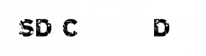
A bold, distressed font with a grunge texture and rugged appearance.
![SD Cammello Demo Frei Schriftart Herunterladen]() Herunterladen 330 Downloads@WebFont
Herunterladen 330 Downloads@WebFont -
( Fonts by Khurasan™ )
A playful, bold typeface with rounded, thick strokes and a whimsical, hand-drawn style.
![Simanja Frei Schriftart Herunterladen]() Herunterladen 330 Downloads@WebFont
Herunterladen 330 Downloads@WebFont -
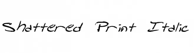
![Shattered Print Italic Frei Schriftart Herunterladen]() Herunterladen 330 Downloads@WebFont
Herunterladen 330 Downloads@WebFont -
( Fonts by Rodrigo German - RASDESIGN )
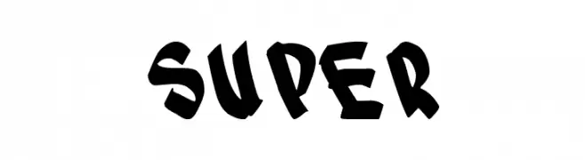
A bold, graffiti-inspired font with sharp, angular edges and dynamic style.
![SUPER Frei Schriftart Herunterladen]() Herunterladen 330 Downloads@WebFont
Herunterladen 330 Downloads@WebFont


Welche Schriften sind gerade am populärsten?
Poppins, Roboto, Montserrat, Open Sans und Lato sind wegen ihrer klaren Formen und breiten Einsetzbarkeit sehr gefragt – von Markenauftritt über Landingpages bis hin zu Postern.
Welche Fonts eignen sich für Logos?
Geometrische Sans‑Serifs (z. B. Poppins, Familien im Gotham‑Stil) sind ein häufiger Griff für sauberes, skalierbares Branding. Für eine persönlichere Note bleiben Scripts und Handschrift‑Stile beliebt. Kombinieren Sie einen prägnanten Headline‑Font mit einer neutralen Brotschrift für Wiedererkennung und Harmonie.
Wie oft wird die Top‑Liste aktualisiert?
Regelmäßig – basierend auf realen Downloads und Interaktionen. Schauen Sie öfter vorbei, um aufstrebende Favoriten früh zu entdecken.
💡 Tipp: Seite bookmarken – Trends wechseln schnell, und heutige Top‑Schriften inspirieren morgen vielleicht das Rebranding.