Willkommen bei den Top‑Schriften – hier treffen Beliebtheit und Qualität aufeinander. Das sind die in diesem Jahr am häufigsten heruntergeladenen und genutzten Fonts. Wenn Sie sichere Optionen für Logo, Web oder Social suchen, starten Sie hier.
Jeder Top‑Font überzeugt durch Balance, Lesbarkeit und Vielseitigkeit. Sie finden moderne Sans‑Serifs, elegante Scripts, Vintage‑Serifs und minimalistische Displays.
-
( Chequered Ink - chequered.ink/ )
A playful, handwritten font with bold, rounded strokes and a casual style.
 Herunterladen 330 Downloads@WebFont
 -
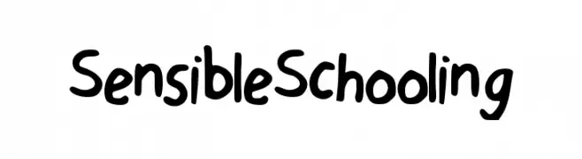
( Fonts by junkohanhero )
A bold, graffiti-inspired font with a hand-drawn, energetic style.
![2016 Bugs Frei Schriftart Herunterladen]() Herunterladen 330 Downloads@WebFont
Herunterladen 330 Downloads@WebFont -
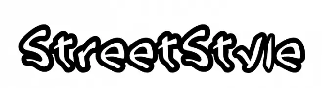
( www.woodcutter.es )
A bold, graffiti-inspired font with thick, rounded strokes and a playful urban style.
![Street Style Frei Schriftart Herunterladen]() Herunterladen 330 Downloads@WebFont
Herunterladen 330 Downloads@WebFont -
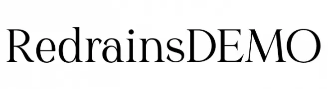
( Fonts by Saridezra - Personal-use only. For commercial use please contact owner. )
A classic serif font with high contrast and sharp serifs, offering elegance and readability.
![Redrains DEMO Frei Schriftart Herunterladen]() Herunterladen 330 Downloads@WebFont
Herunterladen 330 Downloads@WebFont -
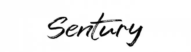
( Fonts by Syaf Rizal - www.creativefabrica.com/ref/53/ - Personal-use only. For commercial use please contact owner. )
A dynamic, brush-style font with expressive and fluid strokes.
![Sentury Frei Schriftart Herunterladen]() Herunterladen 330 Downloads@WebFont
Herunterladen 330 Downloads@WebFont -
-
![IronPipe Frei Schriftart Herunterladen]() Herunterladen 330 Downloads@WebFont
Herunterladen 330 Downloads@WebFont -
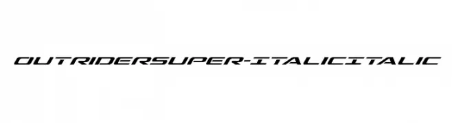
( Iconian Fonts - Daniel Zadorozny - www.iconian.com )
A sleek, italicized font with a futuristic and dynamic style.
![Outrider Super-Italic Italic Frei Schriftart Herunterladen]() Herunterladen 330 Downloads@WebFont
Herunterladen 330 Downloads@WebFont -
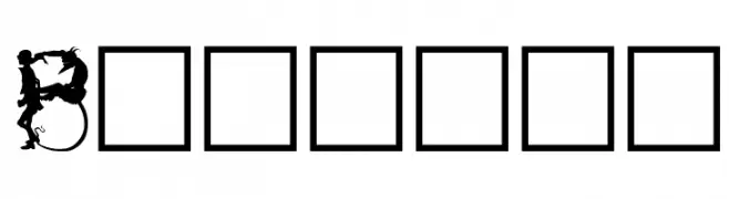
( Fonts by David Rakowski )
A decorative font with intricate, whimsical silhouettes in each letter.
![Bizarro Frei Schriftart Herunterladen]() Herunterladen 330 Downloads@WebFont
Herunterladen 330 Downloads@WebFont -
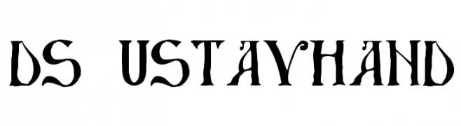
![DS UstavHand Frei Schriftart Herunterladen]() Herunterladen 330 Downloads@WebFont
Herunterladen 330 Downloads@WebFont -
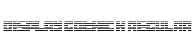
![Display Gothic K Regular Frei Schriftart Herunterladen]() Herunterladen 330 Downloads@WebFont
Herunterladen 330 Downloads@WebFont


Welche Schriften sind gerade am populärsten?
Poppins, Roboto, Montserrat, Open Sans und Lato sind wegen ihrer klaren Formen und breiten Einsetzbarkeit sehr gefragt – von Markenauftritt über Landingpages bis hin zu Postern.
Welche Fonts eignen sich für Logos?
Geometrische Sans‑Serifs (z. B. Poppins, Familien im Gotham‑Stil) sind ein häufiger Griff für sauberes, skalierbares Branding. Für eine persönlichere Note bleiben Scripts und Handschrift‑Stile beliebt. Kombinieren Sie einen prägnanten Headline‑Font mit einer neutralen Brotschrift für Wiedererkennung und Harmonie.
Wie oft wird die Top‑Liste aktualisiert?
Regelmäßig – basierend auf realen Downloads und Interaktionen. Schauen Sie öfter vorbei, um aufstrebende Favoriten früh zu entdecken.
💡 Tipp: Seite bookmarken – Trends wechseln schnell, und heutige Top‑Schriften inspirieren morgen vielleicht das Rebranding.