Willkommen bei den Top‑Schriften – hier treffen Beliebtheit und Qualität aufeinander. Das sind die in diesem Jahr am häufigsten heruntergeladenen und genutzten Fonts. Wenn Sie sichere Optionen für Logo, Web oder Social suchen, starten Sie hier.
Jeder Top‑Font überzeugt durch Balance, Lesbarkeit und Vielseitigkeit. Sie finden moderne Sans‑Serifs, elegante Scripts, Vintage‑Serifs und minimalistische Displays.
-
( Fonts by Wojciech Kalinowski "wmk69" (wmk69@o2.pl) - Personal-use only. For commercial use please contact owner. )
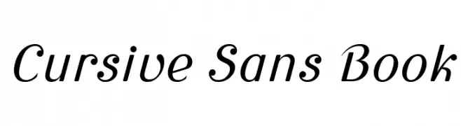
A cursive-inspired sans-serif font with elegant, slanted characters.
 Herunterladen 322 Downloads@WebFont
 -
( Fonts by Kreative Korporation - www.kreativekorp.com )
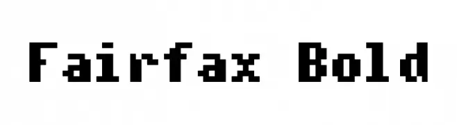
A bold, pixelated font with a retro digital aesthetic.
![Fairfax Bold Frei Schriftart Herunterladen]() Herunterladen 322 Downloads@WebFont
Herunterladen 322 Downloads@WebFont -
![iCiel Altus Frei Schriftart Herunterladen]() Herunterladen 322 Downloads@WebFont
Herunterladen 322 Downloads@WebFont -
( Fonts by www.peter-wiegel.de. Personal-use only. For commercial use please contact owner. )
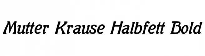
A bold, slightly italicized serif font with smooth curves and elegant serifs.
![Mutter Krause Halbfett Bold Frei Schriftart Herunterladen]() Herunterladen 322 Downloads@WebFont
Herunterladen 322 Downloads@WebFont -
![Hoshi Font Frei Schriftart Herunterladen]() Herunterladen 322 Downloads@WebFont
Herunterladen 322 Downloads@WebFont -
-
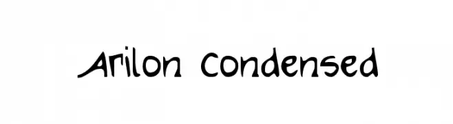
( Fonts by Daniel Zadorozny - www.iconian.com - Free for personal use )
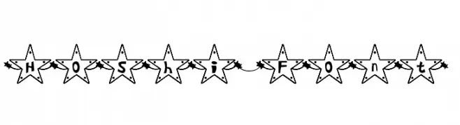
A playful, hand-drawn font with varied stroke thickness and a whimsical style.
![Arilon Condensed Frei Schriftart Herunterladen]() Herunterladen 322 Downloads@WebFont
Herunterladen 322 Downloads@WebFont -
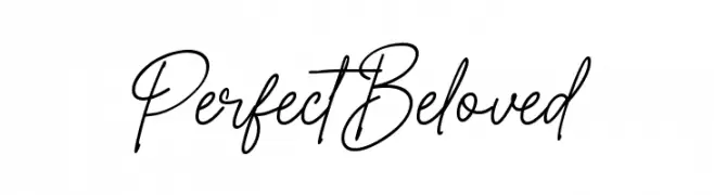
( Fonts by Creavibes Design - Personal-use only. For commercial use please contact owner. )
A cursive script font with elegant, flowing strokes and a handwritten appearance.
![Perfect Beloved Frei Schriftart Herunterladen]() Herunterladen 322 Downloads@WebFont
Herunterladen 322 Downloads@WebFont -
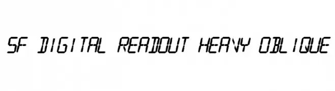
![SF Digital Readout Heavy Oblique Frei Schriftart Herunterladen]() Herunterladen 322 Downloads@WebFont
Herunterladen 322 Downloads@WebFont -
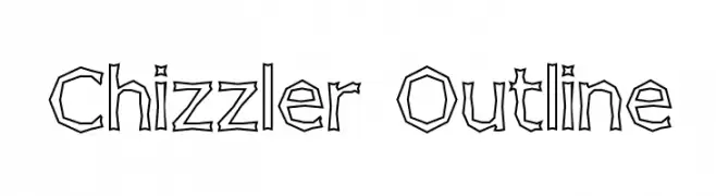
( Fonts by Graham Meade - GemFonts )
A chiseled, outline font with a rugged, artistic style.
![Chizzler Outline Frei Schriftart Herunterladen]() Herunterladen 322 Downloads@WebFont
Herunterladen 322 Downloads@WebFont -
![Zapper Frei Schriftart Herunterladen]() Herunterladen 322 Downloads@WebFont
Herunterladen 322 Downloads@WebFont


Welche Schriften sind gerade am populärsten?
Poppins, Roboto, Montserrat, Open Sans und Lato sind wegen ihrer klaren Formen und breiten Einsetzbarkeit sehr gefragt – von Markenauftritt über Landingpages bis hin zu Postern.
Welche Fonts eignen sich für Logos?
Geometrische Sans‑Serifs (z. B. Poppins, Familien im Gotham‑Stil) sind ein häufiger Griff für sauberes, skalierbares Branding. Für eine persönlichere Note bleiben Scripts und Handschrift‑Stile beliebt. Kombinieren Sie einen prägnanten Headline‑Font mit einer neutralen Brotschrift für Wiedererkennung und Harmonie.
Wie oft wird die Top‑Liste aktualisiert?
Regelmäßig – basierend auf realen Downloads und Interaktionen. Schauen Sie öfter vorbei, um aufstrebende Favoriten früh zu entdecken.
💡 Tipp: Seite bookmarken – Trends wechseln schnell, und heutige Top‑Schriften inspirieren morgen vielleicht das Rebranding.