Willkommen bei den Top‑Schriften – hier treffen Beliebtheit und Qualität aufeinander. Das sind die in diesem Jahr am häufigsten heruntergeladenen und genutzten Fonts. Wenn Sie sichere Optionen für Logo, Web oder Social suchen, starten Sie hier.
Jeder Top‑Font überzeugt durch Balance, Lesbarkeit und Vielseitigkeit. Sie finden moderne Sans‑Serifs, elegante Scripts, Vintage‑Serifs und minimalistische Displays.
-
 Herunterladen 1191 Downloads@WebFont
 -
( Fonts by typedepot - Personal-use only. For commercial use please contact owner. )
A modern, rounded sans-serif font with excellent readability.
![Ossem Rough Frei Schriftart Herunterladen]() Herunterladen 1190 Downloads@WebFont
Herunterladen 1190 Downloads@WebFont -
( Fonts by www.behance.net/typeog - Personal-use only. For commercial use please contact owner. )
A modern sans-serif font with a semi-bold weight, ideal for clarity and versatility.
![Ginora Sans Semi Bold Frei Schriftart Herunterladen]() Herunterladen 1190 Downloads@WebFont
Herunterladen 1190 Downloads@WebFont -
![Kingsmen Frei Schriftart Herunterladen]() Herunterladen 1190 Downloads@WebFont
Herunterladen 1190 Downloads@WebFont -
Schriftart von GillianMcDermott. For commercial use please contact the owner.
![GillianMcDermott Frei Schriftart Herunterladen]() Herunterladen 1190 Downloads@WebFont
Herunterladen 1190 Downloads@WebFont -
-
( Fonts by Darrell Flood )
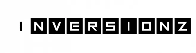
A bold, geometric font with a futuristic, digital aesthetic.
![Inversionz Frei Schriftart Herunterladen]() Herunterladen 1190 Downloads@WebFont
Herunterladen 1190 Downloads@WebFont -
( گالری فانت فارسی پژوهش آريانا - only compatible with Farsi and Arabic )
An artistic and expressive font with calligraphic elements.
![Karim Frei Schriftart Herunterladen]() Herunterladen 1190 Downloads@WebFont
Herunterladen 1190 Downloads@WebFont -
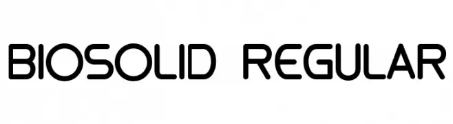
![biosolid Regular Frei Schriftart Herunterladen]() Herunterladen 1190 Downloads@WebFont
Herunterladen 1190 Downloads@WebFont -
( Fonts by backpacker.gr )
A bold, italic font with rounded edges and a friendly, modern style.
![BPreplay-BoldItalic Frei Schriftart Herunterladen]() Herunterladen 1190 Downloads@WebFont
Herunterladen 1190 Downloads@WebFont -
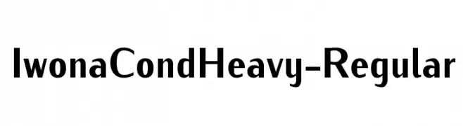
![IwonaCondHeavy-Regular Frei Schriftart Herunterladen]() Herunterladen 1190 Downloads@WebFont
Herunterladen 1190 Downloads@WebFont -
![Turn W Bold Italic Frei Schriftart Herunterladen]() Herunterladen 1190 Downloads@WebFont
Herunterladen 1190 Downloads@WebFont -
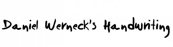
( Fonts by Daniel Werneck )
A bold, expressive handwritten font with a casual, personal style.
![Daniel Werneck's Handwriting Frei Schriftart Herunterladen]() Herunterladen 1190 Downloads@WebFont
Herunterladen 1190 Downloads@WebFont -
![VA Pe 2 Frei Schriftart Herunterladen]() Herunterladen 1190 Downloads@WebFont
Herunterladen 1190 Downloads@WebFont -
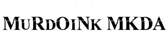
![MuRdOiNk MKDA Frei Schriftart Herunterladen]() Herunterladen 1190 Downloads@WebFont
Herunterladen 1190 Downloads@WebFont -
( Fonts by Jonathan S. Harris )
A bold, playful font with a bubbly, organic design.
![Color Me Purple Frei Schriftart Herunterladen]() Herunterladen 1189 Downloads@WebFont
Herunterladen 1189 Downloads@WebFont -
( Fonts by Daniel Gauthier )
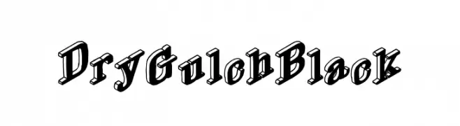
A bold, three-dimensional font with a vintage, western-inspired style.
![DryGulchBlack Frei Schriftart Herunterladen]() Herunterladen 1189 Downloads@WebFont
Herunterladen 1189 Downloads@WebFont -
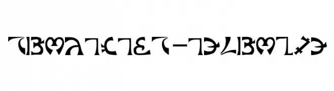
![Schuelers-Enochian Frei Schriftart Herunterladen]() Herunterladen 1189 Downloads@WebFont
Herunterladen 1189 Downloads@WebFont -
( Fonts by weknow - Wino S Kadir )
A whimsical, decorative font with intricate swirls and flourishes, perfect for fantasy themes.
![Once Upon a Time Frei Schriftart Herunterladen]() Herunterladen 1189 Downloads@WebFont
Herunterladen 1189 Downloads@WebFont -
( Fonts by Khurasan )
A bold, dynamic script font with a handwritten feel.
![Pakades Frei Schriftart Herunterladen]() Herunterladen 1188 Downloads@WebFont
Herunterladen 1188 Downloads@WebFont -
( Cooldesignlab - Kurniadi Saputra - creativemarket.com/cooldesignlab?u=cooldesignlab )
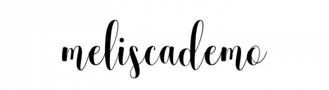
An elegant and flowing script font with decorative swashes and high contrast.
![meliscademo Frei Schriftart Herunterladen]() Herunterladen 1188 Downloads@WebFont
Herunterladen 1188 Downloads@WebFont -
( Copyright 2016 The Jura Font Project Authors (daniel@danieljohnson.name) )
A sleek, modern font with a geometric and minimalistic design.
![Jura Light Frei Schriftart Herunterladen]() Herunterladen 1188 Downloads@WebFont
Herunterladen 1188 Downloads@WebFont -
![Ugly Face Frei Schriftart Herunterladen]() Herunterladen 1188 Downloads@WebFont
Herunterladen 1188 Downloads@WebFont -
![hooge 05_55 Cyr2 Frei Schriftart Herunterladen]() Herunterladen 1188 Downloads@WebFont
Herunterladen 1188 Downloads@WebFont -
( Fonts by Apostrophic Lab )
A sleek, modern font with thin, elongated letterforms and a geometric structure.
![Asenine Thin Frei Schriftart Herunterladen]() Herunterladen 1188 Downloads@WebFont
Herunterladen 1188 Downloads@WebFont -
( Fonts by allsuperfont.com - Personal-use only. For commercial use please contact owner. )
A bold, playful font with exaggerated curves and a whimsical style.
![Super Positive Frei Schriftart Herunterladen]() Herunterladen 1187 Downloads@WebFont
Herunterladen 1187 Downloads@WebFont -
( Fonts by Fonts by Alex Slobzheninov & Chris M. Simpson / Changes by Cristiano Sobral - Personal-use only. For commercial use please contact owner. )
A bold, modern typeface with strong geometric shapes and uniform strokes.
![Metropolitano Black Frei Schriftart Herunterladen]() Herunterladen 1187 Downloads@WebFont
Herunterladen 1187 Downloads@WebFont -
( Fonts by MadeType - Personal-use only. For commercial use please contact owner. )
A bold, modern typeface with clean, geometric lines and excellent readability.
![MADEOuterSansAlt-Medium Frei Schriftart Herunterladen]() Herunterladen 1187 Downloads@WebFont
Herunterladen 1187 Downloads@WebFont -
( Copyright (c) 2015 Ek Type (www.ektype.in) )
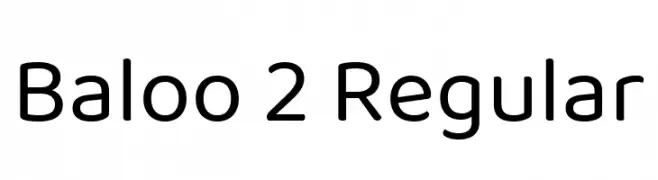
A playful, rounded, and modern sans-serif font with smooth curves.
![Baloo 2 Regular Frei Schriftart Herunterladen]() Herunterladen 1187 Downloads@WebFont
Herunterladen 1187 Downloads@WebFont -
( Copyright 2017 The EB Garamond Project Authors (https://github.com/octaviopardo/EBGaramond12) )
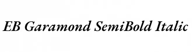
A classic serif font with a semi-bold weight and elegant italic style.
![EB Garamond SemiBold Italic Frei Schriftart Herunterladen]() Herunterladen 1187 Downloads@WebFont
Herunterladen 1187 Downloads@WebFont -
( Copyright 2012 The Encode Project Authors (impallari@gmail.com), with Reserved Font Name "Encode Sansâ€. )
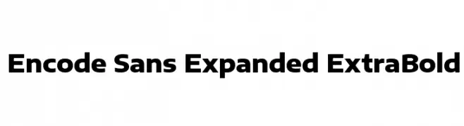
A bold, expanded sans-serif font with a modern and impactful design.
![Encode Sans Expanded ExtraBold Frei Schriftart Herunterladen]() Herunterladen 1187 Downloads@WebFont
Herunterladen 1187 Downloads@WebFont -
( Fonts by Carrot Rope - typewhatyouloveandletitkillyou.tumblr.com. Personal-use only. For commercial use please contact owner. )
A modern, minimalist font with thin, uniform strokes and a sleek design.
![Lugina FP Light Frei Schriftart Herunterladen]() Herunterladen 1187 Downloads@WebFont
Herunterladen 1187 Downloads@WebFont -
( Fonts by Arkandis Digital Foundry )
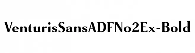
A bold serif font with high contrast and a modern classic style.
![VenturisSansADFNo2Ex-Bold Frei Schriftart Herunterladen]() Herunterladen 1187 Downloads@WebFont
Herunterladen 1187 Downloads@WebFont -
( Fonts by Apostrophic Lab )
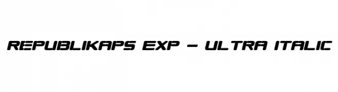
A bold, italicized font with a modern, dynamic style and rounded edges.
![Republikaps Exp - Ultra Italic Frei Schriftart Herunterladen]() Herunterladen 1187 Downloads@WebFont
Herunterladen 1187 Downloads@WebFont -
( SDFonts. http://www.angelfire.com/scifi2/sdfonts/index.html )
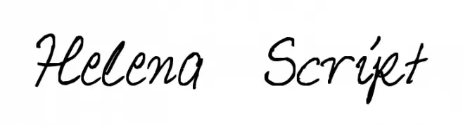
A fluid, cursive script font with elegant, flowing lines and a sophisticated style.
![Helena Script Frei Schriftart Herunterladen]() Herunterladen 1187 Downloads@WebFont
Herunterladen 1187 Downloads@WebFont -
( Fonts by a Clement Nicolle - www.stereo-type.fr . Personal-use only. For commercial use please contact owner. )
A bold, distressed blackletter-style font with a vintage, grunge aesthetic.
![Frakturika Frei Schriftart Herunterladen]() Herunterladen 1187 Downloads@WebFont
Herunterladen 1187 Downloads@WebFont


Welche Schriften sind gerade am populärsten?
Poppins, Roboto, Montserrat, Open Sans und Lato sind wegen ihrer klaren Formen und breiten Einsetzbarkeit sehr gefragt – von Markenauftritt über Landingpages bis hin zu Postern.
Welche Fonts eignen sich für Logos?
Geometrische Sans‑Serifs (z. B. Poppins, Familien im Gotham‑Stil) sind ein häufiger Griff für sauberes, skalierbares Branding. Für eine persönlichere Note bleiben Scripts und Handschrift‑Stile beliebt. Kombinieren Sie einen prägnanten Headline‑Font mit einer neutralen Brotschrift für Wiedererkennung und Harmonie.
Wie oft wird die Top‑Liste aktualisiert?
Regelmäßig – basierend auf realen Downloads und Interaktionen. Schauen Sie öfter vorbei, um aufstrebende Favoriten früh zu entdecken.
💡 Tipp: Seite bookmarken – Trends wechseln schnell, und heutige Top‑Schriften inspirieren morgen vielleicht das Rebranding.