Willkommen bei den Top‑Schriften – hier treffen Beliebtheit und Qualität aufeinander. Das sind die in diesem Jahr am häufigsten heruntergeladenen und genutzten Fonts. Wenn Sie sichere Optionen für Logo, Web oder Social suchen, starten Sie hier.
Jeder Top‑Font überzeugt durch Balance, Lesbarkeit und Vielseitigkeit. Sie finden moderne Sans‑Serifs, elegante Scripts, Vintage‑Serifs und minimalistische Displays.
-
( Fonts by Astigmatic One Eye Typographic Institute - Brian J. Bonislawsky - astigmatic.com )
A bold, spiky font with sharp, jagged edges for a striking visual impact.
 Herunterladen 1182 Downloads@WebFont
 -
![maran orthodox church Frei Schriftart Herunterladen]() Herunterladen 1182 Downloads@WebFont
Herunterladen 1182 Downloads@WebFont -
( Fonts by Tokopress )
A bold, hand-drawn font with a playful and impactful style.
![FOREJUMP Frei Schriftart Herunterladen]() Herunterladen 1181 Downloads@WebFont
Herunterladen 1181 Downloads@WebFont -
( Fonts by Graphix Line Studio )
A playful, bold font with rounded edges and a hand-drawn feel.
![Brianna Frei Schriftart Herunterladen]() Herunterladen 1181 Downloads@WebFont
Herunterladen 1181 Downloads@WebFont -
( Fonts by Woodcutter )
A bold, decorative font with a checkered pattern filling each character.
![Pandora Frei Schriftart Herunterladen]() Herunterladen 1181 Downloads@WebFont
Herunterladen 1181 Downloads@WebFont -
-
( Fonts by Hanken Design Co. - Personal-use only. For commercial use please contact owner. )
A clean, modern sans-serif typeface with uniform stroke width.
![HK Grotesk Light Legacy Frei Schriftart Herunterladen]() Herunterladen 1181 Downloads@WebFont
Herunterladen 1181 Downloads@WebFont -
![Southampton Frei Schriftart Herunterladen]() Herunterladen 1181 Downloads@WebFont
Herunterladen 1181 Downloads@WebFont -
( Fonts by Daniel Zadorozny - www.iconian.com )
A bold, expanded italic font with a modern and dynamic style.
![Oceanic Drift Expanded Italic Frei Schriftart Herunterladen]() Herunterladen 1181 Downloads@WebFont
Herunterladen 1181 Downloads@WebFont -
( Fonts by www.dcoxy.com )
A bold, playful handwritten font with rounded strokes and lively character.
![Rabbit Hole Frei Schriftart Herunterladen]() Herunterladen 1181 Downloads@WebFont
Herunterladen 1181 Downloads@WebFont -
( Fonts by Apostrophic Lab )
A modern, rounded sans-serif font with smooth curves and uniform stroke width.
![Street Upper SemiBold Frei Schriftart Herunterladen]() Herunterladen 1181 Downloads@WebFont
Herunterladen 1181 Downloads@WebFont -
( - www.vnbc.fr )
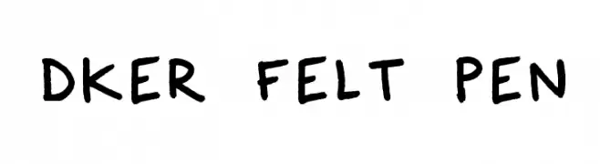
A playful, handwritten-style font with bold, rounded characters.
![Dker Felt Pen Frei Schriftart Herunterladen]() Herunterladen 1181 Downloads@WebFont
Herunterladen 1181 Downloads@WebFont -
( Fonts by www.stereo-type.net )
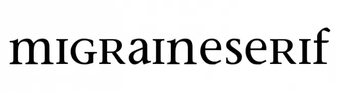
A classic serif font with elegant curves and sharp serifs, perfect for traditional designs.
![MigraineSerif Frei Schriftart Herunterladen]() Herunterladen 1181 Downloads@WebFont
Herunterladen 1181 Downloads@WebFont -
( Fonts by Rick Mueller )
An elegant script font with fluid, natural handwriting style.
![Verona Script Frei Schriftart Herunterladen]() Herunterladen 1181 Downloads@WebFont
Herunterladen 1181 Downloads@WebFont -
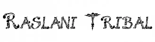
![Raslani Tribal Frei Schriftart Herunterladen]() Herunterladen 1181 Downloads@WebFont
Herunterladen 1181 Downloads@WebFont -
( Fonts by Tup Wanders - www.tupwanders.nl )
A bold, rugged font with a hand-carved, textured appearance.
![Blok Heavy Frei Schriftart Herunterladen]() Herunterladen 1181 Downloads@WebFont
Herunterladen 1181 Downloads@WebFont -
( Fonts by Dieter Steffmann )
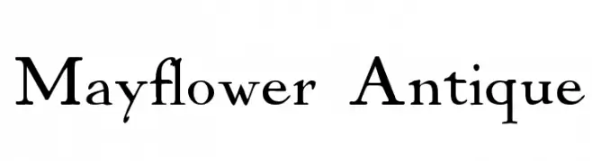
A classic serif font with elegant, sharp serifs and a timeless appeal.
![Mayflower Antique Frei Schriftart Herunterladen]() Herunterladen 1181 Downloads@WebFont
Herunterladen 1181 Downloads@WebFont -
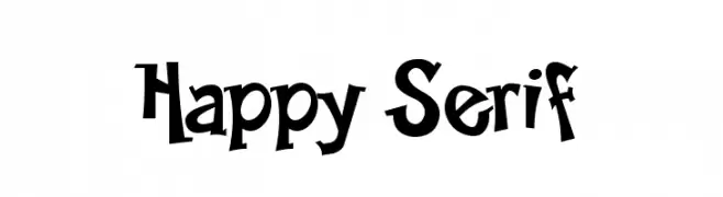
![Happy Serif Frei Schriftart Herunterladen]() Herunterladen 1181 Downloads@WebFont
Herunterladen 1181 Downloads@WebFont -
( Fonts by Levi Halmos )
A bold, italicized font with a modern, dynamic style and strong geometric shapes.
![Mathmos Original Italic Frei Schriftart Herunterladen]() Herunterladen 1181 Downloads@WebFont
Herunterladen 1181 Downloads@WebFont -
( Fonts by ShyFonts )
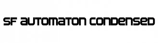
A bold, condensed font with a futuristic, geometric design.
![SF Automaton Condensed Frei Schriftart Herunterladen]() Herunterladen 1181 Downloads@WebFont
Herunterladen 1181 Downloads@WebFont -
Schriftart von glyphstyle. For commercial use please contact the owner.
( NOTE: This demo font is for PERSONAL USE ONLY! But any donation are very appreciated. Paypal account for donation : https://www.paypal.me/dimasardhi full version: https://www.glyphstyle.net/cream-cheese/ contact us at styleglyph@gmail.com And follow m )
A bold, playful font with a wavy, whimsical style.
![Cream Cheese Demo Frei Schriftart Herunterladen]() Herunterladen 1180 Downloads@WebFont
Herunterladen 1180 Downloads@WebFont -
( Fonts by Fonts by Alex Slobzheninov & Chris M. Simpson / Changes by Cristiano Sobral - Personal-use only. For commercial use please contact owner. )
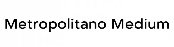
A modern sans-serif font with geometric shapes and balanced proportions.
![Metropolitano Medium Frei Schriftart Herunterladen]() Herunterladen 1180 Downloads@WebFont
Herunterladen 1180 Downloads@WebFont -
( Fonts by Hector Gatti & Omnibus-Type (original fonts) / Cristiano Sobral (main changes and remastering) - Personal-use only. For commercial use please contact owner. )
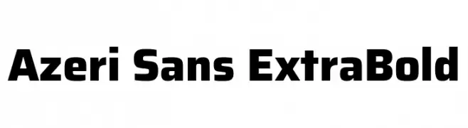
A bold, modern typeface with thick strokes and a slightly condensed style.
![Azeri Sans ExtraBold Frei Schriftart Herunterladen]() Herunterladen 1180 Downloads@WebFont
Herunterladen 1180 Downloads@WebFont -
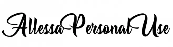
( Fonts by Billy Argel - Personal-use only. For commercial use please contact owner. )
An elegant, flowing script font with ornate, cursive letterforms.
![Allessa Personal Use Frei Schriftart Herunterladen]() Herunterladen 1180 Downloads@WebFont
Herunterladen 1180 Downloads@WebFont -
( Måns Grebäck - www.mansgreback.com )
A bold, modern sans-serif font with clean lines and geometric structure.
![Sonika PERSONAL USE Bold Frei Schriftart Herunterladen]() Herunterladen 1180 Downloads@WebFont
Herunterladen 1180 Downloads@WebFont -
Schriftart von joorgemoron. For commercial use please contact the owner.
( Free for personal use. )
A bold, decorative font with gothic influences and striking serifs.
![JMHCthulhumbusUG-Regular Frei Schriftart Herunterladen]() Herunterladen 1180 Downloads@WebFont
Herunterladen 1180 Downloads@WebFont -
![ClementePDae-Light Frei Schriftart Herunterladen]() Herunterladen 1180 Downloads@WebFont
Herunterladen 1180 Downloads@WebFont -
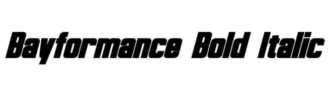
( Fonts by a Neale Davidson - www.pixelsagas.com. Personal-use only. For commercial use please contact owner. )
A bold, italicized font with a dynamic and modern style.
![Bayformance Bold Italic Frei Schriftart Herunterladen]() Herunterladen 1180 Downloads@WebFont
Herunterladen 1180 Downloads@WebFont -
( Fonts by a Neale Davidson - www.pixelsagas.com. Personal-use only. For commercial use please contact owner. )
A bold, geometric font with strong, sharp angles and uniform structure.
![Blitzwing Frei Schriftart Herunterladen]() Herunterladen 1180 Downloads@WebFont
Herunterladen 1180 Downloads@WebFont -
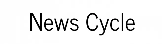
( Copyright (c) 2010-2011, Nathan Willis (nwillis@glyphography.com), with Reserved Font Name "News Cycle." )
A modern, geometric sans-serif font with clean lines and uniform strokes.
![News Cycle Frei Schriftart Herunterladen]() Herunterladen 1180 Downloads@WebFont
Herunterladen 1180 Downloads@WebFont -
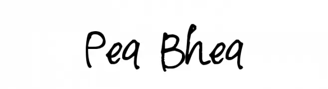
( Free for a personal use. For a commercial use please visit www.kevinandamanda.com )
A playful and dynamic handwritten font with fluid strokes.
![Pea Bhea Frei Schriftart Herunterladen]() Herunterladen 1180 Downloads@WebFont
Herunterladen 1180 Downloads@WebFont -
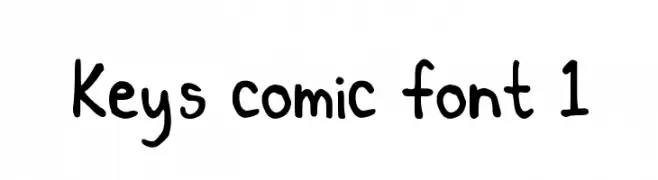
![Key's comic font 1 Frei Schriftart Herunterladen]() Herunterladen 1180 Downloads@WebFont
Herunterladen 1180 Downloads@WebFont -
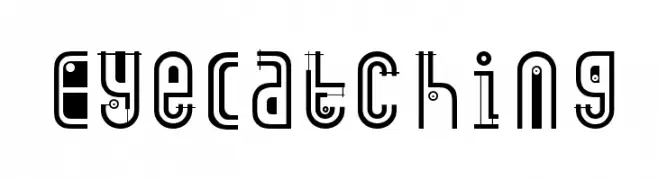
( Fonts by Manfred Klein. Free for private and charity use. Free for commercial with donation to organizations )
A bold, decorative font with geometric shapes and intricate details.
![EyeCatching Frei Schriftart Herunterladen]() Herunterladen 1180 Downloads@WebFont
Herunterladen 1180 Downloads@WebFont -
( Fonts by Daniel Zadorozny - www.iconian.com )
A bold, playful font with rounded, comic book-style characters.
![Comic Book Commando Bold Frei Schriftart Herunterladen]() Herunterladen 1180 Downloads@WebFont
Herunterladen 1180 Downloads@WebFont -
![fat ass filled Frei Schriftart Herunterladen]() Herunterladen 1180 Downloads@WebFont
Herunterladen 1180 Downloads@WebFont -
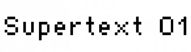
( Font by Sven Stuber - www.superlooper.de )
A pixelated, retro font with a blocky, digital appearance.
![Supertext 01 Frei Schriftart Herunterladen]() Herunterladen 1180 Downloads@WebFont
Herunterladen 1180 Downloads@WebFont


Welche Schriften sind gerade am populärsten?
Poppins, Roboto, Montserrat, Open Sans und Lato sind wegen ihrer klaren Formen und breiten Einsetzbarkeit sehr gefragt – von Markenauftritt über Landingpages bis hin zu Postern.
Welche Fonts eignen sich für Logos?
Geometrische Sans‑Serifs (z. B. Poppins, Familien im Gotham‑Stil) sind ein häufiger Griff für sauberes, skalierbares Branding. Für eine persönlichere Note bleiben Scripts und Handschrift‑Stile beliebt. Kombinieren Sie einen prägnanten Headline‑Font mit einer neutralen Brotschrift für Wiedererkennung und Harmonie.
Wie oft wird die Top‑Liste aktualisiert?
Regelmäßig – basierend auf realen Downloads und Interaktionen. Schauen Sie öfter vorbei, um aufstrebende Favoriten früh zu entdecken.
💡 Tipp: Seite bookmarken – Trends wechseln schnell, und heutige Top‑Schriften inspirieren morgen vielleicht das Rebranding.