Willkommen bei den Top‑Schriften – hier treffen Beliebtheit und Qualität aufeinander. Das sind die in diesem Jahr am häufigsten heruntergeladenen und genutzten Fonts. Wenn Sie sichere Optionen für Logo, Web oder Social suchen, starten Sie hier.
Jeder Top‑Font überzeugt durch Balance, Lesbarkeit und Vielseitigkeit. Sie finden moderne Sans‑Serifs, elegante Scripts, Vintage‑Serifs und minimalistische Displays.
-
( Fonts by Paul Lloyd )
A serif font with a unique shadow effect, offering a classic and bold appearance.
 Herunterladen 1157 Downloads
 -
( Fonts by Md Shohail Bhuian )
A playful, bold font with rounded, thick letters and a whimsical style.
![Got Love Frei Schriftart Herunterladen]() Herunterladen 1156 Downloads@WebFont
Herunterladen 1156 Downloads@WebFont -
Schriftart von HammerBro101. For commercial use please contact the owner.
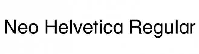
![Neo Helvetica Regular Frei Schriftart Herunterladen]() Herunterladen 1156 Downloads@WebFont
Herunterladen 1156 Downloads@WebFont -
( Jef Triforce - Francisco Arellano - www.ixipcalli.com )
A modern, rounded sans-serif font with excellent readability and a friendly appearance.
![Copilme Regular Frei Schriftart Herunterladen]() Herunterladen 1156 Downloads@WebFont
Herunterladen 1156 Downloads@WebFont -
Schriftart von defharo. For commercial use please contact the owner.
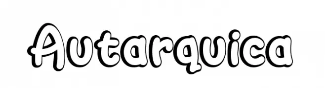
![Autarquica Frei Schriftart Herunterladen]() Herunterladen 1156 Downloads@WebFont
Herunterladen 1156 Downloads@WebFont -
-
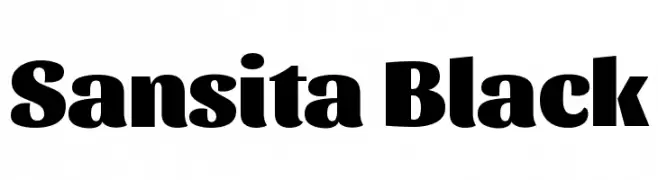
( Copyright 2016 The Sansita Project Authors (omnibus.type@gmail.com) )
A bold and robust font with thick strokes and a modern yet classic style.
![Sansita Black Frei Schriftart Herunterladen]() Herunterladen 1156 Downloads@WebFont
Herunterladen 1156 Downloads@WebFont -
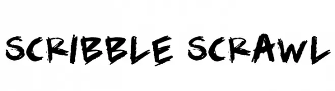
( Fonts by Darrell Flood )
A bold, hand-drawn brush stroke font with dynamic, uneven characters.
![Scribble Scrawl Frei Schriftart Herunterladen]() Herunterladen 1156 Downloads@WebFont
Herunterladen 1156 Downloads@WebFont -
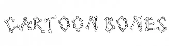
( Fonts by Galdino Otten - galdinootten.com )
A playful, bone-themed font perfect for creative and themed projects.
![Cartoon Bones Frei Schriftart Herunterladen]() Herunterladen 1156 Downloads@WebFont
Herunterladen 1156 Downloads@WebFont -
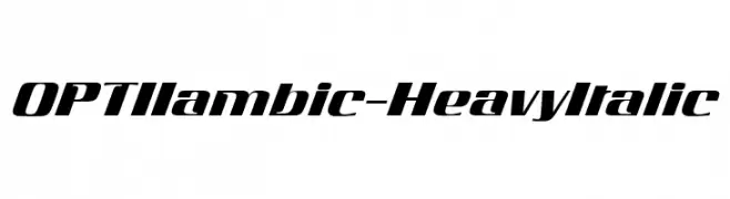
( Fonts by Castcraft Software - opti.netii.net - check the website before use )
A bold, italic font with a dynamic and modern style.
![OPTIIambic-HeavyItalic Frei Schriftart Herunterladen]() Herunterladen 1156 Downloads@WebFont
Herunterladen 1156 Downloads@WebFont -
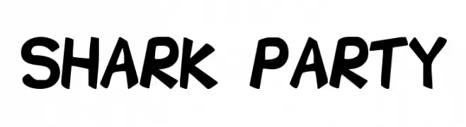
( Fonts by Aryel Filipe )
A playful, bold font with a hand-drawn, energetic style.
![Shark Party Frei Schriftart Herunterladen]() Herunterladen 1156 Downloads@WebFont
Herunterladen 1156 Downloads@WebFont -
![Bulgarian Palatia Frei Schriftart Herunterladen]() Herunterladen 1156 Downloads@WebFont
Herunterladen 1156 Downloads@WebFont -
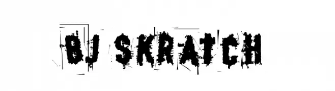
![BJ SKRATCH Frei Schriftart Herunterladen]() Herunterladen 1156 Downloads@WebFont
Herunterladen 1156 Downloads@WebFont -
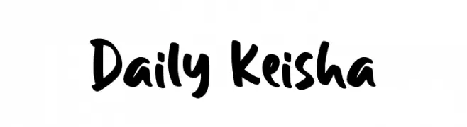
( Fonts by Creakokun Studio )
A bold, playful handwritten font with a casual, friendly style.
![Daily Keisha Frei Schriftart Herunterladen]() Herunterladen 1155 Downloads@WebFont
Herunterladen 1155 Downloads@WebFont -
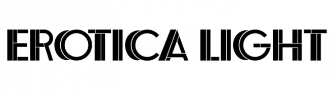
( Fonts by Vladimir Nikolic - www.creativefabrica.com/designer/vladimirnikolic/ - Personal-use only. For commercial use please contact owner. )
A bold, geometric font with sharp angles and a modern, dynamic style.
![Erotica Light Frei Schriftart Herunterladen]() Herunterladen 1155 Downloads@WebFont
Herunterladen 1155 Downloads@WebFont -
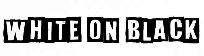
( imagex - www.imagex-fonts.com )
A bold, distressed stencil font with a vintage, industrial feel.
![White On Black Frei Schriftart Herunterladen]() Herunterladen 1155 Downloads@WebFont
Herunterladen 1155 Downloads@WebFont -
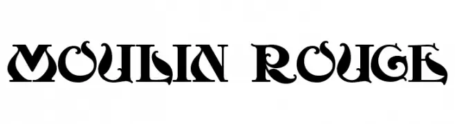
( Fonts by www.gliphmaker.com. Personal-use only. For commercial use please contact owner. )
A bold, decorative font with intricate serifs and vintage flair.
![Moulin Rouge Frei Schriftart Herunterladen]() Herunterladen 1155 Downloads@WebFont
Herunterladen 1155 Downloads@WebFont -
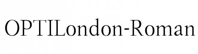
( Fonts by Castcraft Software - opti.netii.net - check the website before use )
A classic serif font with elegant proportions and moderate contrast.
![OPTILondon-Roman Frei Schriftart Herunterladen]() Herunterladen 1155 Downloads@WebFont
Herunterladen 1155 Downloads@WebFont -
( Copyright (c) 2012, Brian J. Bonislawsky DBA Astigmatic (AOETI) (astigma@astigmatic.com), with Reserved Font Names "Eagle Lake" )
A calligraphic font with elegant, flowing lines and moderate contrast.
![EagleLake-Regular Frei Schriftart Herunterladen]() Herunterladen 1155 Downloads@WebFont
Herunterladen 1155 Downloads@WebFont -
![Lutin Flibuste Frei Schriftart Herunterladen]() Herunterladen 1155 Downloads@WebFont
Herunterladen 1155 Downloads@WebFont -
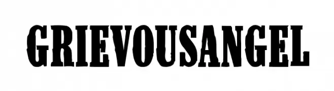
![GrievousAngel Frei Schriftart Herunterladen]() Herunterladen 1155 Downloads@WebFont
Herunterladen 1155 Downloads@WebFont -
( Fonts by Apostrophic Lab )
A modern, clean font with excellent readability and balanced design.
![Steinem Frei Schriftart Herunterladen]() Herunterladen 1155 Downloads@WebFont
Herunterladen 1155 Downloads@WebFont -
( Fonts by Casady & Greene )
A tall, narrow, and bold typeface ideal for impactful headlines.
![GiottoFLF-Bold Frei Schriftart Herunterladen]() Herunterladen 1155 Downloads@WebFont
Herunterladen 1155 Downloads@WebFont -
( Fonts by www.junkohanhero.com )
A distressed, typewriter-style font with a grunge aesthetic.
![Type-Ra Frei Schriftart Herunterladen]() Herunterladen 1155 Downloads@WebFont
Herunterladen 1155 Downloads@WebFont -
![fuehrer Frei Schriftart Herunterladen]() Herunterladen 1155 Downloads@WebFont
Herunterladen 1155 Downloads@WebFont -
( Fonts by Daniel Gauthier )
A playful, hand-drawn font with a bold and energetic style.
![FantasticFont Frei Schriftart Herunterladen]() Herunterladen 1155 Downloads@WebFont
Herunterladen 1155 Downloads@WebFont -
( Fonts by www.houseoflime.com )
A bold, geometric font with a modern, striped design.
![Big Lou Frei Schriftart Herunterladen]() Herunterladen 1155 Downloads@WebFont
Herunterladen 1155 Downloads@WebFont -
( Fonts by Hanoded )
A bold, playful font with a chunky, hand-drawn style and textured details.
![Cookie Supply DEMO Regular Frei Schriftart Herunterladen]() Herunterladen 1154 Downloads@WebFont
Herunterladen 1154 Downloads@WebFont -
( Syntetype Studio )
A bold, geometric sans-serif font with a modern and clean design.
![Neozoic Trial Frei Schriftart Herunterladen]() Herunterladen 1154 Downloads@WebFont
Herunterladen 1154 Downloads@WebFont -
( Sascha Timplan - blog.stereotypes.de )
A tall, elegant font with high contrast and elongated strokes.
![Flenja Frei Schriftart Herunterladen]() Herunterladen 1154 Downloads@WebFont
Herunterladen 1154 Downloads@WebFont -
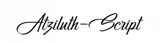
( Motokiwo - Anton Cahyono - creativemarket.com/Motokiwo?u=Motokiwo )
An elegant, flowing script font with intricate loops and swashes.
![Atziluth-Script Frei Schriftart Herunterladen]() Herunterladen 1154 Downloads@WebFont
Herunterladen 1154 Downloads@WebFont -
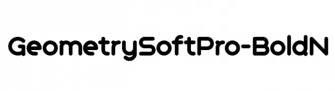
( CheapProFonts - Roger S. Nelsson - www.cheapprofonts.com )
A bold, rounded font with a modern and friendly appearance.
![GeometrySoftPro-BoldN Frei Schriftart Herunterladen]() Herunterladen 1154 Downloads@WebFont
Herunterladen 1154 Downloads@WebFont -
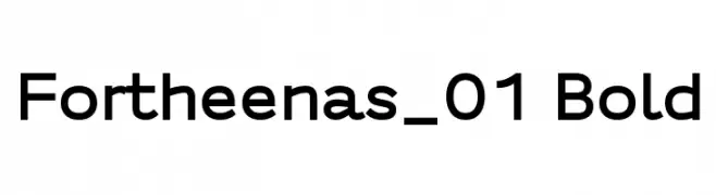
( Fonts by a Situjuh Nazara - c7n1.wordpress.com. Personal-use only. For commercial use please contact owner. )
A bold, modern sans-serif font with clean lines and excellent readability.
![Fortheenas_01 Bold Frei Schriftart Herunterladen]() Herunterladen 1154 Downloads@WebFont
Herunterladen 1154 Downloads@WebFont -
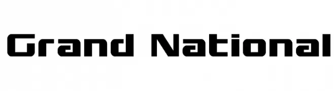
( Fonts by Daniel Zadorozny - www.iconian.com )
Bold, geometric font with sharp angles and a modern look.
![Grand National Frei Schriftart Herunterladen]() Herunterladen 1154 Downloads@WebFont
Herunterladen 1154 Downloads@WebFont -
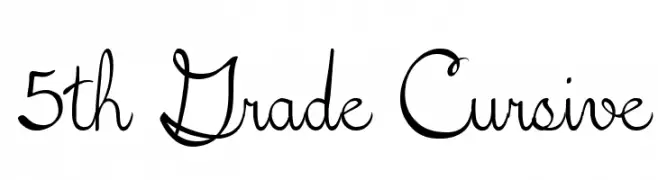
( Fonts by Lee Batchelor http://leeviathan.com/portfolio/fonts/ )
A playful, flowing cursive font with a nostalgic, handwritten style.
![5th Grade Cursive Frei Schriftart Herunterladen]() Herunterladen 1154 Downloads@WebFont
Herunterladen 1154 Downloads@WebFont -
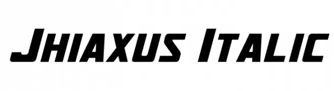
( Fonts by a Neale Davidson - www.pixelsagas.com. Personal-use only. For commercial use please contact owner. )
A bold, italic font with a dynamic and futuristic style.
![Jhiaxus Italic Frei Schriftart Herunterladen]() Herunterladen 1154 Downloads@WebFont
Herunterladen 1154 Downloads@WebFont


Welche Schriften sind gerade am populärsten?
Poppins, Roboto, Montserrat, Open Sans und Lato sind wegen ihrer klaren Formen und breiten Einsetzbarkeit sehr gefragt – von Markenauftritt über Landingpages bis hin zu Postern.
Welche Fonts eignen sich für Logos?
Geometrische Sans‑Serifs (z. B. Poppins, Familien im Gotham‑Stil) sind ein häufiger Griff für sauberes, skalierbares Branding. Für eine persönlichere Note bleiben Scripts und Handschrift‑Stile beliebt. Kombinieren Sie einen prägnanten Headline‑Font mit einer neutralen Brotschrift für Wiedererkennung und Harmonie.
Wie oft wird die Top‑Liste aktualisiert?
Regelmäßig – basierend auf realen Downloads und Interaktionen. Schauen Sie öfter vorbei, um aufstrebende Favoriten früh zu entdecken.
💡 Tipp: Seite bookmarken – Trends wechseln schnell, und heutige Top‑Schriften inspirieren morgen vielleicht das Rebranding.