Willkommen bei den Top‑Schriften – hier treffen Beliebtheit und Qualität aufeinander. Das sind die in diesem Jahr am häufigsten heruntergeladenen und genutzten Fonts. Wenn Sie sichere Optionen für Logo, Web oder Social suchen, starten Sie hier.
Jeder Top‑Font überzeugt durch Balance, Lesbarkeit und Vielseitigkeit. Sie finden moderne Sans‑Serifs, elegante Scripts, Vintage‑Serifs und minimalistische Displays.
-
 Herunterladen 300 Downloads@WebFont
 -
( Fonts by fontease - Kolyu Kolev - Personal-use only. For commercial use please contact owner. )
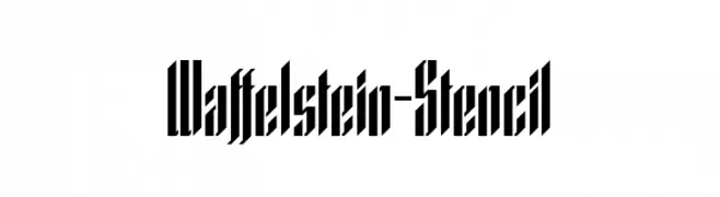
A bold, stencil-style font with sharp, angular edges and a geometric design.
![Waffelstein-Stencil Frei Schriftart Herunterladen]() Herunterladen 300 Downloads@WebFont
Herunterladen 300 Downloads@WebFont -
( Paul Lloyd Fonts )
A playful, artistic font with tall, hand-drawn characters and varying stroke widths.
![d'Spenser Frei Schriftart Herunterladen]() Herunterladen 300 Downloads
Herunterladen 300 Downloads -
( Solidtype - bit.ly/2OxZn2V )
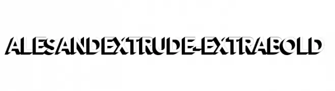
A bold, 3D extruded sans-serif font with a striking geometric style.
![AlesandExtrude-ExtraBold Frei Schriftart Herunterladen]() Herunterladen 300 Downloads@WebFont
Herunterladen 300 Downloads@WebFont -
( Fonts by Fenotype - Emil Bertell - Personal-use only. For commercial use please contact owner. )
A modern, light sans-serif font with excellent readability and clean lines.
![Resolve Sans Light Frei Schriftart Herunterladen]() Herunterladen 300 Downloads@WebFont
Herunterladen 300 Downloads@WebFont -
-
![BOSS M B Frei Schriftart Herunterladen]() Herunterladen 300 Downloads@WebFont
Herunterladen 300 Downloads@WebFont -
( Fonts by Apostrophic Lab )
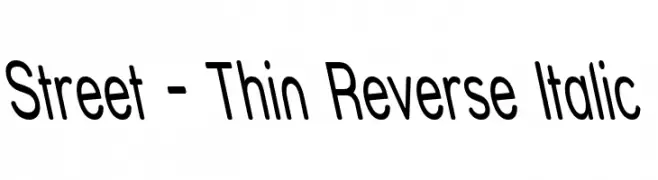
A thin, reverse italic font with a modern and sleek design.
![Street - Thin Reverse Italic Frei Schriftart Herunterladen]() Herunterladen 300 Downloads@WebFont
Herunterladen 300 Downloads@WebFont -
![Xorx_windy Cyr Frei Schriftart Herunterladen]() Herunterladen 300 Downloads@WebFont
Herunterladen 300 Downloads@WebFont -
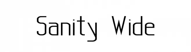
![Sanity Wide Frei Schriftart Herunterladen]() Herunterladen 300 Downloads@WebFont
Herunterladen 300 Downloads@WebFont -
( Fonts by Mocha Frappuccino - Personal-use only. For commercial use please contact owner. )
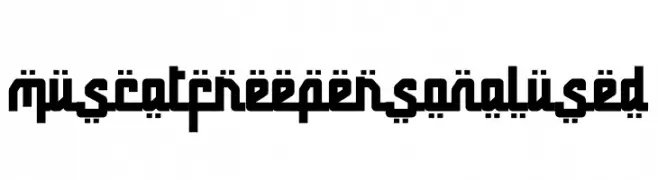
A bold, geometric font with a modern, digital aesthetic.
![Muscat Free Personal Used Frei Schriftart Herunterladen]() Herunterladen 300 Downloads@WebFont
Herunterladen 300 Downloads@WebFont


Welche Schriften sind gerade am populärsten?
Poppins, Roboto, Montserrat, Open Sans und Lato sind wegen ihrer klaren Formen und breiten Einsetzbarkeit sehr gefragt – von Markenauftritt über Landingpages bis hin zu Postern.
Welche Fonts eignen sich für Logos?
Geometrische Sans‑Serifs (z. B. Poppins, Familien im Gotham‑Stil) sind ein häufiger Griff für sauberes, skalierbares Branding. Für eine persönlichere Note bleiben Scripts und Handschrift‑Stile beliebt. Kombinieren Sie einen prägnanten Headline‑Font mit einer neutralen Brotschrift für Wiedererkennung und Harmonie.
Wie oft wird die Top‑Liste aktualisiert?
Regelmäßig – basierend auf realen Downloads und Interaktionen. Schauen Sie öfter vorbei, um aufstrebende Favoriten früh zu entdecken.
💡 Tipp: Seite bookmarken – Trends wechseln schnell, und heutige Top‑Schriften inspirieren morgen vielleicht das Rebranding.