Willkommen bei den Top‑Schriften – hier treffen Beliebtheit und Qualität aufeinander. Das sind die in diesem Jahr am häufigsten heruntergeladenen und genutzten Fonts. Wenn Sie sichere Optionen für Logo, Web oder Social suchen, starten Sie hier.
Jeder Top‑Font überzeugt durch Balance, Lesbarkeit und Vielseitigkeit. Sie finden moderne Sans‑Serifs, elegante Scripts, Vintage‑Serifs und minimalistische Displays.
-
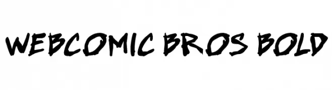
( Fonts by Press Gang Studios - Andeh Pinkard - www.pressgang-studios.com )
A bold, hand-drawn font with a comic book style and dynamic character.
 Herunterladen 299 Downloads@WebFont
 -
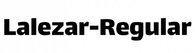
( Fonts by Borna Izadpanah )
A bold, modern font with thick strokes and a clean, impactful design.
![Lalezar-Regular Frei Schriftart Herunterladen]() Herunterladen 299 Downloads@WebFont
Herunterladen 299 Downloads@WebFont -
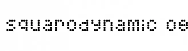
( Fonts by www.fontalicious.com )
A dot matrix style font with a digital, geometric design.
![Squarodynamic 08 Frei Schriftart Herunterladen]() Herunterladen 299 Downloads@WebFont
Herunterladen 299 Downloads@WebFont -
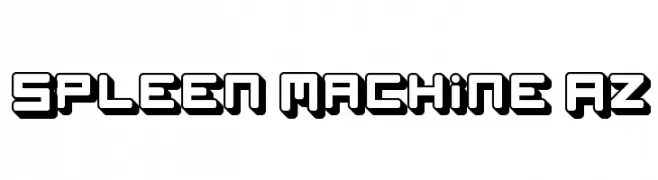
( Fonts by www.paintblackeditions.org - Free for personal use only )
A bold, futuristic font with a 3D shadow effect and geometric design.
![Spleen Machine Az Frei Schriftart Herunterladen]() Herunterladen 299 Downloads@WebFont
Herunterladen 299 Downloads@WebFont -
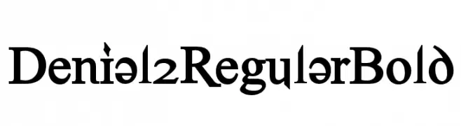
![Denial2RegularBold Frei Schriftart Herunterladen]() Herunterladen 299 Downloads@WebFont
Herunterladen 299 Downloads@WebFont -
-
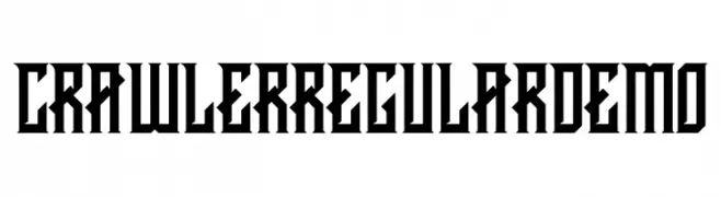
( Fonts by Febryan Satria - Personal-use only. For commercial use please contact owner. )
A bold, angular font with Gothic influences, ideal for dramatic displays.
![CRAWLER Regular DEMO Frei Schriftart Herunterladen]() Herunterladen 299 Downloads@WebFont
Herunterladen 299 Downloads@WebFont -
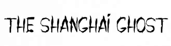
![THE SHANGHAI GHOST Frei Schriftart Herunterladen]() Herunterladen 299 Downloads@WebFont
Herunterladen 299 Downloads@WebFont -
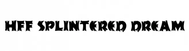
( Fonts by Have Fun with Fonts )
A bold, jagged font with sharp, irregular edges for a dynamic and edgy look.
![HFF Splintered Dream Frei Schriftart Herunterladen]() Herunterladen 299 Downloads@WebFont
Herunterladen 299 Downloads@WebFont -
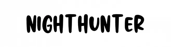
( Fonts by Graphix Line Studio )
A bold, rounded, and playful font with a friendly and energetic style.
![NIGHT HUNTER Frei Schriftart Herunterladen]() Herunterladen 299 Downloads@WebFont
Herunterladen 299 Downloads@WebFont -
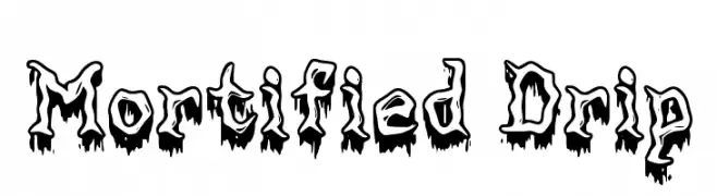
( Walter E Stewart )
A bold, dripping font with a playful yet eerie aesthetic.
![Mortified Drip Frei Schriftart Herunterladen]() Herunterladen 299 Downloads@WebFont
Herunterladen 299 Downloads@WebFont
Welche Schriften sind gerade am populärsten?
Poppins, Roboto, Montserrat, Open Sans und Lato sind wegen ihrer klaren Formen und breiten Einsetzbarkeit sehr gefragt – von Markenauftritt über Landingpages bis hin zu Postern.
Welche Fonts eignen sich für Logos?
Geometrische Sans‑Serifs (z. B. Poppins, Familien im Gotham‑Stil) sind ein häufiger Griff für sauberes, skalierbares Branding. Für eine persönlichere Note bleiben Scripts und Handschrift‑Stile beliebt. Kombinieren Sie einen prägnanten Headline‑Font mit einer neutralen Brotschrift für Wiedererkennung und Harmonie.
Wie oft wird die Top‑Liste aktualisiert?
Regelmäßig – basierend auf realen Downloads und Interaktionen. Schauen Sie öfter vorbei, um aufstrebende Favoriten früh zu entdecken.
💡 Tipp: Seite bookmarken – Trends wechseln schnell, und heutige Top‑Schriften inspirieren morgen vielleicht das Rebranding.