Willkommen bei den Top‑Schriften – hier treffen Beliebtheit und Qualität aufeinander. Das sind die in diesem Jahr am häufigsten heruntergeladenen und genutzten Fonts. Wenn Sie sichere Optionen für Logo, Web oder Social suchen, starten Sie hier.
Jeder Top‑Font überzeugt durch Balance, Lesbarkeit und Vielseitigkeit. Sie finden moderne Sans‑Serifs, elegante Scripts, Vintage‑Serifs und minimalistische Displays.
-
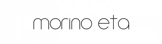
( Daniel Augusto - www.danieaugusto.net )
A sleek, modern font with thin lines and geometric shapes.
 Herunterladen 290 Downloads@WebFont
 -
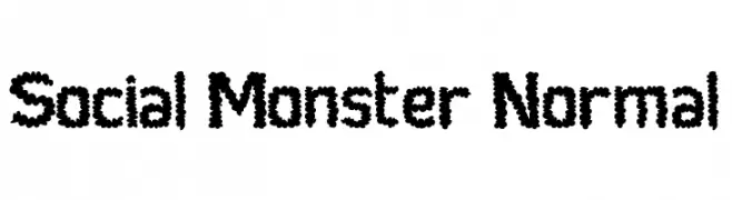
( Fonts by Adien Gunarta - fontasticindonesia.blogspot.com )
A playful, bubbly font with rounded, textured characters.
![Social Monster Normal Frei Schriftart Herunterladen]() Herunterladen 290 Downloads@WebFont
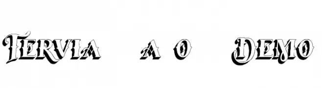
Herunterladen 290 Downloads@WebFont -
![Tervia Shadow2 Demo Frei Schriftart Herunterladen]() Herunterladen 290 Downloads@WebFont
Herunterladen 290 Downloads@WebFont -
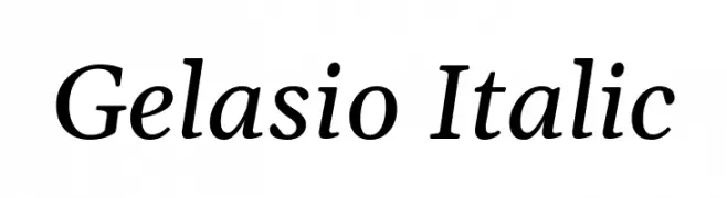
( Copyright 2019 The Gelasio Project Authors (https://github.com/sorkintype/Gelasio) )
An elegant serif font with a classic italic style and smooth, flowing characters.
![Gelasio Italic Frei Schriftart Herunterladen]() Herunterladen 290 Downloads@WebFont
Herunterladen 290 Downloads@WebFont -
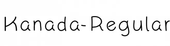
( Fonts by Phitradesign )
A playful, handwritten font with rounded, consistent strokes.
![Kanada-Regular Frei Schriftart Herunterladen]() Herunterladen 290 Downloads@WebFont
Herunterladen 290 Downloads@WebFont -
-
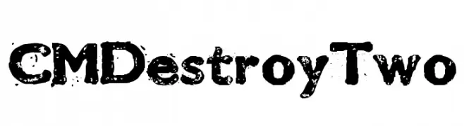
( Fonts by Charly Masci - www.mvdgdesign.com )
A bold, distressed font with a grunge, textured appearance.
![CMDestroyTwo Frei Schriftart Herunterladen]() Herunterladen 290 Downloads@WebFont
Herunterladen 290 Downloads@WebFont -
( Fonts by Inermedia Studio )
A playful, handwritten font with a whimsical and dynamic style.
![Farming Frei Schriftart Herunterladen]() Herunterladen 290 Downloads@WebFont
Herunterladen 290 Downloads@WebFont -
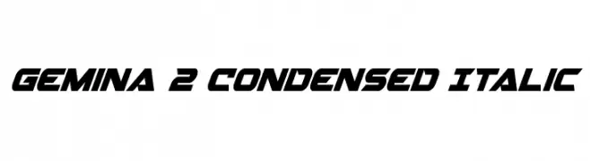
( Fonts by Daniel Zadorozny - www.iconian.com )
A dynamic, italicized, and condensed font with a futuristic style.
![Gemina 2 Condensed Italic Frei Schriftart Herunterladen]() Herunterladen 290 Downloads@WebFont
Herunterladen 290 Downloads@WebFont -
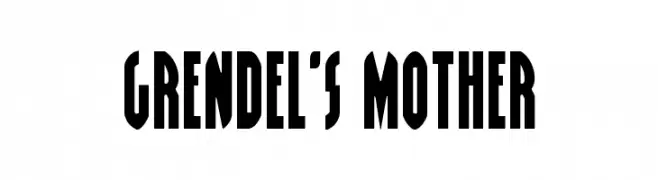
( Fonts by Daniel Zadorozny - www.iconian.com - Free for personal use )
A bold, geometric font with a vintage poster style.
![Grendel's Mother Frei Schriftart Herunterladen]() Herunterladen 290 Downloads@WebFont
Herunterladen 290 Downloads@WebFont -
( Fonts by a Neale Davidson - www.pixelsagas.com. Personal-use only. For commercial use please contact owner. )
A bold, geometric font with a modern, industrial style.
![Huggy Bear Frei Schriftart Herunterladen]() Herunterladen 289 Downloads@WebFont
Herunterladen 289 Downloads@WebFont

Welche Schriften sind gerade am populärsten?
Poppins, Roboto, Montserrat, Open Sans und Lato sind wegen ihrer klaren Formen und breiten Einsetzbarkeit sehr gefragt – von Markenauftritt über Landingpages bis hin zu Postern.
Welche Fonts eignen sich für Logos?
Geometrische Sans‑Serifs (z. B. Poppins, Familien im Gotham‑Stil) sind ein häufiger Griff für sauberes, skalierbares Branding. Für eine persönlichere Note bleiben Scripts und Handschrift‑Stile beliebt. Kombinieren Sie einen prägnanten Headline‑Font mit einer neutralen Brotschrift für Wiedererkennung und Harmonie.
Wie oft wird die Top‑Liste aktualisiert?
Regelmäßig – basierend auf realen Downloads und Interaktionen. Schauen Sie öfter vorbei, um aufstrebende Favoriten früh zu entdecken.
💡 Tipp: Seite bookmarken – Trends wechseln schnell, und heutige Top‑Schriften inspirieren morgen vielleicht das Rebranding.