Willkommen bei den Top‑Schriften – hier treffen Beliebtheit und Qualität aufeinander. Das sind die in diesem Jahr am häufigsten heruntergeladenen und genutzten Fonts. Wenn Sie sichere Optionen für Logo, Web oder Social suchen, starten Sie hier.
Jeder Top‑Font überzeugt durch Balance, Lesbarkeit und Vielseitigkeit. Sie finden moderne Sans‑Serifs, elegante Scripts, Vintage‑Serifs und minimalistische Displays.
-
( Fonts by Khurasan )
A playful, bold font with rounded, thick strokes and a whimsical style.
 Herunterladen 290 Downloads@WebFont
 -
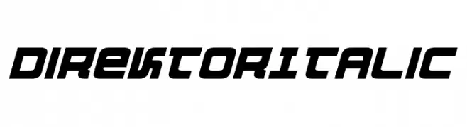
( Fonts by Daniel Zadorozny - www.iconian.com - Free for personal use )
A bold, italic, and futuristic font with geometric shapes and sharp angles.
![DirektorItalic Frei Schriftart Herunterladen]() Herunterladen 290 Downloads@WebFont
Herunterladen 290 Downloads@WebFont -
( گالری فانت فارسی پژوهش آريانا - only compatible with Farsi and Arabic )
A bold, geometric font with clean lines and modern style.
![Sadaf Frei Schriftart Herunterladen]() Herunterladen 290 Downloads@WebFont
Herunterladen 290 Downloads@WebFont -
( Fonts by Tri Sakti Oktaviano )
A bold, playful font with rounded, bubbly characters.
![Kind Kids Frei Schriftart Herunterladen]() Herunterladen 290 Downloads@WebFont
Herunterladen 290 Downloads@WebFont -
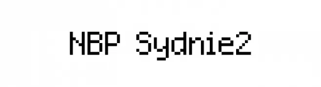
![NBP Sydnie2 Frei Schriftart Herunterladen]() Herunterladen 290 Downloads@WebFont
Herunterladen 290 Downloads@WebFont -
-
( Fonts by www.fontalicious.com )
A bold, geometric font with a modern, futuristic style.
![Sanka Frei Schriftart Herunterladen]() Herunterladen 290 Downloads@WebFont
Herunterladen 290 Downloads@WebFont -
![KGRAIN2 Frei Schriftart Herunterladen]() Herunterladen 290 Downloads@WebFont
Herunterladen 290 Downloads@WebFont -
( Fonts by Omnibus Type )
A bold, semi-condensed italic font with a modern and dynamic style.
![Saira SemiCondensed ExtraBold Italic Frei Schriftart Herunterladen]() Herunterladen 290 Downloads@WebFont
Herunterladen 290 Downloads@WebFont -
![LCR Mountain Climber Frei Schriftart Herunterladen]() Herunterladen 290 Downloads@WebFont
Herunterladen 290 Downloads@WebFont -
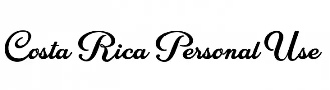
( Fonts by Billy Argel Fonts - www.billyargel.com - Personal-use only. For commercial use please contact owner. )
An elegant script font with flowing lines and decorative curves.
![Costa Rica Personal Use Frei Schriftart Herunterladen]() Herunterladen 290 Downloads@WebFont
Herunterladen 290 Downloads@WebFont


Welche Schriften sind gerade am populärsten?
Poppins, Roboto, Montserrat, Open Sans und Lato sind wegen ihrer klaren Formen und breiten Einsetzbarkeit sehr gefragt – von Markenauftritt über Landingpages bis hin zu Postern.
Welche Fonts eignen sich für Logos?
Geometrische Sans‑Serifs (z. B. Poppins, Familien im Gotham‑Stil) sind ein häufiger Griff für sauberes, skalierbares Branding. Für eine persönlichere Note bleiben Scripts und Handschrift‑Stile beliebt. Kombinieren Sie einen prägnanten Headline‑Font mit einer neutralen Brotschrift für Wiedererkennung und Harmonie.
Wie oft wird die Top‑Liste aktualisiert?
Regelmäßig – basierend auf realen Downloads und Interaktionen. Schauen Sie öfter vorbei, um aufstrebende Favoriten früh zu entdecken.
💡 Tipp: Seite bookmarken – Trends wechseln schnell, und heutige Top‑Schriften inspirieren morgen vielleicht das Rebranding.