Willkommen bei den Top‑Schriften – hier treffen Beliebtheit und Qualität aufeinander. Das sind die in diesem Jahr am häufigsten heruntergeladenen und genutzten Fonts. Wenn Sie sichere Optionen für Logo, Web oder Social suchen, starten Sie hier.
Jeder Top‑Font überzeugt durch Balance, Lesbarkeit und Vielseitigkeit. Sie finden moderne Sans‑Serifs, elegante Scripts, Vintage‑Serifs und minimalistische Displays.
-
( Fonts by Apostrophic Lab )
A modern Art Deco-inspired font with geometric and elegant elements.
 Herunterladen 286 Downloads@WebFont
 -
( Free for a personal use. For a commercial use please visit www.kevinandamanda.com )
A casual, handwritten font with playful and irregular strokes.
![Pea Lisel Frei Schriftart Herunterladen]() Herunterladen 286 Downloads@WebFont
Herunterladen 286 Downloads@WebFont -
( Vladimir Nikolic - www.coroflot.com/vladimirnikolic )
Bold, italicized font with a flat shadow effect for dynamic designs.
![Casino Flat Shadow Italic Frei Schriftart Herunterladen]() Herunterladen 286 Downloads@WebFont
Herunterladen 286 Downloads@WebFont -
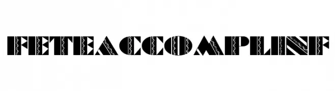
( Fonts by Nick Curtis - Personal-use only. For commercial use please contact owner. )
A bold, decorative font with intricate patterns and high contrast.
![FeteAccompliNF Frei Schriftart Herunterladen]() Herunterladen 286 Downloads@WebFont
Herunterladen 286 Downloads@WebFont -
Schriftart von satrianovian20. For commercial use please contact the owner.
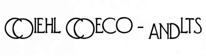
( elemental acts )
A playful, hand-drawn font with circular outlines around each character.
![e-font Frei Schriftart Herunterladen]() Herunterladen 286 Downloads@WebFont
Herunterladen 286 Downloads@WebFont -
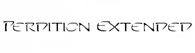
-
![Perdition Extended Frei Schriftart Herunterladen]() Herunterladen 286 Downloads@WebFont
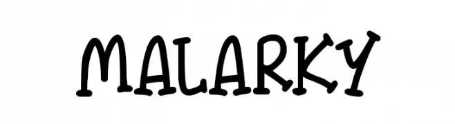
Herunterladen 286 Downloads@WebFont -
![Malarky Frei Schriftart Herunterladen]() Herunterladen 286 Downloads@WebFont
Herunterladen 286 Downloads@WebFont -
( Fonts by Kong Font - https://fontkong.com/ - Personal-use only. For commercial use please contact owner. )
An elegant, flowing script font with a sophisticated cursive style.
![Margharita Frei Schriftart Herunterladen]() Herunterladen 286 Downloads@WebFont
Herunterladen 286 Downloads@WebFont -
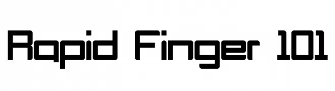
![Rapid Finger 101 Frei Schriftart Herunterladen]() Herunterladen 286 Downloads@WebFont
Herunterladen 286 Downloads@WebFont -
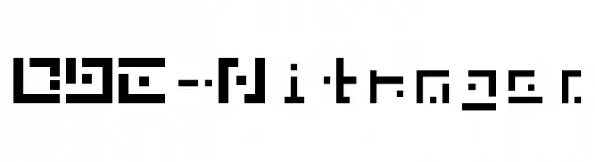
![DBE-Nitrogen Frei Schriftart Herunterladen]() Herunterladen 286 Downloads@WebFont
Herunterladen 286 Downloads@WebFont


Welche Schriften sind gerade am populärsten?
Poppins, Roboto, Montserrat, Open Sans und Lato sind wegen ihrer klaren Formen und breiten Einsetzbarkeit sehr gefragt – von Markenauftritt über Landingpages bis hin zu Postern.
Welche Fonts eignen sich für Logos?
Geometrische Sans‑Serifs (z. B. Poppins, Familien im Gotham‑Stil) sind ein häufiger Griff für sauberes, skalierbares Branding. Für eine persönlichere Note bleiben Scripts und Handschrift‑Stile beliebt. Kombinieren Sie einen prägnanten Headline‑Font mit einer neutralen Brotschrift für Wiedererkennung und Harmonie.
Wie oft wird die Top‑Liste aktualisiert?
Regelmäßig – basierend auf realen Downloads und Interaktionen. Schauen Sie öfter vorbei, um aufstrebende Favoriten früh zu entdecken.
💡 Tipp: Seite bookmarken – Trends wechseln schnell, und heutige Top‑Schriften inspirieren morgen vielleicht das Rebranding.