Willkommen bei den Top‑Schriften – hier treffen Beliebtheit und Qualität aufeinander. Das sind die in diesem Jahr am häufigsten heruntergeladenen und genutzten Fonts. Wenn Sie sichere Optionen für Logo, Web oder Social suchen, starten Sie hier.
Jeder Top‑Font überzeugt durch Balance, Lesbarkeit und Vielseitigkeit. Sie finden moderne Sans‑Serifs, elegante Scripts, Vintage‑Serifs und minimalistische Displays.
-
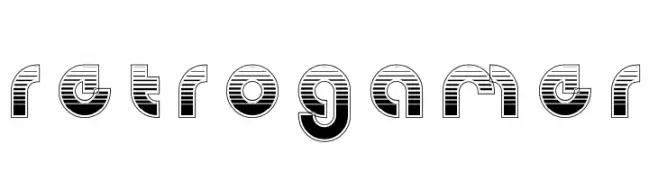
( Fonts by Alex Tomlinson - Skyhaven Fonts - shfonts.com )
A bold, retro-inspired font with a striped pattern and geometric structure.
 Herunterladen 286 Downloads@WebFont
 -
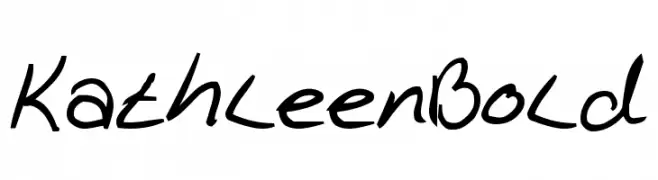
( Fonts by Daniel Gauthier )
A bold, handwritten font with dynamic and fluid strokes.
![KathleenBold Frei Schriftart Herunterladen]() Herunterladen 286 Downloads@WebFont
Herunterladen 286 Downloads@WebFont -
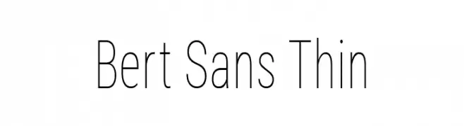
( Fonts by Christian Robertson, Adam Twardoch, & Cristiano Sobral - Personal-use only. For commercial use please contact owner. )
A thin, modern sans-serif font with a clean and elegant style.
![Bert Sans Thin Frei Schriftart Herunterladen]() Herunterladen 286 Downloads@WebFont
Herunterladen 286 Downloads@WebFont -
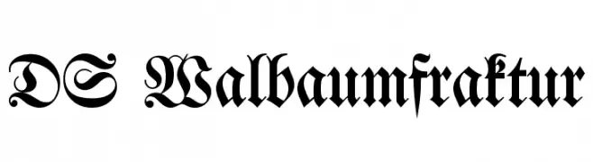
( Fonts by Typographer Mediengestaltung - Personal-use only. For commercial use please contact owner. )
An ornate blackletter font with intricate, historical design elements.
![DS Walbaumfraktur Frei Schriftart Herunterladen]() Herunterladen 286 Downloads@WebFont
Herunterladen 286 Downloads@WebFont -
![Fifont Frei Schriftart Herunterladen]() Herunterladen 286 Downloads@WebFont
Herunterladen 286 Downloads@WebFont -
-
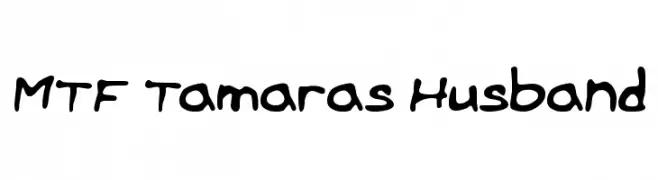
( Fonts by Miss Tiina at www.misstiina.com (please check the website before use) )
A playful, bold handwritten font with rounded edges and consistent strokes.
![MTF Tamaras Husband Frei Schriftart Herunterladen]() Herunterladen 286 Downloads@WebFont
Herunterladen 286 Downloads@WebFont -
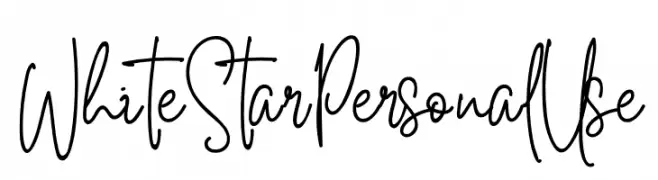
( Fonts by Din Studio - Donis Miftahudin - Personal-use only. For commercial use please contact owner. )
A dynamic and expressive handwritten font with fluid strokes.
![White Star Personal Use Frei Schriftart Herunterladen]() Herunterladen 286 Downloads@WebFont
Herunterladen 286 Downloads@WebFont -
![Grixel Acme 7 Wide Bold Xtnd Frei Schriftart Herunterladen]() Herunterladen 286 Downloads@WebFont
Herunterladen 286 Downloads@WebFont -
![MVUHandwriting Frei Schriftart Herunterladen]() Herunterladen 286 Downloads@WebFont
Herunterladen 286 Downloads@WebFont -
( Free for a personal use. For a commercial use please visit www.kevinandamanda.com )
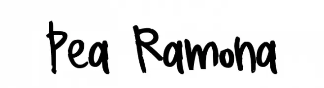
A playful, handwritten font with a casual and friendly vibe.
![Pea Ramona Frei Schriftart Herunterladen]() Herunterladen 286 Downloads@WebFont
Herunterladen 286 Downloads@WebFont

Welche Schriften sind gerade am populärsten?
Poppins, Roboto, Montserrat, Open Sans und Lato sind wegen ihrer klaren Formen und breiten Einsetzbarkeit sehr gefragt – von Markenauftritt über Landingpages bis hin zu Postern.
Welche Fonts eignen sich für Logos?
Geometrische Sans‑Serifs (z. B. Poppins, Familien im Gotham‑Stil) sind ein häufiger Griff für sauberes, skalierbares Branding. Für eine persönlichere Note bleiben Scripts und Handschrift‑Stile beliebt. Kombinieren Sie einen prägnanten Headline‑Font mit einer neutralen Brotschrift für Wiedererkennung und Harmonie.
Wie oft wird die Top‑Liste aktualisiert?
Regelmäßig – basierend auf realen Downloads und Interaktionen. Schauen Sie öfter vorbei, um aufstrebende Favoriten früh zu entdecken.
💡 Tipp: Seite bookmarken – Trends wechseln schnell, und heutige Top‑Schriften inspirieren morgen vielleicht das Rebranding.