Willkommen bei den Top‑Schriften – hier treffen Beliebtheit und Qualität aufeinander. Das sind die in diesem Jahr am häufigsten heruntergeladenen und genutzten Fonts. Wenn Sie sichere Optionen für Logo, Web oder Social suchen, starten Sie hier.
Jeder Top‑Font überzeugt durch Balance, Lesbarkeit und Vielseitigkeit. Sie finden moderne Sans‑Serifs, elegante Scripts, Vintage‑Serifs und minimalistische Displays.
-
 Herunterladen 282 Downloads@WebFont
 -
( Copyright 2014 The Comic Neue Project Authors (https://github.com/crozynski/comicneue) )
A playful, rounded font with a casual and friendly appearance.
![Comic Neue Regular Frei Schriftart Herunterladen]() Herunterladen 282 Downloads@WebFont
Herunterladen 282 Downloads@WebFont -
( Fonts by Anita Jürgeleit - Personal-use only. For commercial use please contact owner. )
A bold, modern sans-serif font with clean lines and strong presence.
![Crossfit Demo Demi Frei Schriftart Herunterladen]() Herunterladen 282 Downloads@WebFont
Herunterladen 282 Downloads@WebFont -
( Fonts by Origin Type )
A playful, handwritten-style font with bold, rounded characters.
![Holiday School Frei Schriftart Herunterladen]() Herunterladen 282 Downloads@WebFont
Herunterladen 282 Downloads@WebFont -
![Dameron Italic Frei Schriftart Herunterladen]() Herunterladen 282 Downloads@WebFont
Herunterladen 282 Downloads@WebFont -
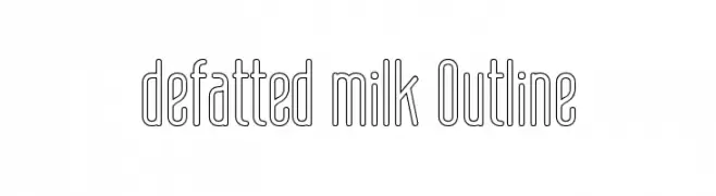
-
![defatted milk Outline Frei Schriftart Herunterladen]() Herunterladen 282 Downloads@WebFont
Herunterladen 282 Downloads@WebFont -
( Fonts by Woodcutter )
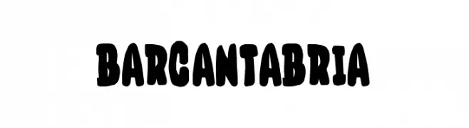
A bold, playful font with thick, rounded strokes and a hand-drawn appearance.
![Bar Cantabria Frei Schriftart Herunterladen]() Herunterladen 282 Downloads@WebFont
Herunterladen 282 Downloads@WebFont -
( Fonts by Masa Aska Sanurumi )
Playful handwritten font with a casual vibe.
![Let's go Holiyay Frei Schriftart Herunterladen]() Herunterladen 282 Downloads@WebFont
Herunterladen 282 Downloads@WebFont -
![Papa Grape Frei Schriftart Herunterladen]() Herunterladen 282 Downloads@WebFont
Herunterladen 282 Downloads@WebFont -
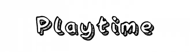
( Fonts by Andrew McCluskey - nalgames.com. Personal-use only. For commercial use please contact owner. )
A playful, hand-drawn font with bold outlines and textured fills.
![Playtime Frei Schriftart Herunterladen]() Herunterladen 282 Downloads@WebFont
Herunterladen 282 Downloads@WebFont


Welche Schriften sind gerade am populärsten?
Poppins, Roboto, Montserrat, Open Sans und Lato sind wegen ihrer klaren Formen und breiten Einsetzbarkeit sehr gefragt – von Markenauftritt über Landingpages bis hin zu Postern.
Welche Fonts eignen sich für Logos?
Geometrische Sans‑Serifs (z. B. Poppins, Familien im Gotham‑Stil) sind ein häufiger Griff für sauberes, skalierbares Branding. Für eine persönlichere Note bleiben Scripts und Handschrift‑Stile beliebt. Kombinieren Sie einen prägnanten Headline‑Font mit einer neutralen Brotschrift für Wiedererkennung und Harmonie.
Wie oft wird die Top‑Liste aktualisiert?
Regelmäßig – basierend auf realen Downloads und Interaktionen. Schauen Sie öfter vorbei, um aufstrebende Favoriten früh zu entdecken.
💡 Tipp: Seite bookmarken – Trends wechseln schnell, und heutige Top‑Schriften inspirieren morgen vielleicht das Rebranding.