Willkommen bei den Top‑Schriften – hier treffen Beliebtheit und Qualität aufeinander. Das sind die in diesem Jahr am häufigsten heruntergeladenen und genutzten Fonts. Wenn Sie sichere Optionen für Logo, Web oder Social suchen, starten Sie hier.
Jeder Top‑Font überzeugt durch Balance, Lesbarkeit und Vielseitigkeit. Sie finden moderne Sans‑Serifs, elegante Scripts, Vintage‑Serifs und minimalistische Displays.
-
( Fonts by www.dcoxy.com )
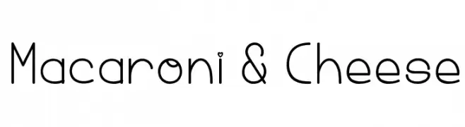
A playful, rounded font with tubular letterforms and consistent stroke width.
 Herunterladen 281 Downloads@WebFont
 -
( Copyright 2019 The Red Hat Project Authors (https://github.com/RedHatOfficial/RedHatFont) )
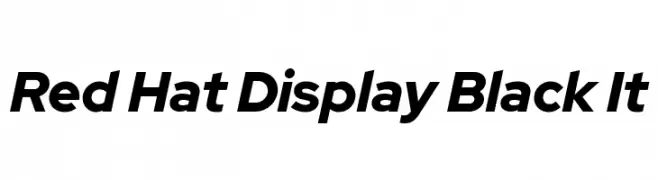
A bold, modern, and slightly condensed italic font with medium contrast.
![Red Hat Display Black It Frei Schriftart Herunterladen]() Herunterladen 281 Downloads@WebFont
Herunterladen 281 Downloads@WebFont -
Schriftart von TGIFStudio. For commercial use please contact the owner.
( Thank you for downloading this font This font is free for PERSONAL USE ONLY! Commercial license for this font can be purchased at: http://bit.ly/2xZKj1Q )
A dynamic and flowing script font with elegant cursive letterforms.
![Elliot Frei Schriftart Herunterladen]() Herunterladen 281 Downloads@WebFont
Herunterladen 281 Downloads@WebFont -
![Stinky Kitty Frei Schriftart Herunterladen]() Herunterladen 281 Downloads@WebFont
Herunterladen 281 Downloads@WebFont -
( Fonts by Toto )
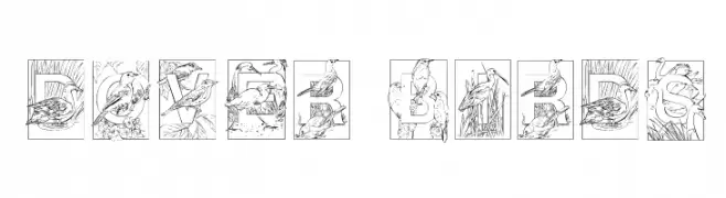
An artistic font with detailed bird illustrations within each letter.
![Dover Birds Frei Schriftart Herunterladen]() Herunterladen 281 Downloads@WebFont
Herunterladen 281 Downloads@WebFont -
-
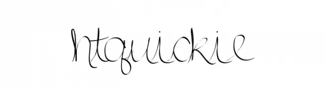
![htquickie Frei Schriftart Herunterladen]() Herunterladen 281 Downloads@WebFont
Herunterladen 281 Downloads@WebFont -
( Luc Mahler )
A bold, modern sans-serif font with clean lines and geometric structure.
![Sornette Bold Frei Schriftart Herunterladen]() Herunterladen 281 Downloads@WebFont
Herunterladen 281 Downloads@WebFont -
( Fonts by Syafrizal )
A bold, playful font with thick, rounded strokes and a hand-drawn feel.
![Si-Brot- Frei Schriftart Herunterladen]() Herunterladen 281 Downloads@WebFont
Herunterladen 281 Downloads@WebFont -
( Fonts by Leah Janoe )
A casual, handwritten-style font with smooth, flowing lines and a playful tone.
![Leah Writes Medium Frei Schriftart Herunterladen]() Herunterladen 281 Downloads@WebFont
Herunterladen 281 Downloads@WebFont -
![Zilap Natural Frei Schriftart Herunterladen]() Herunterladen 281 Downloads@WebFont
Herunterladen 281 Downloads@WebFont


Welche Schriften sind gerade am populärsten?
Poppins, Roboto, Montserrat, Open Sans und Lato sind wegen ihrer klaren Formen und breiten Einsetzbarkeit sehr gefragt – von Markenauftritt über Landingpages bis hin zu Postern.
Welche Fonts eignen sich für Logos?
Geometrische Sans‑Serifs (z. B. Poppins, Familien im Gotham‑Stil) sind ein häufiger Griff für sauberes, skalierbares Branding. Für eine persönlichere Note bleiben Scripts und Handschrift‑Stile beliebt. Kombinieren Sie einen prägnanten Headline‑Font mit einer neutralen Brotschrift für Wiedererkennung und Harmonie.
Wie oft wird die Top‑Liste aktualisiert?
Regelmäßig – basierend auf realen Downloads und Interaktionen. Schauen Sie öfter vorbei, um aufstrebende Favoriten früh zu entdecken.
💡 Tipp: Seite bookmarken – Trends wechseln schnell, und heutige Top‑Schriften inspirieren morgen vielleicht das Rebranding.