Willkommen bei den Top‑Schriften – hier treffen Beliebtheit und Qualität aufeinander. Das sind die in diesem Jahr am häufigsten heruntergeladenen und genutzten Fonts. Wenn Sie sichere Optionen für Logo, Web oder Social suchen, starten Sie hier.
Jeder Top‑Font überzeugt durch Balance, Lesbarkeit und Vielseitigkeit. Sie finden moderne Sans‑Serifs, elegante Scripts, Vintage‑Serifs und minimalistische Displays.
-
 Herunterladen 281 Downloads@WebFont
 -
( Fonts by www.haroldsfonts.com )
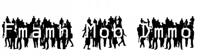
A dynamic font with silhouettes of people, embodying energy and community.
![Flash Mob Demo Frei Schriftart Herunterladen]() Herunterladen 281 Downloads@WebFont
Herunterladen 281 Downloads@WebFont -
( Fonts by fana merah jambu - Personal-use only. For commercial use please contact owner. )
A playful, bubbly font with a hand-drawn feel, perfect for creative projects.
![Bubble Mint Frei Schriftart Herunterladen]() Herunterladen 281 Downloads@WebFont
Herunterladen 281 Downloads@WebFont -
( Fonts by Apostrophic Lab )
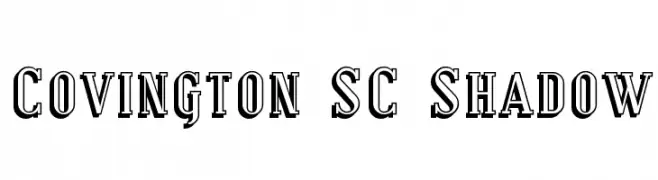
A bold serif font with a distinctive shadow effect, blending classic and modern styles.
![Covington SC Shadow Frei Schriftart Herunterladen]() Herunterladen 281 Downloads@WebFont
Herunterladen 281 Downloads@WebFont -
( Fonts by Graphix Line Studio - Personal-use only. For commercial use please contact owner. )
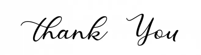
A graceful script font with fluid, cursive strokes and elegant detailing.
![Thank You Frei Schriftart Herunterladen]() Herunterladen 281 Downloads@WebFont
Herunterladen 281 Downloads@WebFont -
-
( Fonts by Fontherapy - Siti Anisa - Personal-use only. For commercial use please contact owner. )
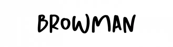
A bold, playful handwritten font with a lively and energetic style.
![Browman Frei Schriftart Herunterladen]() Herunterladen 281 Downloads@WebFont
Herunterladen 281 Downloads@WebFont -
![First Attempt Frei Schriftart Herunterladen]() Herunterladen 281 Downloads@WebFont
Herunterladen 281 Downloads@WebFont -
( Fonts by Nick Quintero - fresherthan.com. Personal-use only. For commercial use please contact owner. )
A decorative, nautical-themed font with anchor-like serifs and a playful style.
![FT Anchor Yard Regular Frei Schriftart Herunterladen]() Herunterladen 281 Downloads@WebFont
Herunterladen 281 Downloads@WebFont -
( Fonts by Uddi Uddi )
A bold, high-contrast serif font with a dynamic and impactful style.
![Jobbernole Frei Schriftart Herunterladen]() Herunterladen 281 Downloads@WebFont
Herunterladen 281 Downloads@WebFont -
![Rubber Walls Frei Schriftart Herunterladen]() Herunterladen 281 Downloads@WebFont
Herunterladen 281 Downloads@WebFont


Welche Schriften sind gerade am populärsten?
Poppins, Roboto, Montserrat, Open Sans und Lato sind wegen ihrer klaren Formen und breiten Einsetzbarkeit sehr gefragt – von Markenauftritt über Landingpages bis hin zu Postern.
Welche Fonts eignen sich für Logos?
Geometrische Sans‑Serifs (z. B. Poppins, Familien im Gotham‑Stil) sind ein häufiger Griff für sauberes, skalierbares Branding. Für eine persönlichere Note bleiben Scripts und Handschrift‑Stile beliebt. Kombinieren Sie einen prägnanten Headline‑Font mit einer neutralen Brotschrift für Wiedererkennung und Harmonie.
Wie oft wird die Top‑Liste aktualisiert?
Regelmäßig – basierend auf realen Downloads und Interaktionen. Schauen Sie öfter vorbei, um aufstrebende Favoriten früh zu entdecken.
💡 Tipp: Seite bookmarken – Trends wechseln schnell, und heutige Top‑Schriften inspirieren morgen vielleicht das Rebranding.