Willkommen bei den Top‑Schriften – hier treffen Beliebtheit und Qualität aufeinander. Das sind die in diesem Jahr am häufigsten heruntergeladenen und genutzten Fonts. Wenn Sie sichere Optionen für Logo, Web oder Social suchen, starten Sie hier.
Jeder Top‑Font überzeugt durch Balance, Lesbarkeit und Vielseitigkeit. Sie finden moderne Sans‑Serifs, elegante Scripts, Vintage‑Serifs und minimalistische Displays.
-
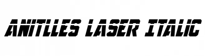
( Fonts by Daniel Zadorozny - www.iconian.com )
A bold, italicized font with a futuristic and angular design.
 Herunterladen 281 Downloads@WebFont
 -
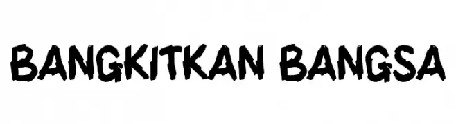
( Fonts by wep )
A bold, hand-drawn font with a rough, expressive style.
![BANGKITKAN BANGSA Frei Schriftart Herunterladen]() Herunterladen 281 Downloads@WebFont
Herunterladen 281 Downloads@WebFont -
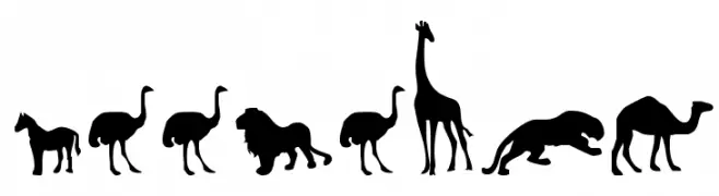
( Fonts by Daniel Zadorozny - www.iconian.com - Free for personal use )
Silhouetted animal shapes in a bold, uniform style.
![Zoologic Frei Schriftart Herunterladen]() Herunterladen 281 Downloads@WebFont
Herunterladen 281 Downloads@WebFont -
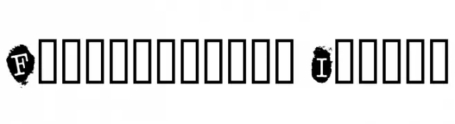
( Fonts by dartcanada.tripod.com - Darren Rigby )
A bold, geometric font with high contrast and art deco influences.
![GangueOuais Frei Schriftart Herunterladen]() Herunterladen 281 Downloads@WebFont
Herunterladen 281 Downloads@WebFont -
![Fingerprints Inside Frei Schriftart Herunterladen]() Herunterladen 281 Downloads@WebFont
Herunterladen 281 Downloads@WebFont -
-
( Fonts by Nikita Grimes )
A playful, handwritten font with tall, narrow characters and a casual style.
![KLEmily Frei Schriftart Herunterladen]() Herunterladen 281 Downloads@WebFont
Herunterladen 281 Downloads@WebFont -
( Paul Lloyd Fonts )
A modern, condensed font with a clean and streamlined appearance.
![LewishamCondensed Frei Schriftart Herunterladen]() Herunterladen 281 Downloads@WebFont
Herunterladen 281 Downloads@WebFont -
( Fonts by David Kerkhoff - www.hanodedphotography.com )
A bold, distressed font with a grunge texture and rugged appearance.
![Project Z Frei Schriftart Herunterladen]() Herunterladen 281 Downloads@WebFont
Herunterladen 281 Downloads@WebFont -
( Fonts by Typefar )
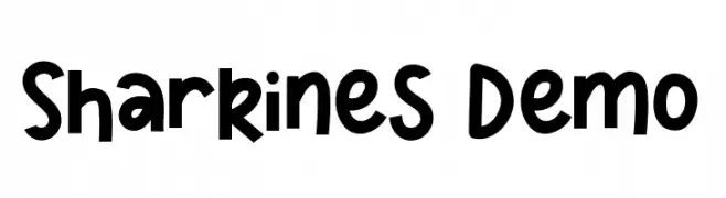
A bold, playful font with rounded edges and a whimsical style.
![Sharkines Demo Frei Schriftart Herunterladen]() Herunterladen 281 Downloads@WebFont
Herunterladen 281 Downloads@WebFont -
( Fonts by www.junkohanhero.com )
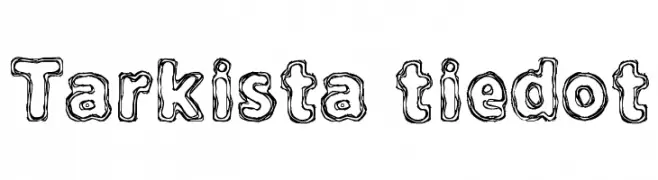
A playful, hand-drawn font with a doodle-like, double-lined style.
![Tarkista tiedot Frei Schriftart Herunterladen]() Herunterladen 281 Downloads@WebFont
Herunterladen 281 Downloads@WebFont


Welche Schriften sind gerade am populärsten?
Poppins, Roboto, Montserrat, Open Sans und Lato sind wegen ihrer klaren Formen und breiten Einsetzbarkeit sehr gefragt – von Markenauftritt über Landingpages bis hin zu Postern.
Welche Fonts eignen sich für Logos?
Geometrische Sans‑Serifs (z. B. Poppins, Familien im Gotham‑Stil) sind ein häufiger Griff für sauberes, skalierbares Branding. Für eine persönlichere Note bleiben Scripts und Handschrift‑Stile beliebt. Kombinieren Sie einen prägnanten Headline‑Font mit einer neutralen Brotschrift für Wiedererkennung und Harmonie.
Wie oft wird die Top‑Liste aktualisiert?
Regelmäßig – basierend auf realen Downloads und Interaktionen. Schauen Sie öfter vorbei, um aufstrebende Favoriten früh zu entdecken.
💡 Tipp: Seite bookmarken – Trends wechseln schnell, und heutige Top‑Schriften inspirieren morgen vielleicht das Rebranding.