Willkommen bei den Top‑Schriften – hier treffen Beliebtheit und Qualität aufeinander. Das sind die in diesem Jahr am häufigsten heruntergeladenen und genutzten Fonts. Wenn Sie sichere Optionen für Logo, Web oder Social suchen, starten Sie hier.
Jeder Top‑Font überzeugt durch Balance, Lesbarkeit und Vielseitigkeit. Sie finden moderne Sans‑Serifs, elegante Scripts, Vintage‑Serifs und minimalistische Displays.
-
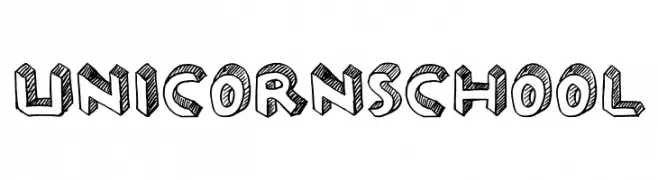
( Fonts by Reguler Studio )
A playful, hand-drawn font with a sketch-like, three-dimensional effect.
 Herunterladen 274 Downloads@WebFont
 -
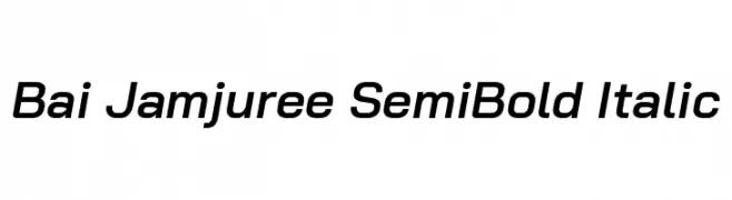
( Copyright 2018 Bai Jamjuree (https://github.com/cadsondemak/Bai-Jamjuree) )
A modern, semi-bold italic sans-serif font with smooth strokes and medium contrast.
![Bai Jamjuree SemiBold Italic Frei Schriftart Herunterladen]() Herunterladen 274 Downloads@WebFont
Herunterladen 274 Downloads@WebFont -
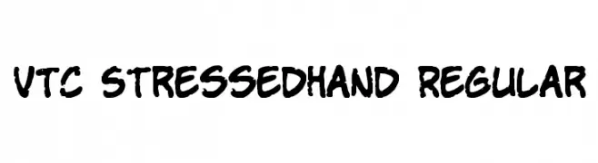
![VTC StressedHand Regular Frei Schriftart Herunterladen]() Herunterladen 274 Downloads@WebFont
Herunterladen 274 Downloads@WebFont -
![Floral 2 Frei Schriftart Herunterladen]() Herunterladen 274 Downloads@WebFont
Herunterladen 274 Downloads@WebFont -
( گالری فانت فارسی پژوهش آريانا - only compatible with Farsi and Arabic )
A bold, geometric font with a modern and impactful design.
![Zan Frei Schriftart Herunterladen]() Herunterladen 274 Downloads@WebFont
Herunterladen 274 Downloads@WebFont -
-
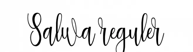
( Rahmat Hidayat )
An elegant, flowing script font with intricate loops and slender letterforms.
![Salwa reguler Frei Schriftart Herunterladen]() Herunterladen 274 Downloads@WebFont
Herunterladen 274 Downloads@WebFont -
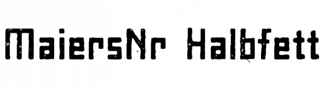
![MaiersNr8-Halbfett Frei Schriftart Herunterladen]() Herunterladen 274 Downloads@WebFont
Herunterladen 274 Downloads@WebFont -
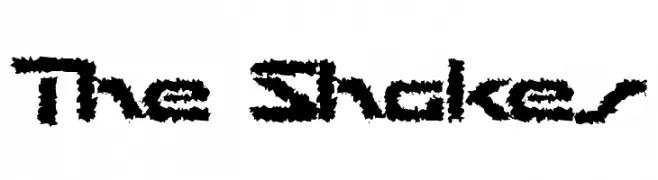
![The Shakes Frei Schriftart Herunterladen]() Herunterladen 274 Downloads@WebFont
Herunterladen 274 Downloads@WebFont -
( Fonts by Balpirick Studio - https://www.creativefabrica.com/designer/balpirick/ref/308299/ - Personal-use only. For commercial use please contact owner. )
A playful, hand-drawn font with a chalk-like, informal style.
![Chalkier Frei Schriftart Herunterladen]() Herunterladen 274 Downloads@WebFont
Herunterladen 274 Downloads@WebFont -
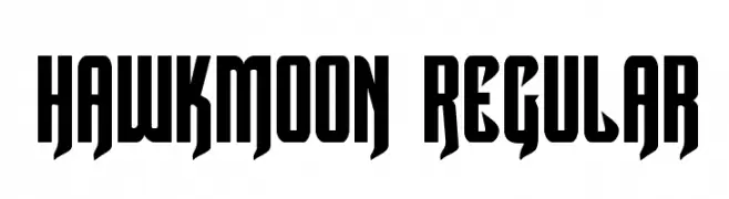
( Fonts by Daniel Zadorozny - www.iconian.com - Free for personal use )
A bold, geometric font with tall, narrow characters and sharp angles.
![Hawkmoon Regular Frei Schriftart Herunterladen]() Herunterladen 274 Downloads@WebFont
Herunterladen 274 Downloads@WebFont


Welche Schriften sind gerade am populärsten?
Poppins, Roboto, Montserrat, Open Sans und Lato sind wegen ihrer klaren Formen und breiten Einsetzbarkeit sehr gefragt – von Markenauftritt über Landingpages bis hin zu Postern.
Welche Fonts eignen sich für Logos?
Geometrische Sans‑Serifs (z. B. Poppins, Familien im Gotham‑Stil) sind ein häufiger Griff für sauberes, skalierbares Branding. Für eine persönlichere Note bleiben Scripts und Handschrift‑Stile beliebt. Kombinieren Sie einen prägnanten Headline‑Font mit einer neutralen Brotschrift für Wiedererkennung und Harmonie.
Wie oft wird die Top‑Liste aktualisiert?
Regelmäßig – basierend auf realen Downloads und Interaktionen. Schauen Sie öfter vorbei, um aufstrebende Favoriten früh zu entdecken.
💡 Tipp: Seite bookmarken – Trends wechseln schnell, und heutige Top‑Schriften inspirieren morgen vielleicht das Rebranding.