Willkommen bei den Top‑Schriften – hier treffen Beliebtheit und Qualität aufeinander. Das sind die in diesem Jahr am häufigsten heruntergeladenen und genutzten Fonts. Wenn Sie sichere Optionen für Logo, Web oder Social suchen, starten Sie hier.
Jeder Top‑Font überzeugt durch Balance, Lesbarkeit und Vielseitigkeit. Sie finden moderne Sans‑Serifs, elegante Scripts, Vintage‑Serifs und minimalistische Displays.
-
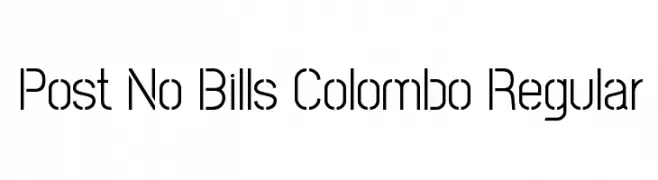
( Copyright (c) 2013-2015 Post No Bills Project Authors (https://github.com/mooniak/post-no-bills-font). )
A modern, geometric sans-serif font with clean lines and uniform stroke width.
 Herunterladen 273 Downloads@WebFont
 -
![PAC-12 Frei Schriftart Herunterladen]() Herunterladen 273 Downloads@WebFont
Herunterladen 273 Downloads@WebFont -
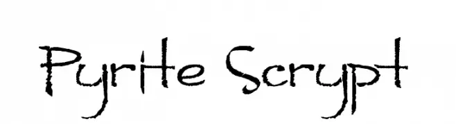
( Fonts by Andrew Hart - dirt2.com )
A hand-drawn, textured font with a dynamic and artistic style.
![Pyrite Scrypt Frei Schriftart Herunterladen]() Herunterladen 273 Downloads@WebFont
Herunterladen 273 Downloads@WebFont -
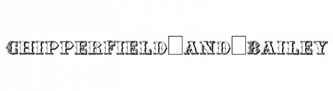
( Fonts by Paul Lloyd )
An ornate and decorative font with intricate detailing and vintage elegance.
![Chipperfield_and_Bailey Frei Schriftart Herunterladen]() Herunterladen 273 Downloads
Herunterladen 273 Downloads -
![Trio Frei Schriftart Herunterladen]() Herunterladen 273 Downloads@WebFont
Herunterladen 273 Downloads@WebFont -
-
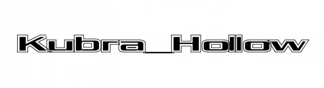
![Kubra_Hollow Frei Schriftart Herunterladen]() Herunterladen 273 Downloads@WebFont
Herunterladen 273 Downloads@WebFont -
( Fonts by Situjuh Nazara - 7ntypes.com - Personal-use only. For commercial use please contact owner. )
A smooth, rounded, light italic font with excellent readability and a modern feel.
![Robaga Rounded Light Italic Frei Schriftart Herunterladen]() Herunterladen 273 Downloads@WebFont
Herunterladen 273 Downloads@WebFont -
( Fonts by Khurasan )
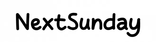
A playful, rounded handwritten font with smooth curves and consistent stroke width.
![Next Sunday Frei Schriftart Herunterladen]() Herunterladen 273 Downloads@WebFont
Herunterladen 273 Downloads@WebFont -
( Fonts by Chequered Ink )
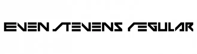
A bold, geometric font with a futuristic and angular design.
![Even Stevens Regular Frei Schriftart Herunterladen]() Herunterladen 273 Downloads@WebFont
Herunterladen 273 Downloads@WebFont -
( Fonts by Darrell Flood - Personal-use only. For commercial use please contact owner. )
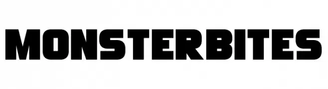
A bold, blocky font with a modern, industrial style.
![Monster Bites Frei Schriftart Herunterladen]() Herunterladen 273 Downloads@WebFont
Herunterladen 273 Downloads@WebFont


Welche Schriften sind gerade am populärsten?
Poppins, Roboto, Montserrat, Open Sans und Lato sind wegen ihrer klaren Formen und breiten Einsetzbarkeit sehr gefragt – von Markenauftritt über Landingpages bis hin zu Postern.
Welche Fonts eignen sich für Logos?
Geometrische Sans‑Serifs (z. B. Poppins, Familien im Gotham‑Stil) sind ein häufiger Griff für sauberes, skalierbares Branding. Für eine persönlichere Note bleiben Scripts und Handschrift‑Stile beliebt. Kombinieren Sie einen prägnanten Headline‑Font mit einer neutralen Brotschrift für Wiedererkennung und Harmonie.
Wie oft wird die Top‑Liste aktualisiert?
Regelmäßig – basierend auf realen Downloads und Interaktionen. Schauen Sie öfter vorbei, um aufstrebende Favoriten früh zu entdecken.
💡 Tipp: Seite bookmarken – Trends wechseln schnell, und heutige Top‑Schriften inspirieren morgen vielleicht das Rebranding.