Willkommen bei den Top‑Schriften – hier treffen Beliebtheit und Qualität aufeinander. Das sind die in diesem Jahr am häufigsten heruntergeladenen und genutzten Fonts. Wenn Sie sichere Optionen für Logo, Web oder Social suchen, starten Sie hier.
Jeder Top‑Font überzeugt durch Balance, Lesbarkeit und Vielseitigkeit. Sie finden moderne Sans‑Serifs, elegante Scripts, Vintage‑Serifs und minimalistische Displays.
-
( Copyright (c) 2010, Kimberly Geswein (kimberlygeswein.com) )
A playful, casual handwritten font with fluid and dynamic strokes.
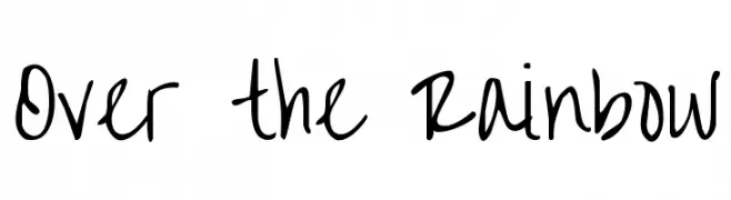 Herunterladen 1060 Downloads@WebFont
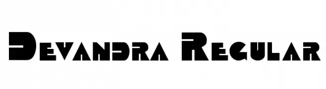
 -
![Devandra Regular Frei Schriftart Herunterladen]() Herunterladen 1060 Downloads@WebFont
Herunterladen 1060 Downloads@WebFont -
( Fonts by Have Fun with Fonts )
A decorative font inspired by traditional Chinese dragons, featuring intricate and bold designs.
![HFF Chinese Dragon Frei Schriftart Herunterladen]() Herunterladen 1060 Downloads@WebFont
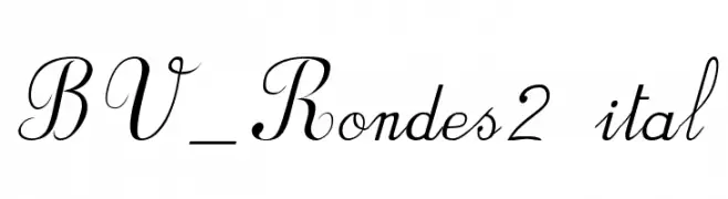
Herunterladen 1060 Downloads@WebFont -
![BV_Rondes2 ital Frei Schriftart Herunterladen]() Herunterladen 1060 Downloads@WebFont
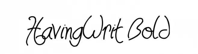
Herunterladen 1060 Downloads@WebFont -
![HavingWrit Bold Frei Schriftart Herunterladen]() Herunterladen 1060 Downloads@WebFont
Herunterladen 1060 Downloads@WebFont -
-
![Thorne Normal Frei Schriftart Herunterladen]() Herunterladen 1060 Downloads@WebFont
Herunterladen 1060 Downloads@WebFont -
![Parafuse Ultra Black Frei Schriftart Herunterladen]() Herunterladen 1060 Downloads@WebFont
Herunterladen 1060 Downloads@WebFont -
( Fonts by Rick Mueller )
A bold, retro font with playful curves and a 1960s vibe.
![Sixties Frei Schriftart Herunterladen]() Herunterladen 1060 Downloads@WebFont
Herunterladen 1060 Downloads@WebFont -
![8-bit Limit O BRK Frei Schriftart Herunterladen]() Herunterladen 1060 Downloads@WebFont
Herunterladen 1060 Downloads@WebFont -
![Jerash Demo Frei Schriftart Herunterladen]() Herunterladen 1060 Downloads@WebFont
Herunterladen 1060 Downloads@WebFont -
![SCRIPT 9 Frei Schriftart Herunterladen]() Herunterladen 1060 Downloads@WebFont
Herunterladen 1060 Downloads@WebFont -
![Terpsichore!]() Herunterladen 1060 Downloads@WebFont
Herunterladen 1060 Downloads@WebFont -
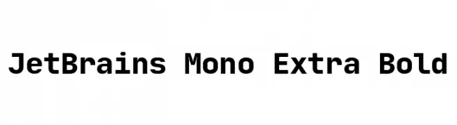
( Fonts by Philipp Nurullin )
A bold, monospaced font ideal for coding with clear, geometric characters.
![JetBrains Mono Extra Bold Frei Schriftart Herunterladen]() Herunterladen 1059 Downloads@WebFont
Herunterladen 1059 Downloads@WebFont -
( Fonts by Zamroni Hamzah )
A bold, playful font with rounded edges and a slightly condensed style.
![Wonder Boys Frei Schriftart Herunterladen]() Herunterladen 1059 Downloads@WebFont
Herunterladen 1059 Downloads@WebFont -
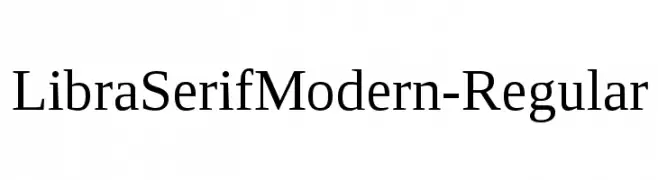
( Fonts by Stefan Peev, Context Ltd - Personal-use only. For commercial use please contact owner. )
A refined serif font with balanced proportions and classic elegance.
![LibraSerifModern-Regular Frei Schriftart Herunterladen]() Herunterladen 1059 Downloads@WebFont
Herunterladen 1059 Downloads@WebFont -
( Lloyd Garmadon Studios - ninjago-chronicles.blogspot.ro )
A bold, geometric font with strong, consistent strokes and modern appeal.
![Kunoichi Frei Schriftart Herunterladen]() Herunterladen 1059 Downloads@WebFont
Herunterladen 1059 Downloads@WebFont -
( Fonts by www.gliphmaker.com. Personal-use only. For commercial use please contact owner. )
A bold, angular serif font with a striking and edgy design.
![Antract Frei Schriftart Herunterladen]() Herunterladen 1059 Downloads@WebFont
Herunterladen 1059 Downloads@WebFont -
( Fonts by junkohanhero )
A bold, distressed grunge font with a rugged, worn-out appearance.
![Burn out, fade away Frei Schriftart Herunterladen]() Herunterladen 1059 Downloads@WebFont
Herunterladen 1059 Downloads@WebFont -
( Fonts by Castcraft Software - opti.netii.net - check the website before use )
A classic serif font with elegant, flowing lines and medium contrast.
![OPTIDelphin-One Frei Schriftart Herunterladen]() Herunterladen 1059 Downloads@WebFont
Herunterladen 1059 Downloads@WebFont -
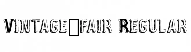
![Vintage_fair Regular Frei Schriftart Herunterladen]() Herunterladen 1059 Downloads@WebFont
Herunterladen 1059 Downloads@WebFont -
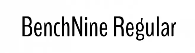
( Copyright (c) 2012, vernon adams (vern@newtypography.co.uk), with Reserved Font Name 'BenchNine'. )
A modern, clean sans-serif font with a slightly condensed style.
![BenchNine Regular Frei Schriftart Herunterladen]() Herunterladen 1059 Downloads@WebFont
Herunterladen 1059 Downloads@WebFont -
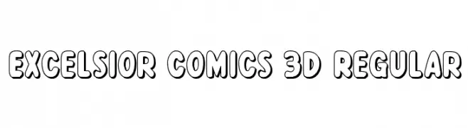
( Fonts by Daniel Zadorozny - www.iconian.com - Free for personal use )
A bold, 3D comic-style font with playful, rounded characters.
![Excelsior Comics 3D Regular Frei Schriftart Herunterladen]() Herunterladen 1059 Downloads@WebFont
Herunterladen 1059 Downloads@WebFont -
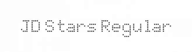
( Fonts by Jecko Development - www.jeckodevelopment.com )
A decorative font composed of star-shaped characters, perfect for playful and themed designs.
![JD Stars Regular Frei Schriftart Herunterladen]() Herunterladen 1059 Downloads@WebFont
Herunterladen 1059 Downloads@WebFont -
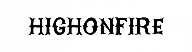
( Fonts by billyargel.blogspot.com - Billy Argel )
A bold, gothic-inspired font with sharp, angular edges and intricate details.
![HIGHONFIRE Frei Schriftart Herunterladen]() Herunterladen 1059 Downloads@WebFont
Herunterladen 1059 Downloads@WebFont -
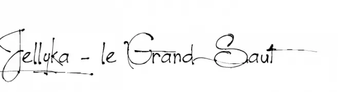
( Fonts are free for a personal use only - www.cuttyfruty.com )
A whimsical, decorative script font with intricate swirls and loops.
![Jellyka - le Grand Saut Frei Schriftart Herunterladen]() Herunterladen 1059 Downloads@WebFont
Herunterladen 1059 Downloads@WebFont -
![Candela Book Frei Schriftart Herunterladen]() Herunterladen 1059 Downloads@WebFont
Herunterladen 1059 Downloads@WebFont -
( Fonts by Sinister Visions - Chad Savage - www.sinisterfonts.com )
A dramatic, gothic-style font with sharp, angular lines and intricate design.
![Sanctuary Frei Schriftart Herunterladen]() Herunterladen 1059 Downloads@WebFont
Herunterladen 1059 Downloads@WebFont -
![Saccule Frei Schriftart Herunterladen]() Herunterladen 1059 Downloads@WebFont
Herunterladen 1059 Downloads@WebFont -
( Fonts by Galdino Otten Fonts - www.galdinootten.com - Personal-use only. For commercial use please contact owner. )
A playful, hand-drawn font with a doodle-like, energetic style.
![Riscada Doodle Frei Schriftart Herunterladen]() Herunterladen 1058 Downloads@WebFont
Herunterladen 1058 Downloads@WebFont -
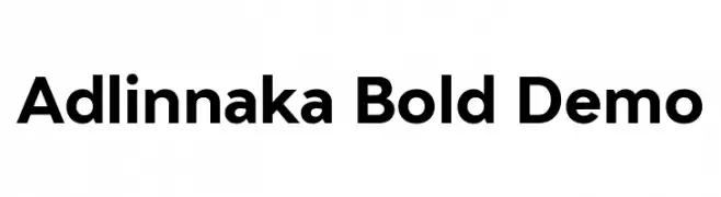
( Fonts by Harmnessless Type - Personal-use only. For commercial use please contact owner. )
A bold, modern sans-serif font with clean lines and strong presence.
![Adlinnaka Bold Demo Frei Schriftart Herunterladen]() Herunterladen 1058 Downloads@WebFont
Herunterladen 1058 Downloads@WebFont -
( Fonts by Ahmad Syarif Afandi - https://delapan.studio - Personal-use only. For commercial use please contact owner. )
A playful, rounded font with a hand-drawn, whimsical style.
![Jojoba Frei Schriftart Herunterladen]() Herunterladen 1058 Downloads@WebFont
Herunterladen 1058 Downloads@WebFont -
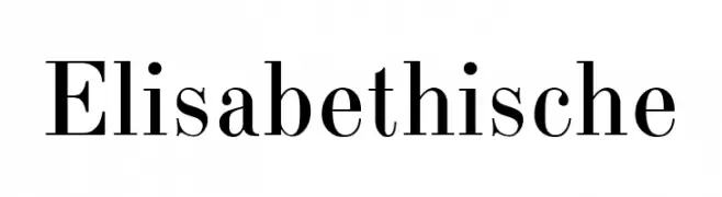
( Fonts by Oleg Matison - Personal-use only. For commercial use please contact owner. )
A classic serif font with high contrast and elegant, bracketed serifs.
![Elisabethische Frei Schriftart Herunterladen]() Herunterladen 1058 Downloads@WebFont
Herunterladen 1058 Downloads@WebFont -
( Fonts by Octotype - www.foundmyfont.com - Personal-use only. For commercial use please contact owner. )
A cursive, elegant font with a classic calligraphic style.
![Beauty and the Dutch Frei Schriftart Herunterladen]() Herunterladen 1058 Downloads@WebFont
Herunterladen 1058 Downloads@WebFont -
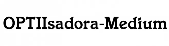
( Fonts by Castcraft Software - opti.netii.net - check the website before use )
A classic serif font with medium weight and pronounced serifs, offering a blend of tradition and modernity.
![OPTIIsadora-Medium Frei Schriftart Herunterladen]() Herunterladen 1058 Downloads@WebFont
Herunterladen 1058 Downloads@WebFont -
![Japanese Tourist Frei Schriftart Herunterladen]() Herunterladen 1058 Downloads@WebFont
Herunterladen 1058 Downloads@WebFont


Welche Schriften sind gerade am populärsten?
Poppins, Roboto, Montserrat, Open Sans und Lato sind wegen ihrer klaren Formen und breiten Einsetzbarkeit sehr gefragt – von Markenauftritt über Landingpages bis hin zu Postern.
Welche Fonts eignen sich für Logos?
Geometrische Sans‑Serifs (z. B. Poppins, Familien im Gotham‑Stil) sind ein häufiger Griff für sauberes, skalierbares Branding. Für eine persönlichere Note bleiben Scripts und Handschrift‑Stile beliebt. Kombinieren Sie einen prägnanten Headline‑Font mit einer neutralen Brotschrift für Wiedererkennung und Harmonie.
Wie oft wird die Top‑Liste aktualisiert?
Regelmäßig – basierend auf realen Downloads und Interaktionen. Schauen Sie öfter vorbei, um aufstrebende Favoriten früh zu entdecken.
💡 Tipp: Seite bookmarken – Trends wechseln schnell, und heutige Top‑Schriften inspirieren morgen vielleicht das Rebranding.