Willkommen bei den Top‑Schriften – hier treffen Beliebtheit und Qualität aufeinander. Das sind die in diesem Jahr am häufigsten heruntergeladenen und genutzten Fonts. Wenn Sie sichere Optionen für Logo, Web oder Social suchen, starten Sie hier.
Jeder Top‑Font überzeugt durch Balance, Lesbarkeit und Vielseitigkeit. Sie finden moderne Sans‑Serifs, elegante Scripts, Vintage‑Serifs und minimalistische Displays.
-
 Herunterladen 996 Downloads@WebFont
 -
( Fonts by Jovanny Lemonad - typetype.ru - Personal-use only. For commercial use please contact owner. )
A rugged, textured font with an inline style and vintage appeal.
![LumberjackInlineRough Frei Schriftart Herunterladen]() Herunterladen 996 Downloads@WebFont
Herunterladen 996 Downloads@WebFont -
( Fonts by a Typeface Leone - www.tipografialeone.net. Personal-use only. For commercial use please contact owner. )
A bold, modern sans-serif font with clean lines and geometric shapes.
![Signoria Bold Frei Schriftart Herunterladen]() Herunterladen 996 Downloads@WebFont
Herunterladen 996 Downloads@WebFont -
( Fonts by Style-7 - www.styleseven.com - Personal-use only. For commercial use please contact owner. )
A pixelated, monospaced font with a retro digital aesthetic.
![Smallest Pixel-7 Frei Schriftart Herunterladen]() Herunterladen 996 Downloads@WebFont
Herunterladen 996 Downloads@WebFont -
( Copyright (c) 2014, Indian Type Foundry (info@indiantypefoundry.com). )
A modern serif typeface with balanced proportions and elegant curves.
![Karma Regular Frei Schriftart Herunterladen]() Herunterladen 996 Downloads@WebFont
Herunterladen 996 Downloads@WebFont -
-
( Fonts by www.TomzWeb.com - Thomas E. Harvey - NOT free - Commercial use requires license )
A bold, rounded font with a playful and friendly appearance.
![Rhinofon Normal Frei Schriftart Herunterladen]() Herunterladen 996 Downloads@WebFont
Herunterladen 996 Downloads@WebFont -
( Fonts by Kreative Korporation - www.kreativekorp.com - personal use only )
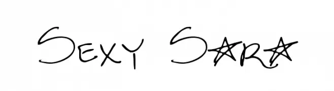
A playful handwritten font with dynamic strokes and decorative elements.
![Sexy Sara Frei Schriftart Herunterladen]() Herunterladen 996 Downloads@WebFont
Herunterladen 996 Downloads@WebFont -
( Fonts by ShyFonts )
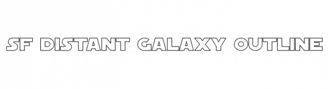
A bold, geometric outline font with a futuristic, sci-fi aesthetic.
![SF Distant Galaxy Outline Frei Schriftart Herunterladen]() Herunterladen 996 Downloads@WebFont
Herunterladen 996 Downloads@WebFont -
( Fonts by David Rakowski )
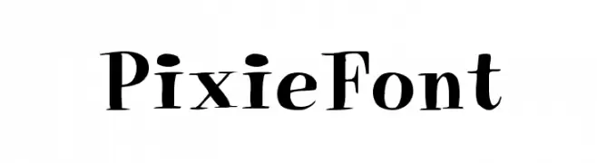
A whimsical and decorative serif font with playful serifs and dynamic strokes.
![PixieFont Frei Schriftart Herunterladen]() Herunterladen 996 Downloads
Herunterladen 996 Downloads -
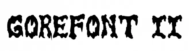
![GoreFont II Frei Schriftart Herunterladen]() Herunterladen 996 Downloads@WebFont
Herunterladen 996 Downloads@WebFont -
( Fonts by www.DigitalDreamDesign.net )
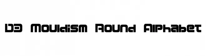
A bold, geometric font with rounded edges and a modern, futuristic style.
![D3 Mouldism Round Alphabet Frei Schriftart Herunterladen]() Herunterladen 996 Downloads@WebFont
Herunterladen 996 Downloads@WebFont -
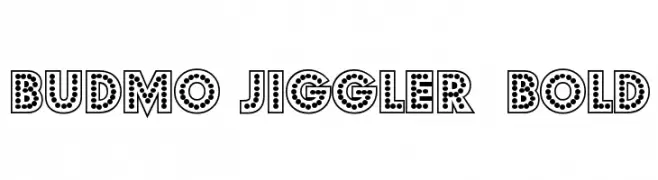
![Budmo Jiggler Bold Frei Schriftart Herunterladen]() Herunterladen 996 Downloads@WebFont
Herunterladen 996 Downloads@WebFont -
( Fonts by Emerald City Fontwerks )
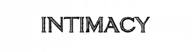
A playful, hand-drawn font with a sketch-like, whimsical appearance.
![intimacy Frei Schriftart Herunterladen]() Herunterladen 996 Downloads@WebFont
Herunterladen 996 Downloads@WebFont -
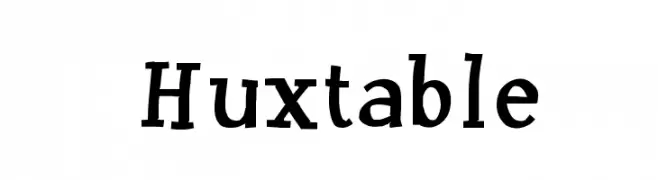
![Huxtable Frei Schriftart Herunterladen]() Herunterladen 996 Downloads@WebFont
Herunterladen 996 Downloads@WebFont -
( Fonts by Darrell Flood - Personal-use only. For commercial use please contact owner. )
A futuristic, geometric font with clean lines and squared edges.
![Robot Dreamer Frei Schriftart Herunterladen]() Herunterladen 995 Downloads@WebFont
Herunterladen 995 Downloads@WebFont -
( Fonts by wep )
A bold, playful handwritten font with thick, rounded strokes.
![Damel Frei Schriftart Herunterladen]() Herunterladen 995 Downloads@WebFont
Herunterladen 995 Downloads@WebFont -
( Copyright 2019 The Tomorrow Project Authors (github.com/MonicaRizzolli/Tomorrow) )
A bold, geometric font with a modern and impactful style.
![Tomorrow ExtraBold Frei Schriftart Herunterladen]() Herunterladen 995 Downloads@WebFont
Herunterladen 995 Downloads@WebFont -
Schriftart von HammerBro101. For commercial use please contact the owner.
![CarbonThin W00 Regular Frei Schriftart Herunterladen]() Herunterladen 995 Downloads@WebFont
Herunterladen 995 Downloads@WebFont -
( Copyright 2017 The Inria Sans Project Authors (https://github.com/BlackFoundryCom/InriaFonts) )
A bold, modern sans-serif font with excellent readability and versatility.
![Inria Sans Bold Frei Schriftart Herunterladen]() Herunterladen 995 Downloads@WebFont
Herunterladen 995 Downloads@WebFont -
( Roger White - web.archive.org/web/20120416090521/www.rogersfonts.org.uk/ )
An elegant script font with intricate loops and flourishes.
![Hanford Script Frei Schriftart Herunterladen]() Herunterladen 995 Downloads@WebFont
Herunterladen 995 Downloads@WebFont -
( Cotbada Studio - Isfani - creativemarket.com/Cotbada_studio )
A modern handwritten font with elegant, fluid strokes and a cursive style.
![Dhanikans Signature Regular Frei Schriftart Herunterladen]() Herunterladen 995 Downloads@WebFont
Herunterladen 995 Downloads@WebFont -
( Fonts by Zetafonts )
A bold, high-contrast serif font with strong, elegant strokes.
![Morbodoni Frei Schriftart Herunterladen]() Herunterladen 995 Downloads@WebFont
Herunterladen 995 Downloads@WebFont -
![Anitype Journal 3 Frei Schriftart Herunterladen]() Herunterladen 995 Downloads@WebFont
Herunterladen 995 Downloads@WebFont -
( Copyright 2016 The Rounded M+ Project Authors. )
A modern, rounded typeface with a clean and friendly appearance.
![Rounded Mplus 1c Light Frei Schriftart Herunterladen]() Herunterladen 995 Downloads@WebFont
Herunterladen 995 Downloads@WebFont -
![AishaScript Frei Schriftart Herunterladen]() Herunterladen 995 Downloads@WebFont
Herunterladen 995 Downloads@WebFont -
( Fonts by Daniel Zadorozny - www.iconian.com )
A bold, geometric font with an expanded width and modern style.
![Grand National Expanded Frei Schriftart Herunterladen]() Herunterladen 995 Downloads@WebFont
Herunterladen 995 Downloads@WebFont -
( Copyright (c) 2014, Indian Type Foundry (info@indiantypefoundry.com). )
A bold, geometric font with strong, thick strokes and a modern aesthetic.
![Sarpanch ExtraBold Frei Schriftart Herunterladen]() Herunterladen 995 Downloads@WebFont
Herunterladen 995 Downloads@WebFont -
![Cybertron Bold Italic Frei Schriftart Herunterladen]() Herunterladen 995 Downloads@WebFont
Herunterladen 995 Downloads@WebFont -
( Fonts by Castcraft Software - opti.netii.net - check the website before use )
A bold, medieval-inspired font with sharp serifs and a modern touch.
![OPTIFurst-Bold Frei Schriftart Herunterladen]() Herunterladen 995 Downloads@WebFont
Herunterladen 995 Downloads@WebFont -
( Free - www.alphabetype.it )
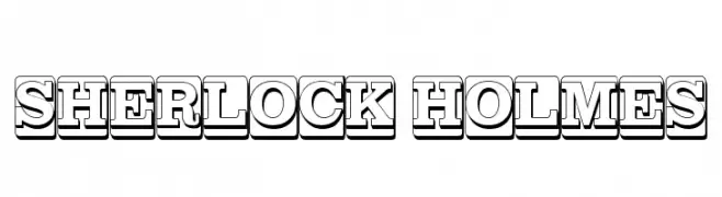
A bold, three-dimensional font with a shadowed effect, ideal for vintage-themed projects.
![SHERLOCK HOLMES Frei Schriftart Herunterladen]() Herunterladen 995 Downloads@WebFont
Herunterladen 995 Downloads@WebFont -
![Post-it Penscript Frei Schriftart Herunterladen]() Herunterladen 995 Downloads@WebFont
Herunterladen 995 Downloads@WebFont -
![n0rpicons2 Frei Schriftart Herunterladen]() Herunterladen 995 Downloads@WebFont
Herunterladen 995 Downloads@WebFont -
( Fonts by Spork Thug Typography - Josh Wilhelm - www.lifewithouttaffy.com/taffy/blog )
A playful, bold font with irregular patterns and a hand-drawn style.
![Bunker Frei Schriftart Herunterladen]() Herunterladen 995 Downloads@WebFont
Herunterladen 995 Downloads@WebFont -
( Fonts by Daniel Zadorozny - www.iconian.com - Free for personal use )
A bold, geometric font with a futuristic and modern aesthetic.
![voxBOX Frei Schriftart Herunterladen]() Herunterladen 995 Downloads
Herunterladen 995 Downloads -
( Fonts by Florian Karsten )
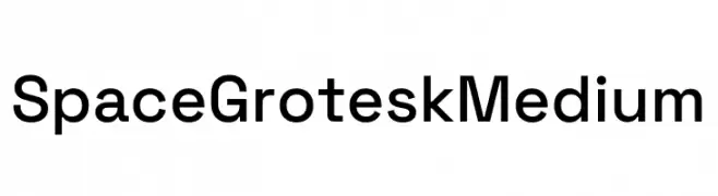
A modern, geometric sans-serif font with a clean and balanced design.
![Space Grotesk Medium Frei Schriftart Herunterladen]() Herunterladen 994 Downloads@WebFont
Herunterladen 994 Downloads@WebFont


Welche Schriften sind gerade am populärsten?
Poppins, Roboto, Montserrat, Open Sans und Lato sind wegen ihrer klaren Formen und breiten Einsetzbarkeit sehr gefragt – von Markenauftritt über Landingpages bis hin zu Postern.
Welche Fonts eignen sich für Logos?
Geometrische Sans‑Serifs (z. B. Poppins, Familien im Gotham‑Stil) sind ein häufiger Griff für sauberes, skalierbares Branding. Für eine persönlichere Note bleiben Scripts und Handschrift‑Stile beliebt. Kombinieren Sie einen prägnanten Headline‑Font mit einer neutralen Brotschrift für Wiedererkennung und Harmonie.
Wie oft wird die Top‑Liste aktualisiert?
Regelmäßig – basierend auf realen Downloads und Interaktionen. Schauen Sie öfter vorbei, um aufstrebende Favoriten früh zu entdecken.
💡 Tipp: Seite bookmarken – Trends wechseln schnell, und heutige Top‑Schriften inspirieren morgen vielleicht das Rebranding.