Willkommen bei den Top‑Schriften – hier treffen Beliebtheit und Qualität aufeinander. Das sind die in diesem Jahr am häufigsten heruntergeladenen und genutzten Fonts. Wenn Sie sichere Optionen für Logo, Web oder Social suchen, starten Sie hier.
Jeder Top‑Font überzeugt durch Balance, Lesbarkeit und Vielseitigkeit. Sie finden moderne Sans‑Serifs, elegante Scripts, Vintage‑Serifs und minimalistische Displays.
-
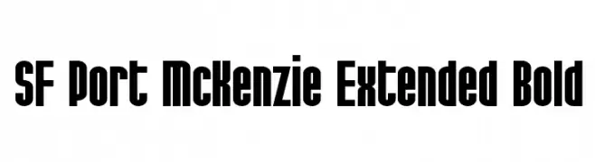
( Fonts by ShyFonts )
A bold, extended font with a strong, geometric design for impactful text.
 Herunterladen 995 Downloads@WebFont
 -
( Fonts by Daniel Zadorozny - www.iconian.com - Free for personal use )
A bold, geometric font with a futuristic and modern aesthetic.
![voxBOX Frei Schriftart Herunterladen]() Herunterladen 995 Downloads
Herunterladen 995 Downloads -
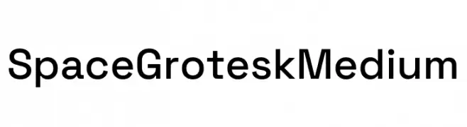
( Fonts by Florian Karsten )
A modern, geometric sans-serif font with a clean and balanced design.
![Space Grotesk Medium Frei Schriftart Herunterladen]() Herunterladen 994 Downloads@WebFont
Herunterladen 994 Downloads@WebFont -
( Fonts by MJType )
A bold, rounded font with a playful and friendly style.
![DAYSANS Frei Schriftart Herunterladen]() Herunterladen 994 Downloads@WebFont
Herunterladen 994 Downloads@WebFont -
( Fonts by wep - Wahyu Eka Prasetya - Personal-use only. For commercial use please contact owner. )
A modern, rounded font with a clean and approachable style.
![Benmono Liane Frei Schriftart Herunterladen]() Herunterladen 994 Downloads@WebFont
Herunterladen 994 Downloads@WebFont -
-
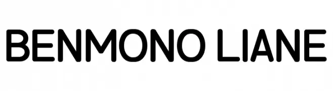
( Fonts by Small Voice Studio - smallvoice.studio/typefaces - Personal-use only. For commercial use please contact owner. )
A modern, condensed sans-serif font with uniform stroke width and excellent readability.
![CrucifixSansOne Condensed Frei Schriftart Herunterladen]() Herunterladen 994 Downloads@WebFont
Herunterladen 994 Downloads@WebFont -
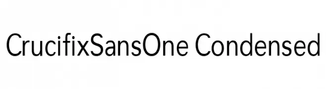
( Fonts by Vernon Adams - Personal-use only. For commercial use please contact owner. )
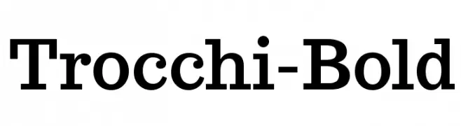
A bold serif font with strong vertical strokes and slightly curved serifs.
![Trocchi-Bold Frei Schriftart Herunterladen]() Herunterladen 994 Downloads@WebFont
Herunterladen 994 Downloads@WebFont -
( Iconian Fonts - Daniel Zadorozny - www.iconian.com )
A bold, modern font with wide, slanted characters and a dynamic style.
![Soloist Expanded Frei Schriftart Herunterladen]() Herunterladen 994 Downloads@WebFont
Herunterladen 994 Downloads@WebFont -
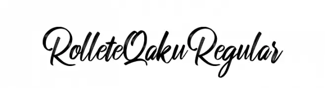
![RolleteQaku-Regular Frei Schriftart Herunterladen]() Herunterladen 994 Downloads@WebFont
Herunterladen 994 Downloads@WebFont -
( Fonts by mjanetmars.com - Personal-use only. For commercial use please contact owner. )
A bold, geometric font with a modern and impactful design.
![MSU1 Frei Schriftart Herunterladen]() Herunterladen 994 Downloads@WebFont
Herunterladen 994 Downloads@WebFont -
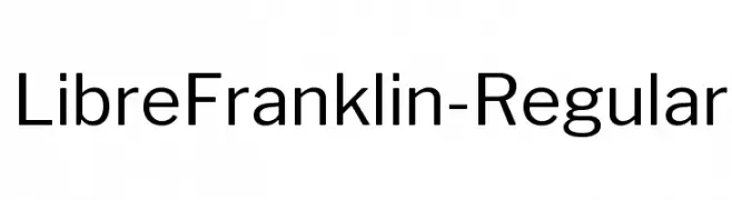
( Copyright (c) 2015, Impallari Type (www.impallari.com) )
A modern, geometric sans-serif font with balanced proportions and clear legibility.
![LibreFranklin-Regular Frei Schriftart Herunterladen]() Herunterladen 994 Downloads@WebFont
Herunterladen 994 Downloads@WebFont -
![Means Frei Schriftart Herunterladen]() Herunterladen 994 Downloads@WebFont
Herunterladen 994 Downloads@WebFont -
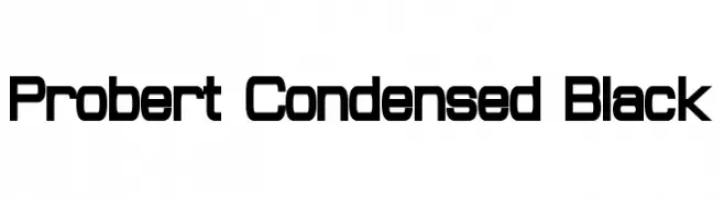
( Fonts by a Neale Davidson - www.pixelsagas.com. Personal-use only. For commercial use please contact owner. )
A bold, condensed font with a modern, geometric style.
![Probert Condensed Black Frei Schriftart Herunterladen]() Herunterladen 994 Downloads@WebFont
Herunterladen 994 Downloads@WebFont -
( Fonts by a Situjuh Nazara - c7n1.wordpress.com. Personal-use only. For commercial use please contact owner. )
A modern, geometric font with clean, rounded edges and consistent stroke width.
![gpkn Frei Schriftart Herunterladen]() Herunterladen 994 Downloads@WebFont
Herunterladen 994 Downloads@WebFont -
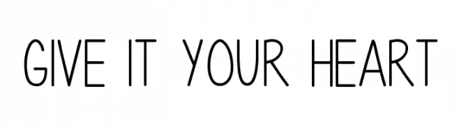
( Fonts by Vanessa Bays - bythebutterfly.com )
A playful, handwritten font with rounded, consistent strokes.
![Give It Your Heart Frei Schriftart Herunterladen]() Herunterladen 994 Downloads@WebFont
Herunterladen 994 Downloads@WebFont -
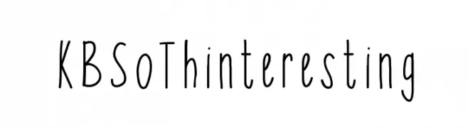
( Fonts by Khrys Bosland )
A playful, handwritten font with tall, narrow letters and a casual style.
![KBSoThinteresting Frei Schriftart Herunterladen]() Herunterladen 994 Downloads@WebFont
Herunterladen 994 Downloads@WebFont -
( Fonts by Matthew Welch - www.squaregear.net/fonts/ )
A modern, geometric sans-serif font with clean lines and balanced spacing.
![Libby Regular:Version 1.00 Frei Schriftart Herunterladen]() Herunterladen 994 Downloads@WebFont
Herunterladen 994 Downloads@WebFont -
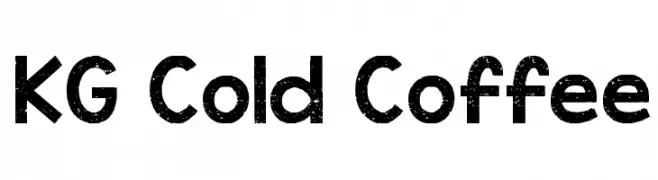
( Fonts by www.kimberlygeswein.com - Kimberly Geswein )
A bold, textured font with a vintage, playful style.
![KG Cold Coffee Frei Schriftart Herunterladen]() Herunterladen 994 Downloads@WebFont
Herunterladen 994 Downloads@WebFont -
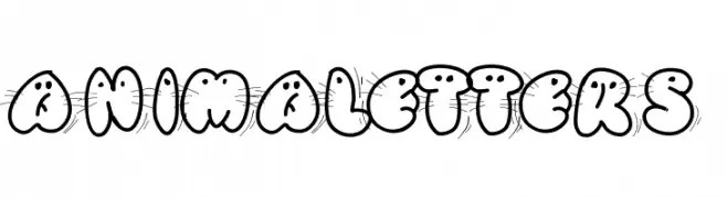
( Fonts by Peax Webdesign - www.peax-webdesign.com. Personal-use only. For commercial use please contact owner. )
A playful, animal-themed decorative font with bold outlines.
![Animaletters Frei Schriftart Herunterladen]() Herunterladen 994 Downloads@WebFont
Herunterladen 994 Downloads@WebFont -
( Public domain / GPL / OFL - jlhfonts.blogspot.com/ )
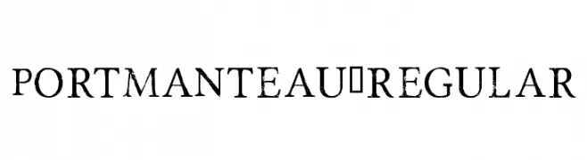
A distressed serif font with a vintage, textured appearance.
![Portmanteau-Regular Frei Schriftart Herunterladen]() Herunterladen 994 Downloads@WebFont
Herunterladen 994 Downloads@WebFont -
( Fonts by Lauren Thompson - www.nymfont.com )
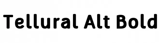
A bold, rounded sans-serif font with a modern and friendly appearance.
![Tellural Alt Bold Frei Schriftart Herunterladen]() Herunterladen 994 Downloads@WebFont
Herunterladen 994 Downloads@WebFont -
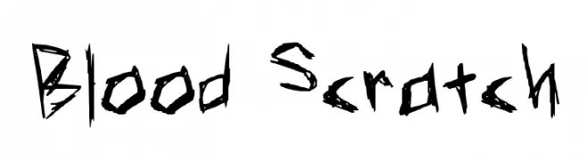
![Blood Scratch Frei Schriftart Herunterladen]() Herunterladen 994 Downloads@WebFont
Herunterladen 994 Downloads@WebFont -
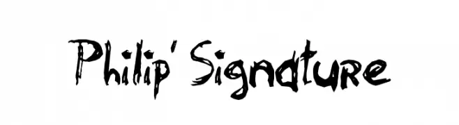
![Philip' Signature Frei Schriftart Herunterladen]() Herunterladen 994 Downloads@WebFont
Herunterladen 994 Downloads@WebFont -
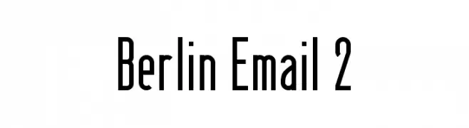
( Fonts by www.peter-wiegel.de. Personal-use only. For commercial use please contact owner. )
A tall, narrow, and modern font with a sleek and structured appearance.
![Berlin Email 2 Frei Schriftart Herunterladen]() Herunterladen 994 Downloads@WebFont
Herunterladen 994 Downloads@WebFont -
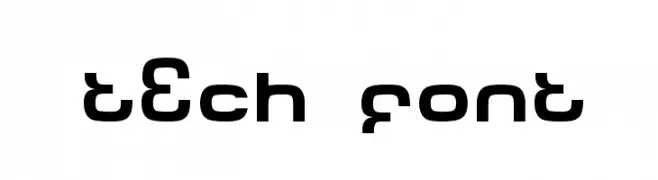
( Fonts by dustBUST - Andreas Nylin )
A futuristic and geometric font with bold, rounded letterforms and consistent stroke width.
![Tech Font Frei Schriftart Herunterladen]() Herunterladen 994 Downloads@WebFont
Herunterladen 994 Downloads@WebFont -
( Fonts by pOPdOG fONTS - Dimitris Kolyris - popdog_fonts.tripod.com Sponsoren Schriftart )
A bold, distressed font with a rugged, vintage texture.
![VIPER NORA Frei Schriftart Herunterladen]() Herunterladen 994 Downloads
Herunterladen 994 Downloads -
( Fonts by Daniel Gauthier )
A decorative font with characters designed as chain links, offering a bold and industrial look.
![ChainFontOpen Frei Schriftart Herunterladen]() Herunterladen 994 Downloads@WebFont
Herunterladen 994 Downloads@WebFont -
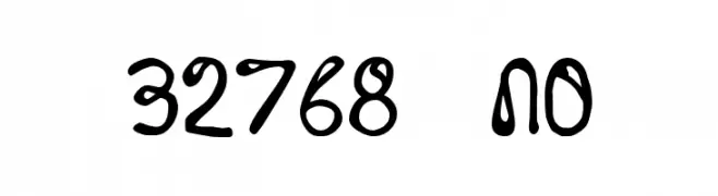
( Fonts by Divide By Zero! - fonts.tom7.com )
A playful, handwritten font with bold, rounded characters and a whimsical style.
![32768 NO Frei Schriftart Herunterladen]() Herunterladen 994 Downloads@WebFont
Herunterladen 994 Downloads@WebFont -
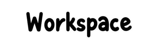
( Fonts by Mozatype )
Playful rounded sans-serif font.
![Workspace Frei Schriftart Herunterladen]() Herunterladen 993 Downloads@WebFont
Herunterladen 993 Downloads@WebFont -
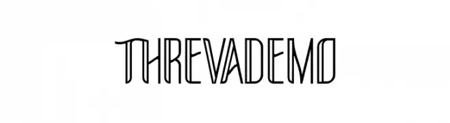
Schriftart von glyphstyle. For commercial use please contact the owner.
( NOTE: This demo font is for PERSONAL USE ONLY! But any donation are very appreciated. Paypal account for donation : https://www.paypal.me/dimasardhi full version: https://www.glyphstyle.net/threva/ contact us at styleglyph@gmail.com And follow my ins )
A modern, geometric font with a clean and professional appearance.
![THREVA Demo Frei Schriftart Herunterladen]() Herunterladen 993 Downloads@WebFont
Herunterladen 993 Downloads@WebFont -
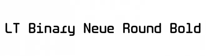
( Fonts by LyonsType )
A bold, rounded, and modern font with smooth curves and consistent stroke thickness.
![LT Binary Neue Round Bold Frei Schriftart Herunterladen]() Herunterladen 993 Downloads@WebFont
Herunterladen 993 Downloads@WebFont -
( Fonts by Zetafonts - Personal-use only. For commercial use please contact owner. )
A modern, narrow sans-serif font with clean lines and tight spacing.
![Heading Now Trial 34 Regular Frei Schriftart Herunterladen]() Herunterladen 993 Downloads@WebFont
Herunterladen 993 Downloads@WebFont -
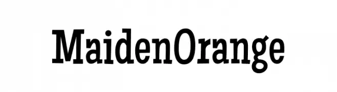
( Fonts by Astigmatic )
A bold, playful font with vintage charm and approachable characters.
![Maiden Orange Frei Schriftart Herunterladen]() Herunterladen 993 Downloads@WebFont
Herunterladen 993 Downloads@WebFont -
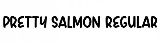
( Fonts by Niskala Huruf )
A playful, bold font with rounded edges and a hand-drawn style.
![Pretty Salmon Regular Frei Schriftart Herunterladen]() Herunterladen 993 Downloads@WebFont
Herunterladen 993 Downloads@WebFont -
( Fonts by CannotIntoSpaceFonts - KineticPlasma Fonts - Personal-use only. For commercial use please contact owner. )
A modern italic font with clean lines and dynamic slant.
![Asimov Italic Frei Schriftart Herunterladen]() Herunterladen 993 Downloads@WebFont
Herunterladen 993 Downloads@WebFont


Welche Schriften sind gerade am populärsten?
Poppins, Roboto, Montserrat, Open Sans und Lato sind wegen ihrer klaren Formen und breiten Einsetzbarkeit sehr gefragt – von Markenauftritt über Landingpages bis hin zu Postern.
Welche Fonts eignen sich für Logos?
Geometrische Sans‑Serifs (z. B. Poppins, Familien im Gotham‑Stil) sind ein häufiger Griff für sauberes, skalierbares Branding. Für eine persönlichere Note bleiben Scripts und Handschrift‑Stile beliebt. Kombinieren Sie einen prägnanten Headline‑Font mit einer neutralen Brotschrift für Wiedererkennung und Harmonie.
Wie oft wird die Top‑Liste aktualisiert?
Regelmäßig – basierend auf realen Downloads und Interaktionen. Schauen Sie öfter vorbei, um aufstrebende Favoriten früh zu entdecken.
💡 Tipp: Seite bookmarken – Trends wechseln schnell, und heutige Top‑Schriften inspirieren morgen vielleicht das Rebranding.