Willkommen bei den Top‑Schriften – hier treffen Beliebtheit und Qualität aufeinander. Das sind die in diesem Jahr am häufigsten heruntergeladenen und genutzten Fonts. Wenn Sie sichere Optionen für Logo, Web oder Social suchen, starten Sie hier.
Jeder Top‑Font überzeugt durch Balance, Lesbarkeit und Vielseitigkeit. Sie finden moderne Sans‑Serifs, elegante Scripts, Vintage‑Serifs und minimalistische Displays.
-
 Herunterladen 981 Downloads@WebFont
 -
( Fonts by Manfred Klein - manfred-klein.ina-mar.com )
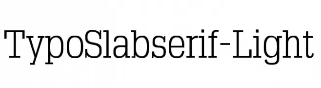
A light, elegant slab serif font with clean lines and subtle serifs.
![TypoSlabserif-Light Frei Schriftart Herunterladen]() Herunterladen 981 Downloads@WebFont
Herunterladen 981 Downloads@WebFont -
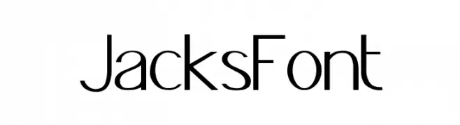
![JacksFont Frei Schriftart Herunterladen]() Herunterladen 981 Downloads@WebFont
Herunterladen 981 Downloads@WebFont -
( Fonts by www.typadelic.com )
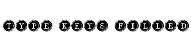
A decorative serif font with characters enclosed in circular, typewriter-style keys.
![Type Keys Filled Frei Schriftart Herunterladen]() Herunterladen 981 Downloads@WebFont
Herunterladen 981 Downloads@WebFont -
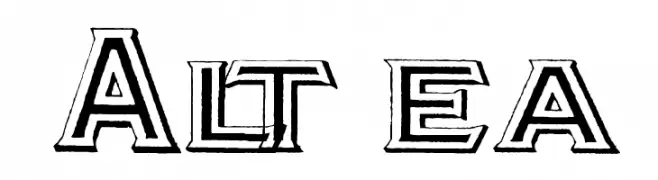
( Fonts by Paul Lloyd )
A bold, three-dimensional font with a modern yet retro flair.
![Altea Frei Schriftart Herunterladen]() Herunterladen 981 Downloads@WebFont
Herunterladen 981 Downloads@WebFont -
-
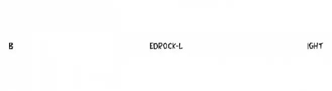
![Bedrock-Light Frei Schriftart Herunterladen]() Herunterladen 981 Downloads
Herunterladen 981 Downloads -
( Fonts by Typo World )
A decorative font with hollow, outlined characters featuring circular cutouts.
![Hollowgraphy Frei Schriftart Herunterladen]() Herunterladen 980 Downloads@WebFont
Herunterladen 980 Downloads@WebFont -
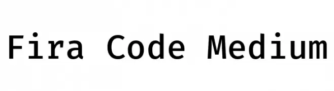
( Copyright (c) 2014, The Fira Code Project Authors (https://github.com/tonsky/FiraCode) )
A modern, monospaced font designed for clarity and readability in coding.
![Fira Code Medium Frei Schriftart Herunterladen]() Herunterladen 980 Downloads@WebFont
Herunterladen 980 Downloads@WebFont -
( mlkwsn - Malik Wisnu )
An elegant script font with flowing, interconnected letters and ornate flourishes.
![Classical Frei Schriftart Herunterladen]() Herunterladen 980 Downloads@WebFont
Herunterladen 980 Downloads@WebFont -
( Fonts by Mister Chek )
A bold, angular font with a modern Gothic influence.
![MCF krechet Frei Schriftart Herunterladen]() Herunterladen 980 Downloads@WebFont
Herunterladen 980 Downloads@WebFont -
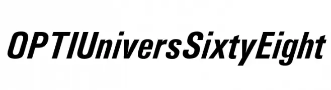
( Fonts by Castcraft Software - OPTI Fonts Archive - opti.netii.net - Personal-use only. For commercial use please contact owner. )
A bold, modern, and slightly condensed italic font with clean lines.
![OPTIUniversSixtyEight Frei Schriftart Herunterladen]() Herunterladen 980 Downloads@WebFont
Herunterladen 980 Downloads@WebFont -
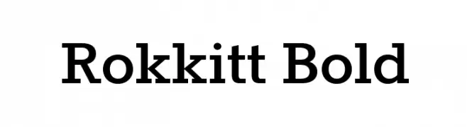
( Fonts by New Typography - Vernon Adams. Personal-use only. For commercial use please contact owner. )
A bold, slab serif typeface with strong, squared serifs and minimal contrast.
![Rokkitt Bold Frei Schriftart Herunterladen]() Herunterladen 980 Downloads@WebFont
Herunterladen 980 Downloads@WebFont -
![NVDAASDAWADIDOHI Frei Schriftart Herunterladen]() Herunterladen 980 Downloads@WebFont
Herunterladen 980 Downloads@WebFont -
( Fonts by Style-7 - www.styleseven.com - Personal-use only. For commercial use please contact owner. )
A bold, pixelated typeface inspired by retro digital displays.
![Small Bold Pixel-7 Frei Schriftart Herunterladen]() Herunterladen 980 Downloads@WebFont
Herunterladen 980 Downloads@WebFont -
( Copyright (c) 2012, Brian J. Bonislawsky DBA Astigmatic (AOETI) (astigma@astigmatic.com), with Reserved Font Names "Romanesco" )
A dynamic script font with elegant calligraphic influences and dramatic flourishes.
![Romanesco Frei Schriftart Herunterladen]() Herunterladen 980 Downloads@WebFont
Herunterladen 980 Downloads@WebFont -
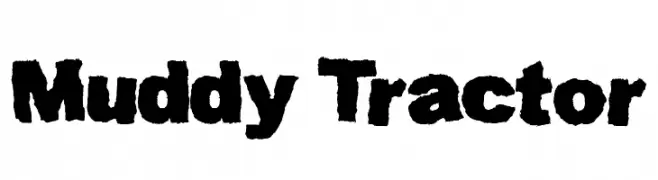
( Fonts by Kevin Christopher - www.kcfonts.com )
A bold, textured font with a rugged, organic appearance.
![Muddy Tractor Frei Schriftart Herunterladen]() Herunterladen 980 Downloads@WebFont
Herunterladen 980 Downloads@WebFont -
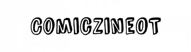
( Fonts by Blue Vinyl - Jess Latham - www.bvfonts.com )
A playful, hand-drawn comic-style font with bold outlines and irregular shapes.
![ComicZineOT Frei Schriftart Herunterladen]() Herunterladen 980 Downloads@WebFont
Herunterladen 980 Downloads@WebFont -
( Fonts by Galdino Otten - galdinootten.com )
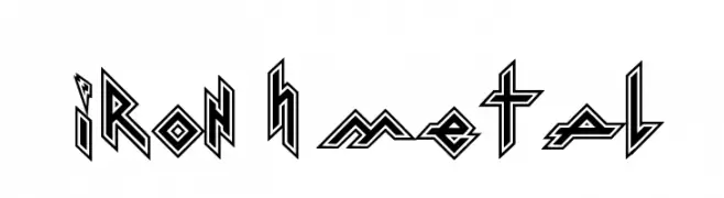
A bold, angular font with a metallic and industrial aesthetic.
![Iron H Metal Frei Schriftart Herunterladen]() Herunterladen 980 Downloads@WebFont
Herunterladen 980 Downloads@WebFont -
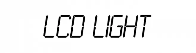
![LCD Light Frei Schriftart Herunterladen]() Herunterladen 980 Downloads@WebFont
Herunterladen 980 Downloads@WebFont -
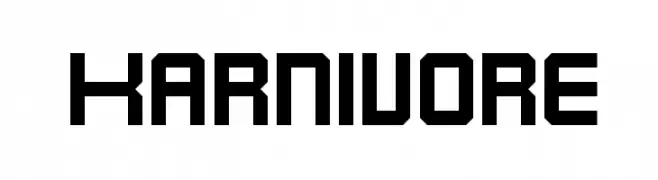
( Fonts by Apostrophic Lab )
A bold, geometric font with a strong, angular design.
![Karnivore Frei Schriftart Herunterladen]() Herunterladen 980 Downloads@WebFont
Herunterladen 980 Downloads@WebFont -
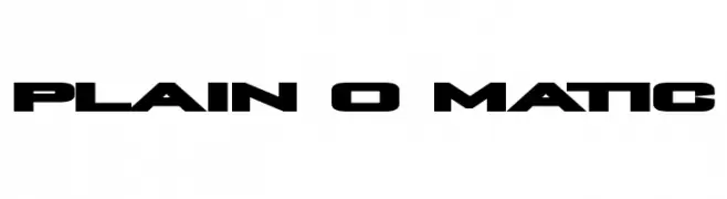
( Fonts by Utopiafonts )
A bold, futuristic font with angular cuts and strong geometric shapes.
![Plain O Matic Frei Schriftart Herunterladen]() Herunterladen 980 Downloads@WebFont
Herunterladen 980 Downloads@WebFont -
( Fonts by Paul Lloyd )
A playful and whimsical font with unique, irregular letterforms.
![Casua Frei Schriftart Herunterladen]() Herunterladen 980 Downloads@WebFont
Herunterladen 980 Downloads@WebFont -
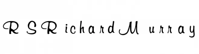
![RSRichardMurray Frei Schriftart Herunterladen]() Herunterladen 980 Downloads
Herunterladen 980 Downloads -
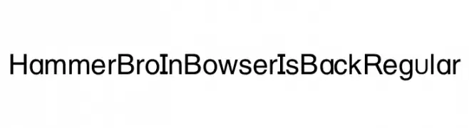
Schriftart von HammerBro101. For commercial use please contact the owner.
![Hammer Bro In Bowser Is Back Regular Frei Schriftart Herunterladen]() Herunterladen 979 Downloads@WebFont
Herunterladen 979 Downloads@WebFont -
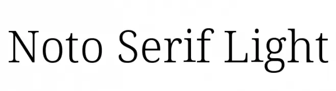
( Noto is a trademark of Google Inc. Noto fonts are open source. All Noto fonts are published under the SIL Open Font License, Version 1.1 )
A refined serif typeface with elegant, thin strokes and excellent readability.
![Noto Serif Light Frei Schriftart Herunterladen]() Herunterladen 979 Downloads@WebFont
Herunterladen 979 Downloads@WebFont -
( Fonts by Blambot Comic Fonts - Personal-use only. For commercial use please contact owner. )
A playful handwritten font with a casual, pen-like style.
![ChewedPenBB Frei Schriftart Herunterladen]() Herunterladen 979 Downloads@WebFont
Herunterladen 979 Downloads@WebFont -
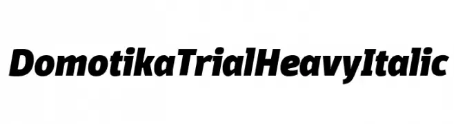
( Zetafonts - www.zetafonts.com )
A bold, heavy, italic font with a modern and dynamic style.
![Domotika Trial Heavy Italic Frei Schriftart Herunterladen]() Herunterladen 979 Downloads@WebFont
Herunterladen 979 Downloads@WebFont -
( Fonts by CannotIntoSpaceFonts - KineticPlasma Fonts - Personal-use only. For commercial use please contact owner. )
A bold, geometric font with clean lines and a modern aesthetic.
![Hussar Tani Frei Schriftart Herunterladen]() Herunterladen 979 Downloads@WebFont
Herunterladen 979 Downloads@WebFont -
( Copyright (c) 2012 by Sorkin Type Co (www.sorkintype.com) )
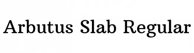
A classic serif font with bold strokes and pronounced serifs.
![Arbutus Slab Regular Frei Schriftart Herunterladen]() Herunterladen 979 Downloads@WebFont
Herunterladen 979 Downloads@WebFont -
![Beillingsday Frei Schriftart Herunterladen]() Herunterladen 979 Downloads@WebFont
Herunterladen 979 Downloads@WebFont -
![Quincy Regular Frei Schriftart Herunterladen]() Herunterladen 979 Downloads@WebFont
Herunterladen 979 Downloads@WebFont -
( Fonts by 7NTypes )
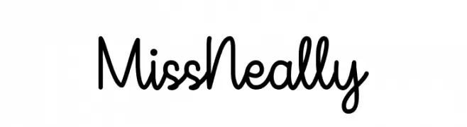
A playful, handwritten script font with smooth, connected letters.
![Miss Neally Frei Schriftart Herunterladen]() Herunterladen 979 Downloads@WebFont
Herunterladen 979 Downloads@WebFont -
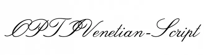
( Fonts by Castcraft Software - OPTI Fonts Archive - opti.netii.net - Personal-use only. For commercial use please contact owner. )
An elegant script font with flowing, cursive lines and intricate flourishes.
![OPTIVenetian-Script Frei Schriftart Herunterladen]() Herunterladen 979 Downloads@WebFont
Herunterladen 979 Downloads@WebFont -
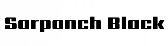
( Copyright (c) 2014, Indian Type Foundry (info@indiantypefoundry.com). )
A bold, modern font with thick, block-like characters for impactful design.
![Sarpanch Black Frei Schriftart Herunterladen]() Herunterladen 979 Downloads@WebFont
Herunterladen 979 Downloads@WebFont -
![DarkMoonBold Frei Schriftart Herunterladen]() Herunterladen 979 Downloads@WebFont
Herunterladen 979 Downloads@WebFont


Welche Schriften sind gerade am populärsten?
Poppins, Roboto, Montserrat, Open Sans und Lato sind wegen ihrer klaren Formen und breiten Einsetzbarkeit sehr gefragt – von Markenauftritt über Landingpages bis hin zu Postern.
Welche Fonts eignen sich für Logos?
Geometrische Sans‑Serifs (z. B. Poppins, Familien im Gotham‑Stil) sind ein häufiger Griff für sauberes, skalierbares Branding. Für eine persönlichere Note bleiben Scripts und Handschrift‑Stile beliebt. Kombinieren Sie einen prägnanten Headline‑Font mit einer neutralen Brotschrift für Wiedererkennung und Harmonie.
Wie oft wird die Top‑Liste aktualisiert?
Regelmäßig – basierend auf realen Downloads und Interaktionen. Schauen Sie öfter vorbei, um aufstrebende Favoriten früh zu entdecken.
💡 Tipp: Seite bookmarken – Trends wechseln schnell, und heutige Top‑Schriften inspirieren morgen vielleicht das Rebranding.