Willkommen bei den Top‑Schriften – hier treffen Beliebtheit und Qualität aufeinander. Das sind die in diesem Jahr am häufigsten heruntergeladenen und genutzten Fonts. Wenn Sie sichere Optionen für Logo, Web oder Social suchen, starten Sie hier.
Jeder Top‑Font überzeugt durch Balance, Lesbarkeit und Vielseitigkeit. Sie finden moderne Sans‑Serifs, elegante Scripts, Vintage‑Serifs und minimalistische Displays.
-
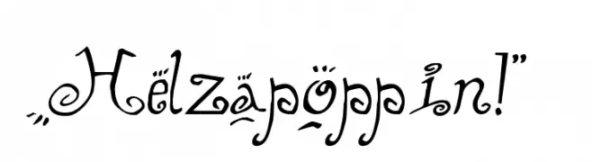
( Fonts by The Scriptorium - Dave Nalle )
A whimsical and decorative font with playful flourishes and embellishments.
 Herunterladen 977 Downloads@WebFont
 -
( Fonts by Graham Meade - GemFonts )
A bold, three-dimensional font with a striped, layered design.
![Early Tickertape Frei Schriftart Herunterladen]() Herunterladen 977 Downloads@WebFont
Herunterladen 977 Downloads@WebFont -
( Fonts by Gassstype )
A playful, hand-drawn font with bold, irregular characters.
![Bad Reason Frei Schriftart Herunterladen]() Herunterladen 976 Downloads@WebFont
Herunterladen 976 Downloads@WebFont -
( Fonts by Febri_Creative - Febrianto Yuwono - Personal-use only. For commercial use please contact owner. )
A dynamic and flowing script font with elegant cursive letterforms.
![Amaliani Frei Schriftart Herunterladen]() Herunterladen 976 Downloads@WebFont
Herunterladen 976 Downloads@WebFont -
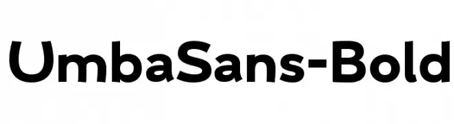
( Anita Jürgeleit - www.anitajuergeleit.de )
A bold, modern sans-serif font with clean, geometric lines.
![UmbaSans-Bold Frei Schriftart Herunterladen]() Herunterladen 976 Downloads@WebFont
Herunterladen 976 Downloads@WebFont -
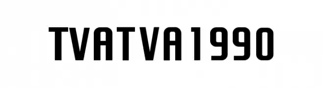
-
![TVA 1990 Frei Schriftart Herunterladen]() Herunterladen 976 Downloads@WebFont
Herunterladen 976 Downloads@WebFont -
( Fonts by a Max Infeld - XEROGRAPHER FONTS - xerographer.blogspot.com . Personal-use only. For commercial use please contact owner. )
A playful, hand-drawn font with tall, narrow letters and a whimsical style.
![LowerCase Frei Schriftart Herunterladen]() Herunterladen 976 Downloads@WebFont
Herunterladen 976 Downloads@WebFont -
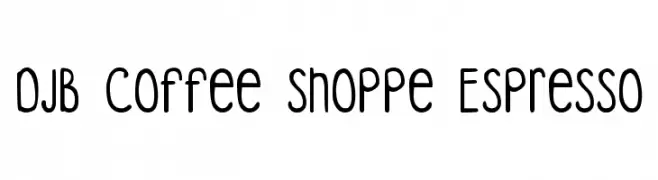
( Fonts by Darcy Baldwin - darcybaldwin.com. Free for personal use only )
A playful, handwritten font with rounded edges and a friendly appearance.
![DJB Coffee Shoppe Espresso Frei Schriftart Herunterladen]() Herunterladen 976 Downloads@WebFont
Herunterladen 976 Downloads@WebFont -
( Copyright (c) 2012 by Brian J. Bonislawsky DBA Astigmatic (AOETI) )
A modern, geometric sans-serif font with clean lines and balanced proportions.
![BrunoAce-Regular Frei Schriftart Herunterladen]() Herunterladen 976 Downloads@WebFont
Herunterladen 976 Downloads@WebFont -
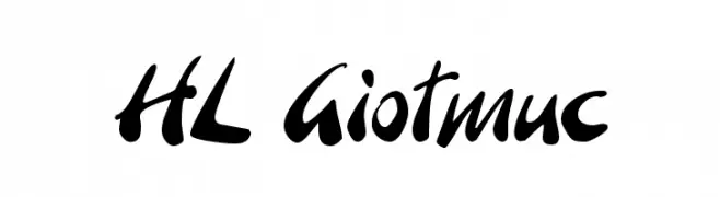
( Fonts by HungLan Design - www.hunglandesign.com )
A bold, dynamic script font with fluid, expressive strokes.
![HL Giotmuc Frei Schriftart Herunterladen]() Herunterladen 976 Downloads@WebFont
Herunterladen 976 Downloads@WebFont -
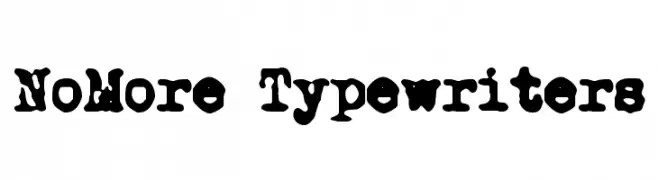
![NoMore Typewriters Frei Schriftart Herunterladen]() Herunterladen 976 Downloads@WebFont
Herunterladen 976 Downloads@WebFont -
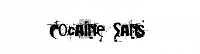
( Fonts by Christopher Hansen )
A distressed, grungy font with chaotic, textured characters.
![Cocaine Sans Frei Schriftart Herunterladen]() Herunterladen 976 Downloads@WebFont
Herunterladen 976 Downloads@WebFont -
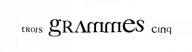
( Fonts by a Clement Nicolle - www.stereo-type.fr . Personal-use only. For commercial use please contact owner. )
A modern serif font with playful serifs and dynamic character forms.
![3 grammes 5 Frei Schriftart Herunterladen]() Herunterladen 976 Downloads@WebFont
Herunterladen 976 Downloads@WebFont -
( Fonts by Apostrophic Lab )
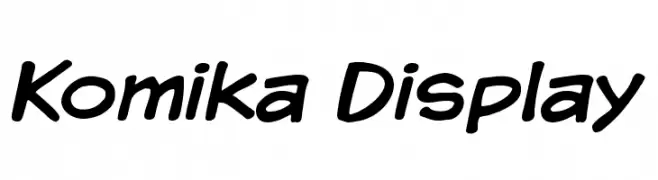
A playful, bold font with rounded, slightly italicized letterforms.
![Komika Display Frei Schriftart Herunterladen]() Herunterladen 976 Downloads@WebFont
Herunterladen 976 Downloads@WebFont -
( Paul Lloyd Fonts )
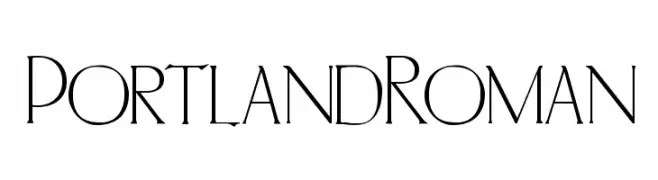
An elegant serif font with high contrast and refined details.
![PortlandRoman Frei Schriftart Herunterladen]() Herunterladen 976 Downloads@WebFont
Herunterladen 976 Downloads@WebFont -
( Fonts by Yoga Letter )
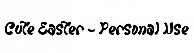
A playful, bold, and rounded font with a hand-drawn feel.
![Cute Easter - Personal Use Frei Schriftart Herunterladen]() Herunterladen 975 Downloads@WebFont
Herunterladen 975 Downloads@WebFont -
( Fonts by BLKBK Fonts - www.blkbk.shop - Personal-use only. For commercial use please contact owner. Sponsoren Schriftart )
A bold, brushstroke-style font with a dynamic and artistic appearance.
![Sun Ray Frei Schriftart Herunterladen]() Herunterladen 975 Downloads
Herunterladen 975 Downloads -
( Fonts by Fonts by Rasmus Andersson / Changes by Cristiano Sobral with parts from Marc Monis - Personal-use only. For commercial use please contact owner. )
A modern, light sans-serif font with clean lines and balanced spacing.
![LinikSans-Light Frei Schriftart Herunterladen]() Herunterladen 975 Downloads@WebFont
Herunterladen 975 Downloads@WebFont -
( Fonts by MadeType - Personal-use only. For commercial use please contact owner. )
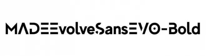
A bold, geometric sans-serif font with a modern and clean aesthetic.
![MADEEvolveSansEVO-Bold Frei Schriftart Herunterladen]() Herunterladen 975 Downloads@WebFont
Herunterladen 975 Downloads@WebFont -
( Fonts by MadeType - Personal-use only. For commercial use please contact owner. )
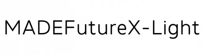
A modern, geometric sans-serif font with a clean and balanced design.
![MADEFutureX-Light Frei Schriftart Herunterladen]() Herunterladen 975 Downloads@WebFont
Herunterladen 975 Downloads@WebFont -
( Copyright 2019 The Red Hat Project Authors (https://github.com/RedHatOfficial/RedHatFont) )
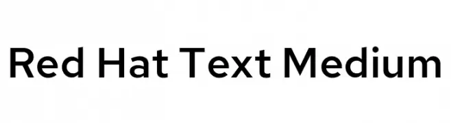
A modern, geometric sans-serif font with balanced proportions and clear readability.
![Red Hat Text Medium Frei Schriftart Herunterladen]() Herunterladen 975 Downloads@WebFont
Herunterladen 975 Downloads@WebFont -
( Fonts by Mozilla Foundation - Personal-use only. For commercial use please contact owner. )
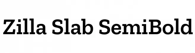
A modern slab serif font with strong serifs and balanced proportions.
![Zilla Slab SemiBold Frei Schriftart Herunterladen]() Herunterladen 975 Downloads@WebFont
Herunterladen 975 Downloads@WebFont -
( Vladimir Nikolic - www.coroflot.com/vladimirnikolic )
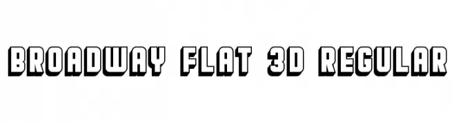
A bold, 3D geometric font with a modern, impactful style.
![Broadway Flat 3D Regular Frei Schriftart Herunterladen]() Herunterladen 975 Downloads@WebFont
Herunterladen 975 Downloads@WebFont -
( Fadhil Aqsa - creativemarket.com/Meutuwah )
An elegant script font with fluid, cursive strokes and refined contrast.
![Clarity free Frei Schriftart Herunterladen]() Herunterladen 975 Downloads@WebFont
Herunterladen 975 Downloads@WebFont -
( Fonts by Typodermic Fonts )
A bold, monospaced font with a modern, industrial style.
![NK57MonospaceCdEb-Regular Frei Schriftart Herunterladen]() Herunterladen 975 Downloads@WebFont
Herunterladen 975 Downloads@WebFont -
( Fonts by Neale Davidson - www.pixelsagas.com )
A bold, futuristic font with geometric letterforms and sharp angles.
![Jedi Frei Schriftart Herunterladen]() Herunterladen 975 Downloads@WebFont
Herunterladen 975 Downloads@WebFont -
( Fonts by www.typedepot.com )
A delicate, sketch-like font with thin, hand-drawn lines and a whimsical aesthetic.
![MatildeSketch Frei Schriftart Herunterladen]() Herunterladen 975 Downloads@WebFont
Herunterladen 975 Downloads@WebFont -
![BDSPACY125 Frei Schriftart Herunterladen]() Herunterladen 975 Downloads@WebFont
Herunterladen 975 Downloads@WebFont -
( THESE ARE SHAREWARE FONTS ! NOT FREEWARE ! PLEASE VISIT www.fuelfonts.com )
A bold, rounded font with smooth curves and consistent spacing.
![Subhuman Frei Schriftart Herunterladen]() Herunterladen 975 Downloads@WebFont
Herunterladen 975 Downloads@WebFont -
![Bullets-4-Japanese- Frei Schriftart Herunterladen]() Herunterladen 975 Downloads@WebFont
Herunterladen 975 Downloads@WebFont -
![TPF U13 Frei Schriftart Herunterladen]() Herunterladen 975 Downloads@WebFont
Herunterladen 975 Downloads@WebFont -
![Mr.B Frei Schriftart Herunterladen]() Herunterladen 975 Downloads@WebFont
Herunterladen 975 Downloads@WebFont -
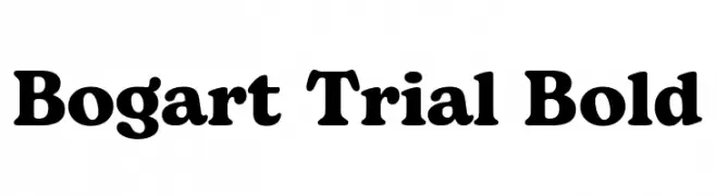
( Fonts by Zetafonts - Personal-use only. For commercial use please contact owner. )
A bold serif font with strong, thick strokes and a classic yet modern appeal.
![Bogart Trial Bold Frei Schriftart Herunterladen]() Herunterladen 974 Downloads@WebFont
Herunterladen 974 Downloads@WebFont -
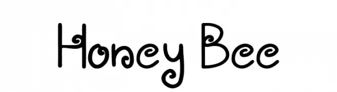
( Fonts by Ni Luh Purnamawati )
A playful, whimsical font with rounded and curly elements, perfect for creative projects.
![Honey Bee Frei Schriftart Herunterladen]() Herunterladen 974 Downloads@WebFont
Herunterladen 974 Downloads@WebFont -
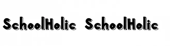
( Fonts by Subectype & Orenari )
A playful, bold font with a 3D shadow effect and cartoonish style.
![School Holic 7 School Holic 7 Frei Schriftart Herunterladen]() Herunterladen 974 Downloads@WebFont
Herunterladen 974 Downloads@WebFont


Welche Schriften sind gerade am populärsten?
Poppins, Roboto, Montserrat, Open Sans und Lato sind wegen ihrer klaren Formen und breiten Einsetzbarkeit sehr gefragt – von Markenauftritt über Landingpages bis hin zu Postern.
Welche Fonts eignen sich für Logos?
Geometrische Sans‑Serifs (z. B. Poppins, Familien im Gotham‑Stil) sind ein häufiger Griff für sauberes, skalierbares Branding. Für eine persönlichere Note bleiben Scripts und Handschrift‑Stile beliebt. Kombinieren Sie einen prägnanten Headline‑Font mit einer neutralen Brotschrift für Wiedererkennung und Harmonie.
Wie oft wird die Top‑Liste aktualisiert?
Regelmäßig – basierend auf realen Downloads und Interaktionen. Schauen Sie öfter vorbei, um aufstrebende Favoriten früh zu entdecken.
💡 Tipp: Seite bookmarken – Trends wechseln schnell, und heutige Top‑Schriften inspirieren morgen vielleicht das Rebranding.