Willkommen bei den Top‑Schriften – hier treffen Beliebtheit und Qualität aufeinander. Das sind die in diesem Jahr am häufigsten heruntergeladenen und genutzten Fonts. Wenn Sie sichere Optionen für Logo, Web oder Social suchen, starten Sie hier.
Jeder Top‑Font überzeugt durch Balance, Lesbarkeit und Vielseitigkeit. Sie finden moderne Sans‑Serifs, elegante Scripts, Vintage‑Serifs und minimalistische Displays.
-
( Fonts by Kong Font - https://fontkong.com/ - Personal-use only. For commercial use please contact owner. )
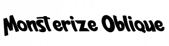
A bold, playful font with slanted, dynamic characters.
 Herunterladen 243 Downloads@WebFont
 -
( Fonts by weknow - Wino S Kadir )
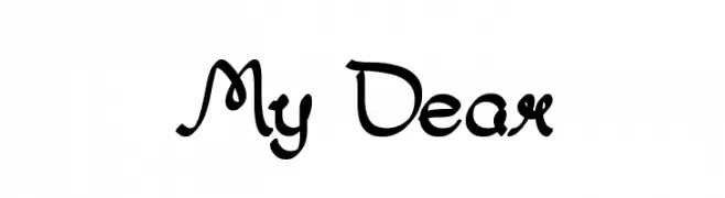
A whimsical, bold, and decorative font with interconnected strokes and a calligraphic style.
![My Dear Frei Schriftart Herunterladen]() Herunterladen 243 Downloads@WebFont
Herunterladen 243 Downloads@WebFont -
( Fonts by Peter Wiegel - www.peter-wiegel.de - Personal-use only. For commercial use please contact owner. )
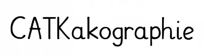
A playful handwritten font with rounded edges and a casual style.
![CATKakographie Frei Schriftart Herunterladen]() Herunterladen 243 Downloads@WebFont
Herunterladen 243 Downloads@WebFont -
( Please check www.otlab.ru before you use this font! )
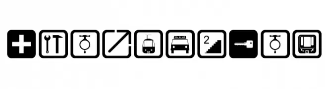
Iconic pictogram font for signage and wayfinding.
![Notice2Std Frei Schriftart Herunterladen]() Herunterladen 243 Downloads@WebFont
Herunterladen 243 Downloads@WebFont -
![Voco Script SSi Frei Schriftart Herunterladen]() Herunterladen 243 Downloads
Herunterladen 243 Downloads -
-
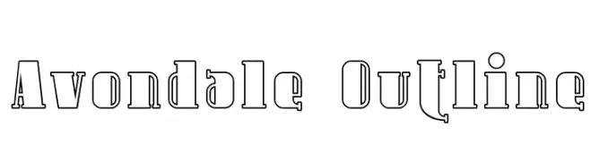
( Fonts by Apostrophic Lab )
A bold, outlined font with a strong, dimensional presence.
![Avondale Outline Frei Schriftart Herunterladen]() Herunterladen 243 Downloads@WebFont
Herunterladen 243 Downloads@WebFont -
![Maddie_Nicole Frei Schriftart Herunterladen]() Herunterladen 243 Downloads@WebFont
Herunterladen 243 Downloads@WebFont -
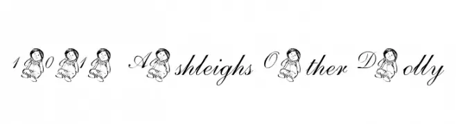
( Nght's Place - www.crosswinds.net/~nghtmvs/font/fonts1.html )
A whimsical script font with decorative doll illustrations on uppercase letters and numerals.
![101! Ashleigh's Other Dolly Frei Schriftart Herunterladen]() Herunterladen 243 Downloads@WebFont
Herunterladen 243 Downloads@WebFont -
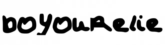
![DoYouRelize Frei Schriftart Herunterladen]() Herunterladen 243 Downloads@WebFont
Herunterladen 243 Downloads@WebFont -
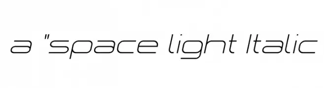
![a]() Herunterladen 243 Downloads@WebFont
Herunterladen 243 Downloads@WebFont
Welche Schriften sind gerade am populärsten?
Poppins, Roboto, Montserrat, Open Sans und Lato sind wegen ihrer klaren Formen und breiten Einsetzbarkeit sehr gefragt – von Markenauftritt über Landingpages bis hin zu Postern.
Welche Fonts eignen sich für Logos?
Geometrische Sans‑Serifs (z. B. Poppins, Familien im Gotham‑Stil) sind ein häufiger Griff für sauberes, skalierbares Branding. Für eine persönlichere Note bleiben Scripts und Handschrift‑Stile beliebt. Kombinieren Sie einen prägnanten Headline‑Font mit einer neutralen Brotschrift für Wiedererkennung und Harmonie.
Wie oft wird die Top‑Liste aktualisiert?
Regelmäßig – basierend auf realen Downloads und Interaktionen. Schauen Sie öfter vorbei, um aufstrebende Favoriten früh zu entdecken.
💡 Tipp: Seite bookmarken – Trends wechseln schnell, und heutige Top‑Schriften inspirieren morgen vielleicht das Rebranding.