Willkommen bei den Top‑Schriften – hier treffen Beliebtheit und Qualität aufeinander. Das sind die in diesem Jahr am häufigsten heruntergeladenen und genutzten Fonts. Wenn Sie sichere Optionen für Logo, Web oder Social suchen, starten Sie hier.
Jeder Top‑Font überzeugt durch Balance, Lesbarkeit und Vielseitigkeit. Sie finden moderne Sans‑Serifs, elegante Scripts, Vintage‑Serifs und minimalistische Displays.
-
 Herunterladen 242 Downloads@WebFont
 -
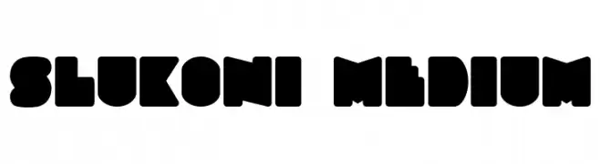
![Slukoni Medium Frei Schriftart Herunterladen]() Herunterladen 242 Downloads@WebFont
Herunterladen 242 Downloads@WebFont -
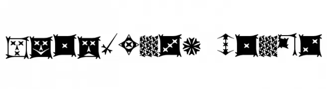
( Fonts by Apostrophic Lab )
A decorative, abstract font with geometric and tribal-inspired designs.
![Carbolith Trips Frei Schriftart Herunterladen]() Herunterladen 242 Downloads@WebFont
Herunterladen 242 Downloads@WebFont -
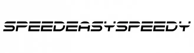
( Chequered Ink - chequered.ink/ )
A futuristic, dynamic font with sharp angles and sleek lines.
![Speedeasy Speedy Frei Schriftart Herunterladen]() Herunterladen 242 Downloads@WebFont
Herunterladen 242 Downloads@WebFont -
( Fonts by Windestrian- https://creativemarket.com/windestrian - Personal-use only. For commercial use please contact owner. )
A lively handwritten font with fluid strokes and playful elegance.
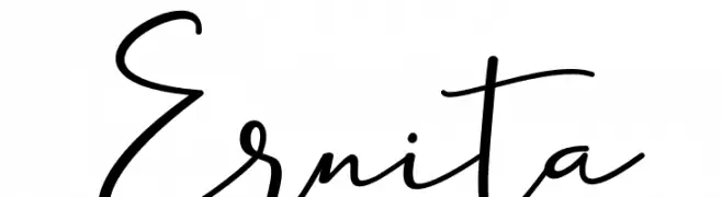
![Ernita Frei Schriftart Herunterladen]() Herunterladen 242 Downloads@WebFont
Herunterladen 242 Downloads@WebFont -
-
( Free for a personal use. For a commercial use please visit www.kevinandamanda.com )
A playful, handwritten font with a casual and lively style.
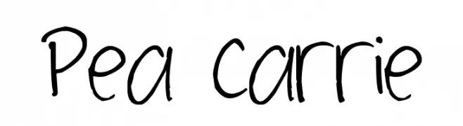
![Pea Carrie Frei Schriftart Herunterladen]() Herunterladen 242 Downloads@WebFont
Herunterladen 242 Downloads@WebFont -
( Fonts by Scratchones )
An elegant script font with graceful curves and intricate swirls.
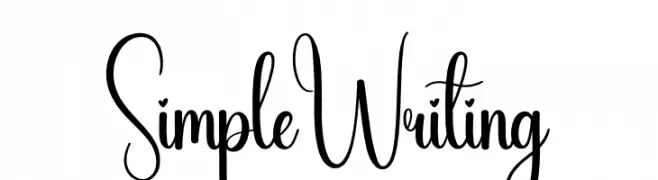
![Simple Writing Frei Schriftart Herunterladen]() Herunterladen 242 Downloads@WebFont
Herunterladen 242 Downloads@WebFont -
( jamm0.pw )
A casual, handwritten font with bold, irregular strokes and a playful appearance.
![Drag Frei Schriftart Herunterladen]() Herunterladen 242 Downloads@WebFont
Herunterladen 242 Downloads@WebFont -
( Fonts by Perspectype Studio )
A playful, handwritten font with rounded edges and a casual style.
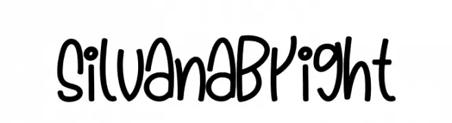
![Silvana Bright Frei Schriftart Herunterladen]() Herunterladen 242 Downloads@WebFont
Herunterladen 242 Downloads@WebFont -
( Fonts by Apostrophic Lab )
A rough, hand-drawn font with tall, slender characters and uneven strokes.
![Castorgate - Rough Frei Schriftart Herunterladen]() Herunterladen 242 Downloads@WebFont
Herunterladen 242 Downloads@WebFont

Welche Schriften sind gerade am populärsten?
Poppins, Roboto, Montserrat, Open Sans und Lato sind wegen ihrer klaren Formen und breiten Einsetzbarkeit sehr gefragt – von Markenauftritt über Landingpages bis hin zu Postern.
Welche Fonts eignen sich für Logos?
Geometrische Sans‑Serifs (z. B. Poppins, Familien im Gotham‑Stil) sind ein häufiger Griff für sauberes, skalierbares Branding. Für eine persönlichere Note bleiben Scripts und Handschrift‑Stile beliebt. Kombinieren Sie einen prägnanten Headline‑Font mit einer neutralen Brotschrift für Wiedererkennung und Harmonie.
Wie oft wird die Top‑Liste aktualisiert?
Regelmäßig – basierend auf realen Downloads und Interaktionen. Schauen Sie öfter vorbei, um aufstrebende Favoriten früh zu entdecken.
💡 Tipp: Seite bookmarken – Trends wechseln schnell, und heutige Top‑Schriften inspirieren morgen vielleicht das Rebranding.