Willkommen bei den Top‑Schriften – hier treffen Beliebtheit und Qualität aufeinander. Das sind die in diesem Jahr am häufigsten heruntergeladenen und genutzten Fonts. Wenn Sie sichere Optionen für Logo, Web oder Social suchen, starten Sie hier.
Jeder Top‑Font überzeugt durch Balance, Lesbarkeit und Vielseitigkeit. Sie finden moderne Sans‑Serifs, elegante Scripts, Vintage‑Serifs und minimalistische Displays.
-
( Fonts by www.gliphmaker.com. Personal-use only. For commercial use please contact owner. )
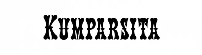
A bold, decorative font with high contrast and vintage flair.
 Herunterladen 242 Downloads@WebFont
 -
( Fonts by Ruben Prol - www.ipanemagrafica.com )
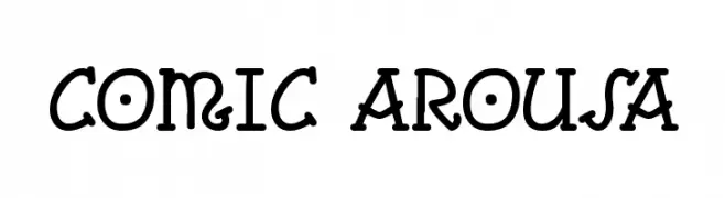
A playful, bold font with decorative, cartoonish elements.
![Comic Arousa Frei Schriftart Herunterladen]() Herunterladen 242 Downloads@WebFont
Herunterladen 242 Downloads@WebFont -
![Keneel Messy Frei Schriftart Herunterladen]() Herunterladen 242 Downloads@WebFont
Herunterladen 242 Downloads@WebFont -
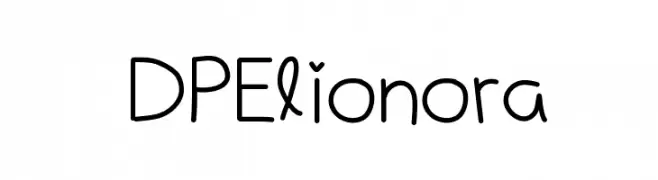
![DPElionora Frei Schriftart Herunterladen]() Herunterladen 242 Downloads@WebFont
Herunterladen 242 Downloads@WebFont -
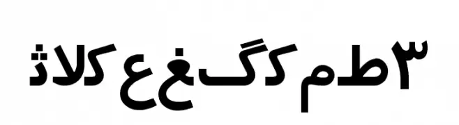
![Irnafont_3 Frei Schriftart Herunterladen]() Herunterladen 242 Downloads@WebFont
Herunterladen 242 Downloads@WebFont -
-
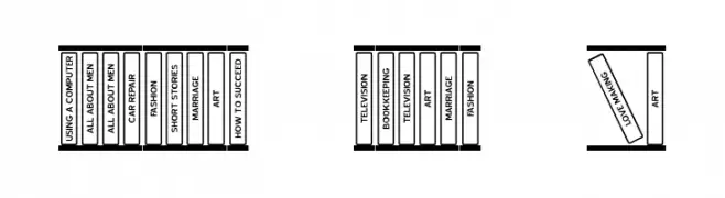
( Fonts by Jeff Levine. FREEWARE )
A clean, straightforward font with uniform stroke width and high legibility.
![Bookshelf Titles JL Frei Schriftart Herunterladen]() Herunterladen 242 Downloads@WebFont
Herunterladen 242 Downloads@WebFont -
( Fonts by Alvaro Thomaz - alvarothomaz.com )
A sleek, modern, and oblique sans-serif font with a light weight.
![Regencie Light Oblique Frei Schriftart Herunterladen]() Herunterladen 242 Downloads@WebFont
Herunterladen 242 Downloads@WebFont -
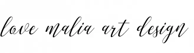
( Marwah Store - Alexe Crisna - fontbundles.net/art-design )
A graceful and elegant script font with flowing, cursive strokes.
![love malia art design Frei Schriftart Herunterladen]() Herunterladen 242 Downloads@WebFont
Herunterladen 242 Downloads@WebFont -
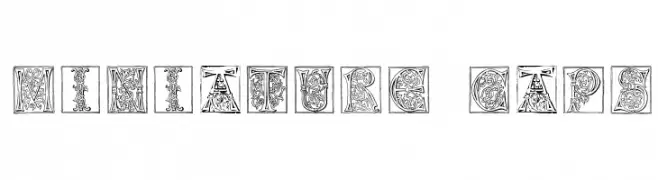
( Fonts by Giovanni Landi )
An ornate, decorative font with intricate, framed letters.
![Miniature-Caps Frei Schriftart Herunterladen]() Herunterladen 242 Downloads@WebFont
Herunterladen 242 Downloads@WebFont -
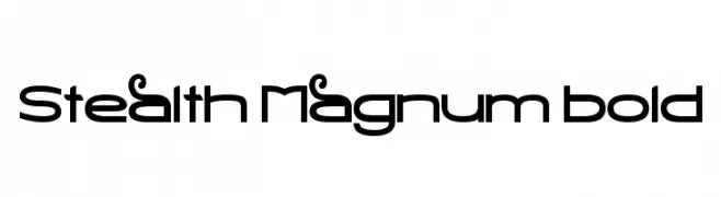
( Fonts by Barry Bujol - theoriginal19.blogspot.com )
A bold, futuristic font with geometric shapes and smooth curves.
![Stealth Magnum Bold Frei Schriftart Herunterladen]() Herunterladen 242 Downloads@WebFont
Herunterladen 242 Downloads@WebFont


Welche Schriften sind gerade am populärsten?
Poppins, Roboto, Montserrat, Open Sans und Lato sind wegen ihrer klaren Formen und breiten Einsetzbarkeit sehr gefragt – von Markenauftritt über Landingpages bis hin zu Postern.
Welche Fonts eignen sich für Logos?
Geometrische Sans‑Serifs (z. B. Poppins, Familien im Gotham‑Stil) sind ein häufiger Griff für sauberes, skalierbares Branding. Für eine persönlichere Note bleiben Scripts und Handschrift‑Stile beliebt. Kombinieren Sie einen prägnanten Headline‑Font mit einer neutralen Brotschrift für Wiedererkennung und Harmonie.
Wie oft wird die Top‑Liste aktualisiert?
Regelmäßig – basierend auf realen Downloads und Interaktionen. Schauen Sie öfter vorbei, um aufstrebende Favoriten früh zu entdecken.
💡 Tipp: Seite bookmarken – Trends wechseln schnell, und heutige Top‑Schriften inspirieren morgen vielleicht das Rebranding.