Willkommen bei den Top‑Schriften – hier treffen Beliebtheit und Qualität aufeinander. Das sind die in diesem Jahr am häufigsten heruntergeladenen und genutzten Fonts. Wenn Sie sichere Optionen für Logo, Web oder Social suchen, starten Sie hier.
Jeder Top‑Font überzeugt durch Balance, Lesbarkeit und Vielseitigkeit. Sie finden moderne Sans‑Serifs, elegante Scripts, Vintage‑Serifs und minimalistische Displays.
-
( Fonts by Bearytype )
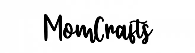
Playful handwritten script font.
 Herunterladen 240 Downloads@WebFont
 -
( Fonts by Apostrophic Lab )
A bold, wide slab serif font with consistent strokes and prominent serifs.
![Street Slab - Super Wide Frei Schriftart Herunterladen]() Herunterladen 240 Downloads@WebFont
Herunterladen 240 Downloads@WebFont -
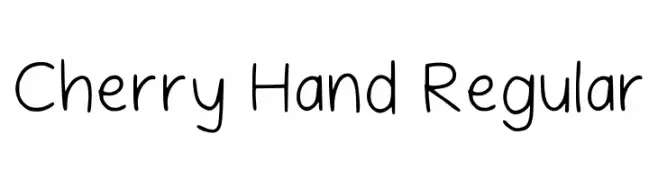
( Fonts by Jazmin Mendez )
Casual handwritten font with a friendly style.
![Cherry Hand Regular Frei Schriftart Herunterladen]() Herunterladen 240 Downloads@WebFont
Herunterladen 240 Downloads@WebFont -
![Quo Vadis Frei Schriftart Herunterladen]() Herunterladen 240 Downloads@WebFont
Herunterladen 240 Downloads@WebFont -
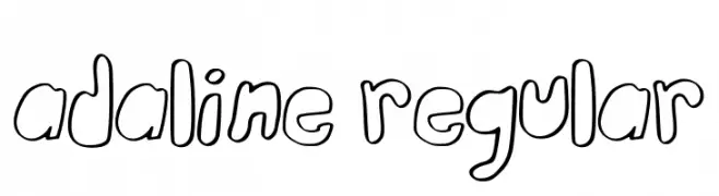
( Fonts by Alexa Wolff )
A playful, hand-drawn outline font with rounded, whimsical characters.
![Adaline Regular Frei Schriftart Herunterladen]() Herunterladen 240 Downloads@WebFont
Herunterladen 240 Downloads@WebFont -
-
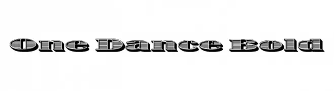
( Fonts by Koczman Balint - magiquefonts.gportal.hu )
A bold, decorative font with a 3D shadow effect and striped pattern.
![One Dance Bold Frei Schriftart Herunterladen]() Herunterladen 240 Downloads@WebFont
Herunterladen 240 Downloads@WebFont -
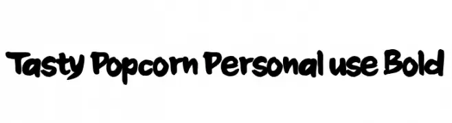
( Fonts by Anang Fibriyanto - www.creativefabrica.com/designer/cornertypestudio/ref/356436/ - Personal-use only. For commercial use please contact owner. )
A playful, bold font with a hand-drawn, comic-style appearance.
![Tasty Popcorn Personal use Bold Frei Schriftart Herunterladen]() Herunterladen 240 Downloads@WebFont
Herunterladen 240 Downloads@WebFont -
( Fonts by Chequered Ink )
Casual handwritten font with a playful style.
![Pearlesce Frei Schriftart Herunterladen]() Herunterladen 240 Downloads@WebFont
Herunterladen 240 Downloads@WebFont -
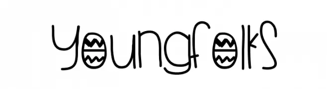
( Fonts by Des Gomez )
A playful, handwritten font with a youthful and whimsical style.
![YoungFolks Frei Schriftart Herunterladen]() Herunterladen 240 Downloads@WebFont
Herunterladen 240 Downloads@WebFont -
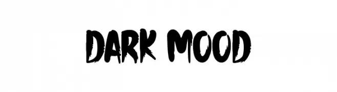
( Fonts by Md Shohail Bhuian )
A bold, brush-style font with an energetic and artistic flair.
![Dark Mood Frei Schriftart Herunterladen]() Herunterladen 240 Downloads@WebFont
Herunterladen 240 Downloads@WebFont


Welche Schriften sind gerade am populärsten?
Poppins, Roboto, Montserrat, Open Sans und Lato sind wegen ihrer klaren Formen und breiten Einsetzbarkeit sehr gefragt – von Markenauftritt über Landingpages bis hin zu Postern.
Welche Fonts eignen sich für Logos?
Geometrische Sans‑Serifs (z. B. Poppins, Familien im Gotham‑Stil) sind ein häufiger Griff für sauberes, skalierbares Branding. Für eine persönlichere Note bleiben Scripts und Handschrift‑Stile beliebt. Kombinieren Sie einen prägnanten Headline‑Font mit einer neutralen Brotschrift für Wiedererkennung und Harmonie.
Wie oft wird die Top‑Liste aktualisiert?
Regelmäßig – basierend auf realen Downloads und Interaktionen. Schauen Sie öfter vorbei, um aufstrebende Favoriten früh zu entdecken.
💡 Tipp: Seite bookmarken – Trends wechseln schnell, und heutige Top‑Schriften inspirieren morgen vielleicht das Rebranding.