Willkommen bei den Top‑Schriften – hier treffen Beliebtheit und Qualität aufeinander. Das sind die in diesem Jahr am häufigsten heruntergeladenen und genutzten Fonts. Wenn Sie sichere Optionen für Logo, Web oder Social suchen, starten Sie hier.
Jeder Top‑Font überzeugt durch Balance, Lesbarkeit und Vielseitigkeit. Sie finden moderne Sans‑Serifs, elegante Scripts, Vintage‑Serifs und minimalistische Displays.
-
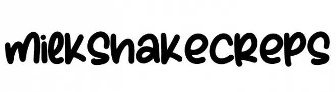
( Fonts by Perspectype Studio )
A bold, rounded, handwritten-style font with a playful and energetic vibe.
 Herunterladen 960 Downloads@WebFont
 -
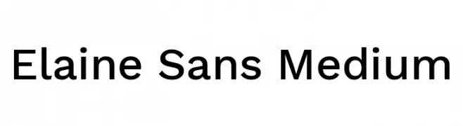
( Fonts by Wei Huang - Personal-use only. For commercial use please contact owner. )
A modern, clean sans-serif typeface with consistent stroke width and balanced spacing.
![Elaine Sans Medium Frei Schriftart Herunterladen]() Herunterladen 960 Downloads@WebFont
Herunterladen 960 Downloads@WebFont -
( imagex - www.imagex-fonts.com )
A bold, distressed font with a gritty, textured appearance.
![Danger Zone Warning Frei Schriftart Herunterladen]() Herunterladen 960 Downloads@WebFont
Herunterladen 960 Downloads@WebFont -
( Guiltype Studio - MIZAN - graphicriver.net/item/good-morning-purple/22116135 )
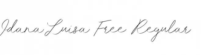
A graceful and flowing script font with elegant, interconnected characters.
![Idana Luisa Free Regular Frei Schriftart Herunterladen]() Herunterladen 960 Downloads@WebFont
Herunterladen 960 Downloads@WebFont -
( Fonts by Situjuh Nazara - 7ntypes.com - Personal-use only. For commercial use please contact owner. )
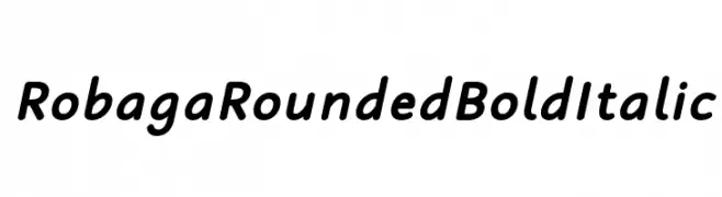
A rounded, bold, italic font with smooth curves and a friendly appearance.
![Robaga Rounded Bold Italic Frei Schriftart Herunterladen]() Herunterladen 960 Downloads@WebFont
Herunterladen 960 Downloads@WebFont -
-
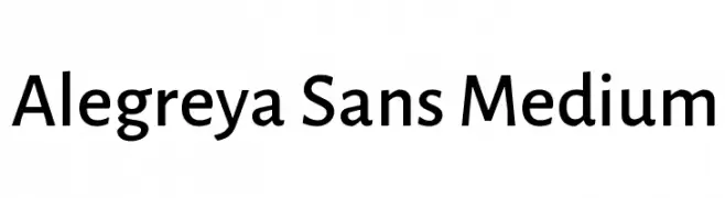
( Copyright 2013 The Alegreya Sans Project Authors (https://github.com/huertatipografica/Alegreya-Sans) )
A modern sans-serif font with medium weight and rounded characters.
![Alegreya Sans Medium Frei Schriftart Herunterladen]() Herunterladen 960 Downloads@WebFont
Herunterladen 960 Downloads@WebFont -
( Fonts by www.fontalicious.com )
A bold, geometric font with a playful and modern aesthetic.
![Munkeyshine Frei Schriftart Herunterladen]() Herunterladen 960 Downloads@WebFont
Herunterladen 960 Downloads@WebFont -
( Fonts by www.legacyofdefeat.com )
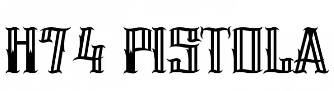
A bold, angular font with high contrast and dramatic style.
![H74 Pistola Frei Schriftart Herunterladen]() Herunterladen 960 Downloads@WebFont
Herunterladen 960 Downloads@WebFont -
![FFF Freedom Frei Schriftart Herunterladen]() Herunterladen 960 Downloads@WebFont
Herunterladen 960 Downloads@WebFont -
![HandPrinting Frei Schriftart Herunterladen]() Herunterladen 960 Downloads@WebFont
Herunterladen 960 Downloads@WebFont -
![Extemplary Frei Schriftart Herunterladen]() Herunterladen 960 Downloads@WebFont
Herunterladen 960 Downloads@WebFont -
( Fonts by Daniel Zadorozny - www.iconian.com - Free for personal use )
A bold, italicized font with a playful and dynamic style.
![Action Man Bold Italic Frei Schriftart Herunterladen]() Herunterladen 960 Downloads@WebFont
Herunterladen 960 Downloads@WebFont -
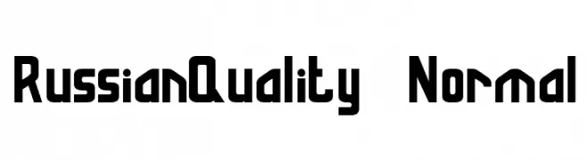
![RussianQuality Normal Frei Schriftart Herunterladen]() Herunterladen 960 Downloads@WebFont
Herunterladen 960 Downloads@WebFont -
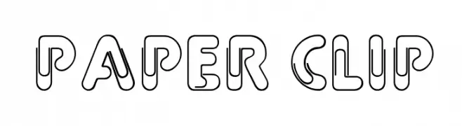
( Fonts by Alan Carr )
A playful, outlined font with a paper clip-like design and rounded edges.
![Paper Clip Frei Schriftart Herunterladen]() Herunterladen 960 Downloads@WebFont
Herunterladen 960 Downloads@WebFont -
![HMan Frei Schriftart Herunterladen]() Herunterladen 960 Downloads@WebFont
Herunterladen 960 Downloads@WebFont -
![Jolly-Raunchy Frei Schriftart Herunterladen]() Herunterladen 960 Downloads@WebFont
Herunterladen 960 Downloads@WebFont -
( Fonts by The Scriptorium - Dave Nalle )
A bold, geometric font with sharp angles and a strong, architectural presence.
![Basileus Frei Schriftart Herunterladen]() Herunterladen 960 Downloads@WebFont
Herunterladen 960 Downloads@WebFont -
( Fonts by Khurasan )
A playful, bold handwritten font with rounded edges and a friendly appearance.
![First Coffee Frei Schriftart Herunterladen]() Herunterladen 959 Downloads@WebFont
Herunterladen 959 Downloads@WebFont -
Schriftart von HammerBro101. For commercial use please contact the owner.
![CoopFlaired Frei Schriftart Herunterladen]() Herunterladen 959 Downloads@WebFont
Herunterladen 959 Downloads@WebFont -
( Fonts by Peter Wiegel - Personal-use only. For commercial use please contact owner. )
A bold, geometric outline font with a modern, futuristic style.
![AurachBi Frei Schriftart Herunterladen]() Herunterladen 959 Downloads@WebFont
Herunterladen 959 Downloads@WebFont -
( bogstav - www.bogstav.com )
A playful, handwritten font with tall, narrow letters and smooth, rounded strokes.
![Blikfang DEMO Regular Frei Schriftart Herunterladen]() Herunterladen 959 Downloads@WebFont
Herunterladen 959 Downloads@WebFont -
( Levi Szekeres - www.loremipsum.ro )
A bold, vintage-inspired font with thick strokes and a modern twist.
![Fat Flamingo5 Overlay Frei Schriftart Herunterladen]() Herunterladen 959 Downloads@WebFont
Herunterladen 959 Downloads@WebFont -
( Fonts by Iconian Fonts )
A bold, geometric font with a futuristic and industrial style.
![Strike Fighter Expanded Frei Schriftart Herunterladen]() Herunterladen 959 Downloads@WebFont
Herunterladen 959 Downloads@WebFont -
( Fonts by youssef-habchi.com - Personal-use only. For commercial use please contact owner. )
A bold, hand-drawn font with a playful and casual style.
![TastyBirds-BoldSans Frei Schriftart Herunterladen]() Herunterladen 959 Downloads@WebFont
Herunterladen 959 Downloads@WebFont -
( Fonts by Castcraft Software - OPTI Fonts Archive - opti.netii.net - Personal-use only. For commercial use please contact owner. )
A bold, high-contrast serif font with dramatic and elegant features.
![OPTIOcelot Frei Schriftart Herunterladen]() Herunterladen 959 Downloads@WebFont
Herunterladen 959 Downloads@WebFont -
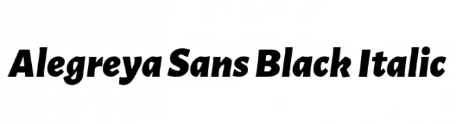
( Copyright 2013 The Alegreya Sans Project Authors (https://github.com/huertatipografica/Alegreya-Sans) )
A bold, italicized sans-serif font with a modern and authoritative style.
![Alegreya Sans Black Italic Frei Schriftart Herunterladen]() Herunterladen 959 Downloads@WebFont
Herunterladen 959 Downloads@WebFont -
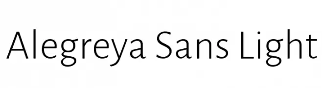
( Copyright 2013 The Alegreya Sans Project Authors (https://github.com/huertatipografica/Alegreya-Sans) )
A modern, light sans-serif font with low contrast and a clean, professional appearance.
![Alegreya Sans Light Frei Schriftart Herunterladen]() Herunterladen 959 Downloads@WebFont
Herunterladen 959 Downloads@WebFont -
![Timeline Regular Frei Schriftart Herunterladen]() Herunterladen 959 Downloads@WebFont
Herunterladen 959 Downloads@WebFont -
![Society Editor Personal Use Frei Schriftart Herunterladen]() Herunterladen 959 Downloads@WebFont
Herunterladen 959 Downloads@WebFont -
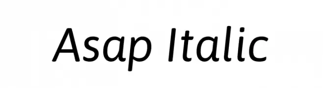
( Copyright 2016 The Asap Project Authors (omnibus.type@gmail.com) )
A modern, italic sans-serif font with clean lines and balanced proportions.
![Asap Italic Frei Schriftart Herunterladen]() Herunterladen 959 Downloads@WebFont
Herunterladen 959 Downloads@WebFont -
![ElementalEnd Italic Frei Schriftart Herunterladen]() Herunterladen 959 Downloads@WebFont
Herunterladen 959 Downloads@WebFont -
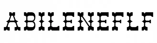
( Fonts by Casady & Greene )
A bold, decorative slab serif font with unique cut-out details.
![AbileneFLF Frei Schriftart Herunterladen]() Herunterladen 959 Downloads@WebFont
Herunterladen 959 Downloads@WebFont -
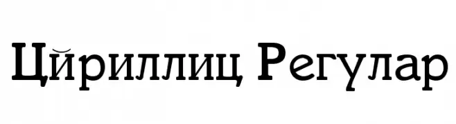
![Cyrillic Regular Frei Schriftart Herunterladen]() Herunterladen 959 Downloads@WebFont
Herunterladen 959 Downloads@WebFont -
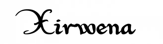
( Fonts by www.pia-frauss.de )
An ornate and decorative script font with intricate details.
![Xirwena Frei Schriftart Herunterladen]() Herunterladen 959 Downloads@WebFont
Herunterladen 959 Downloads@WebFont -
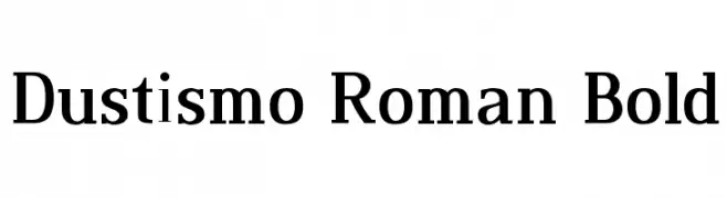
( Fonts by Dustin Norlander - www.cheapskatefonts.com )
A bold, classic serif font with strong, elegant strokes.
![Dustismo Roman Bold Frei Schriftart Herunterladen]() Herunterladen 959 Downloads@WebFont
Herunterladen 959 Downloads@WebFont


Welche Schriften sind gerade am populärsten?
Poppins, Roboto, Montserrat, Open Sans und Lato sind wegen ihrer klaren Formen und breiten Einsetzbarkeit sehr gefragt – von Markenauftritt über Landingpages bis hin zu Postern.
Welche Fonts eignen sich für Logos?
Geometrische Sans‑Serifs (z. B. Poppins, Familien im Gotham‑Stil) sind ein häufiger Griff für sauberes, skalierbares Branding. Für eine persönlichere Note bleiben Scripts und Handschrift‑Stile beliebt. Kombinieren Sie einen prägnanten Headline‑Font mit einer neutralen Brotschrift für Wiedererkennung und Harmonie.
Wie oft wird die Top‑Liste aktualisiert?
Regelmäßig – basierend auf realen Downloads und Interaktionen. Schauen Sie öfter vorbei, um aufstrebende Favoriten früh zu entdecken.
💡 Tipp: Seite bookmarken – Trends wechseln schnell, und heutige Top‑Schriften inspirieren morgen vielleicht das Rebranding.