Willkommen bei den Top‑Schriften – hier treffen Beliebtheit und Qualität aufeinander. Das sind die in diesem Jahr am häufigsten heruntergeladenen und genutzten Fonts. Wenn Sie sichere Optionen für Logo, Web oder Social suchen, starten Sie hier.
Jeder Top‑Font überzeugt durch Balance, Lesbarkeit und Vielseitigkeit. Sie finden moderne Sans‑Serifs, elegante Scripts, Vintage‑Serifs und minimalistische Displays.
-
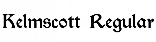
( Fonts by The Scriptorium - Dave Nalle )
A decorative font with medieval, handcrafted elements and intricate details.
 Herunterladen 959 Downloads@WebFont
 -
![Almanaque Outline Italic Frei Schriftart Herunterladen]() Herunterladen 959 Downloads@WebFont
Herunterladen 959 Downloads@WebFont -
![Deka Regular Frei Schriftart Herunterladen]() Herunterladen 959 Downloads@WebFont
Herunterladen 959 Downloads@WebFont -
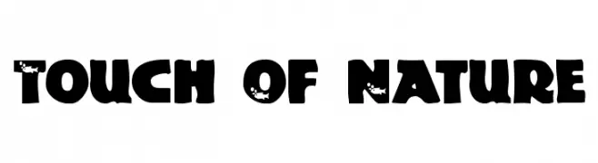
( Fonts by uatype.faithweb.com - UnAuthorized Type )
A bold, nature-inspired font with a playful and organic design.
![Touch Of Nature Frei Schriftart Herunterladen]() Herunterladen 959 Downloads@WebFont
Herunterladen 959 Downloads@WebFont -
( Fonts by Brainware Graphic - Muhammad Jauhar Azmi - Personal-use only. For commercial use please contact owner. )
A bold, geometric font with strong, angular lines and a modern aesthetic.
![Ron Frei Schriftart Herunterladen]() Herunterladen 958 Downloads@WebFont
Herunterladen 958 Downloads@WebFont -
-
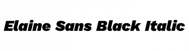
( Fonts by Wei Huang - Personal-use only. For commercial use please contact owner. )
A bold, italic sans-serif font with a modern and dynamic style.
![Elaine Sans Black Italic Frei Schriftart Herunterladen]() Herunterladen 958 Downloads@WebFont
Herunterladen 958 Downloads@WebFont -
( Fonts by Donald E. Knuth - Personal-use only. For commercial use please contact owner. )
A clean, modern sans-serif font with medium weight and balanced proportions.
![CMU Sans Serif Medium Frei Schriftart Herunterladen]() Herunterladen 958 Downloads@WebFont
Herunterladen 958 Downloads@WebFont -
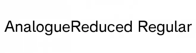
( ingoFonts - Ingo Zimmermann - www.ingofonts.com )
A clean and modern sans-serif typeface with uniform stroke width and balanced spacing.
![AnalogueReduced-Regular Frei Schriftart Herunterladen]() Herunterladen 958 Downloads@WebFont
Herunterladen 958 Downloads@WebFont -
( Vladimir Nikolic - www.coroflot.com/vladimirnikolic )
A bold, decorative font with a shadow effect and dotted outlines, ideal for vintage-themed designs.
![Casino Shadow Regular Frei Schriftart Herunterladen]() Herunterladen 958 Downloads@WebFont
Herunterladen 958 Downloads@WebFont -
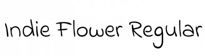
( Copyright 2010 The Indie Flower Authors (kimberlygeswein.com) )
A playful, handwritten font with a casual and friendly appearance.
![Indie Flower Regular Frei Schriftart Herunterladen]() Herunterladen 958 Downloads@WebFont
Herunterladen 958 Downloads@WebFont -
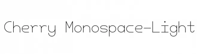
( Fonts by Amin Abedi )
A clean, monospaced font with a light and minimalistic design.
![Cherry Monospace-Light Frei Schriftart Herunterladen]() Herunterladen 958 Downloads@WebFont
Herunterladen 958 Downloads@WebFont -
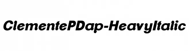
![ClementePDap-HeavyItalic Frei Schriftart Herunterladen]() Herunterladen 958 Downloads@WebFont
Herunterladen 958 Downloads@WebFont -
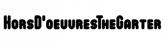
( Fonts by Chequered Ink )
A bold, rounded font with a playful and modern aesthetic.
![Hors D'oeuvres The Garter Frei Schriftart Herunterladen]() Herunterladen 958 Downloads@WebFont
Herunterladen 958 Downloads@WebFont -
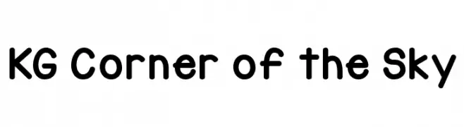
( Fonts by www.kimberlygeswein.com - Kimberly Geswein )
A playful, rounded font with smooth curves and uniform stroke width.
![KG Corner of the Sky Frei Schriftart Herunterladen]() Herunterladen 958 Downloads@WebFont
Herunterladen 958 Downloads@WebFont -
( Fonts by Mans Greback - www.mawns.com )
A classic serif font with high contrast and elegant, angular serifs.
![Crackin Frei Schriftart Herunterladen]() Herunterladen 958 Downloads@WebFont
Herunterladen 958 Downloads@WebFont -
![Alt Matey Black Frei Schriftart Herunterladen]() Herunterladen 958 Downloads@WebFont
Herunterladen 958 Downloads@WebFont -
( Fonts by www.blambot.com )
A bold, handwritten font with a playful and dynamic style.
![SmackAttackBB-Bold Frei Schriftart Herunterladen]() Herunterladen 958 Downloads@WebFont
Herunterladen 958 Downloads@WebFont -
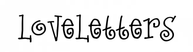
( Fonts by Jacob Fisher - www.pizzadude.dk )
A whimsical, hand-drawn font with a playful and irregular style.
![LoveLetters Frei Schriftart Herunterladen]() Herunterladen 958 Downloads@WebFont
Herunterladen 958 Downloads@WebFont -
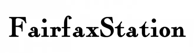
( Fonts by Nick Curtis - www.nicksfonts.com )
A classic serif font with bold strokes and high contrast, ideal for elegant designs.
![FairfaxStation Frei Schriftart Herunterladen]() Herunterladen 958 Downloads@WebFont
Herunterladen 958 Downloads@WebFont -
![Black Sam's Gold Frei Schriftart Herunterladen]() Herunterladen 958 Downloads@WebFont
Herunterladen 958 Downloads@WebFont -
( Fonts by Inermedia Studio )
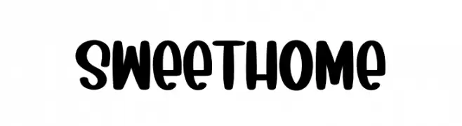
A playful, bold font with rounded edges and a hand-drawn look.
![Sweet Home Frei Schriftart Herunterladen]() Herunterladen 957 Downloads@WebFont
Herunterladen 957 Downloads@WebFont -
![Sugar Kisses Personal Use Regular Frei Schriftart Herunterladen]() Herunterladen 957 Downloads@WebFont
Herunterladen 957 Downloads@WebFont -
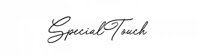
( Fonts by BLKBK - https://blkbk.ink - Personal-use only. For commercial use please contact owner. Sponsoren Schriftart )
A fluid, cursive script font with elegant, flowing lines.
![Special Touch Frei Schriftart Herunterladen]() Herunterladen 957 Downloads
Herunterladen 957 Downloads -
( Fonts by Jonathan S. Harris - www.tattoowoo.com. Personal-use only. For commercial use please contact owner. )
A bold, brush-style font with dynamic, hand-painted strokes.
![Last Feast Frei Schriftart Herunterladen]() Herunterladen 957 Downloads@WebFont
Herunterladen 957 Downloads@WebFont -
( Fonts by a Neale Davidson - www.pixelsagas.com. Personal-use only. For commercial use please contact owner. )
A bold, geometric font with a modern, digital aesthetic and rounded corners.
![Twobit Bold Frei Schriftart Herunterladen]() Herunterladen 957 Downloads@WebFont
Herunterladen 957 Downloads@WebFont -
![DKHobgoblin Frei Schriftart Herunterladen]() Herunterladen 957 Downloads@WebFont
Herunterladen 957 Downloads@WebFont -
![Tribal Garamond Frei Schriftart Herunterladen]() Herunterladen 957 Downloads@WebFont
Herunterladen 957 Downloads@WebFont -
![Montepetrum Frei Schriftart Herunterladen]() Herunterladen 957 Downloads@WebFont
Herunterladen 957 Downloads@WebFont -
( Fonts by David Rakowski )
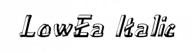
A bold, italic, hand-drawn font with dynamic strokes and a playful style.
![LowEa Italic Frei Schriftart Herunterladen]() Herunterladen 957 Downloads@WebFont
Herunterladen 957 Downloads@WebFont -
( Fonts by Jennifer Dickert - www.MintCure.com )
A bold, playful font with rounded edges and a retro vibe.
![fStop Frei Schriftart Herunterladen]() Herunterladen 957 Downloads@WebFont
Herunterladen 957 Downloads@WebFont -
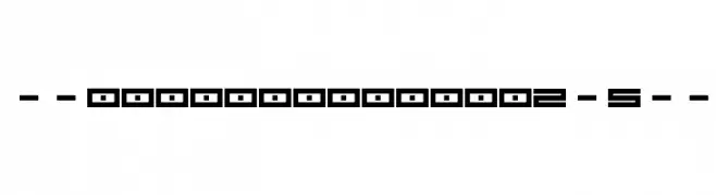
![--squarepusherv2-5-- Frei Schriftart Herunterladen]() Herunterladen 957 Downloads@WebFont
Herunterladen 957 Downloads@WebFont -
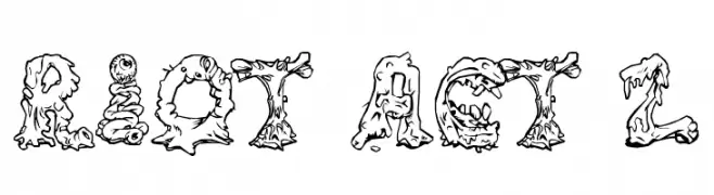
![Riot Act 2 Frei Schriftart Herunterladen]() Herunterladen 957 Downloads@WebFont
Herunterladen 957 Downloads@WebFont -
![Paddington Bold Italic Frei Schriftart Herunterladen]() Herunterladen 957 Downloads@WebFont
Herunterladen 957 Downloads@WebFont -
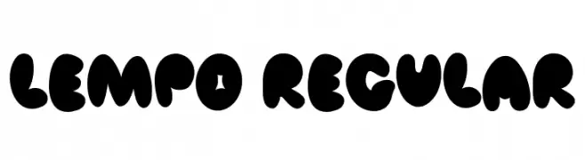
( Fonts by Ach Syafii )
A playful, bold font with rounded, bubble-like characters.
![Lempo Regular Frei Schriftart Herunterladen]() Herunterladen 956 Downloads@WebFont
Herunterladen 956 Downloads@WebFont -
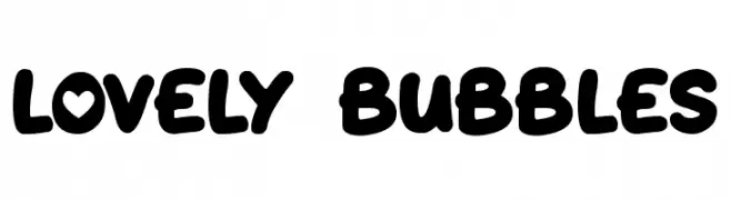
( Fonts by Darrell Flood )
A playful, bubbly font with rounded, thick strokes and a friendly appearance.
![Lovely Bubbles Frei Schriftart Herunterladen]() Herunterladen 956 Downloads@WebFont
Herunterladen 956 Downloads@WebFont


Welche Schriften sind gerade am populärsten?
Poppins, Roboto, Montserrat, Open Sans und Lato sind wegen ihrer klaren Formen und breiten Einsetzbarkeit sehr gefragt – von Markenauftritt über Landingpages bis hin zu Postern.
Welche Fonts eignen sich für Logos?
Geometrische Sans‑Serifs (z. B. Poppins, Familien im Gotham‑Stil) sind ein häufiger Griff für sauberes, skalierbares Branding. Für eine persönlichere Note bleiben Scripts und Handschrift‑Stile beliebt. Kombinieren Sie einen prägnanten Headline‑Font mit einer neutralen Brotschrift für Wiedererkennung und Harmonie.
Wie oft wird die Top‑Liste aktualisiert?
Regelmäßig – basierend auf realen Downloads und Interaktionen. Schauen Sie öfter vorbei, um aufstrebende Favoriten früh zu entdecken.
💡 Tipp: Seite bookmarken – Trends wechseln schnell, und heutige Top‑Schriften inspirieren morgen vielleicht das Rebranding.