Willkommen bei den Top‑Schriften – hier treffen Beliebtheit und Qualität aufeinander. Das sind die in diesem Jahr am häufigsten heruntergeladenen und genutzten Fonts. Wenn Sie sichere Optionen für Logo, Web oder Social suchen, starten Sie hier.
Jeder Top‑Font überzeugt durch Balance, Lesbarkeit und Vielseitigkeit. Sie finden moderne Sans‑Serifs, elegante Scripts, Vintage‑Serifs und minimalistische Displays.
-
( Roger White - web.archive.org/web/20120416090521/www.rogersfonts.org.uk/ )
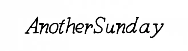
A bold, italic serif font with a classic and elegant style.
 Herunterladen 235 Downloads@WebFont
 -
![AnotherSunday Frei Schriftart Herunterladen]() Herunterladen 235 Downloads@WebFont
Herunterladen 235 Downloads@WebFont -
( Fonts by Vanessa Bays - bythebutterfly.com )
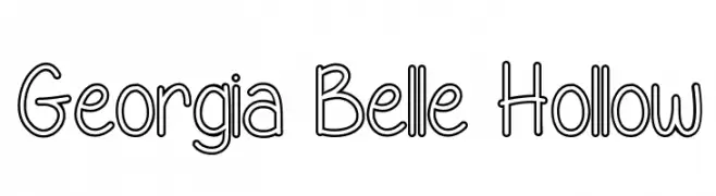
A playful, hollow, rounded font with a whimsical and airy design.
![Georgia Belle Hollow Frei Schriftart Herunterladen]() Herunterladen 235 Downloads@WebFont
Herunterladen 235 Downloads@WebFont -
( Fonts by Daniel Zadorozny - www.iconian.com )
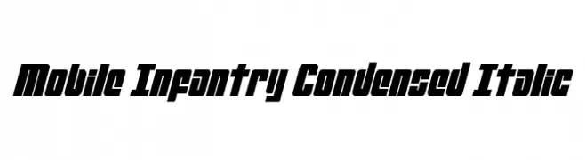
A bold, condensed, and italic font with a modern, dynamic style.
![Mobile Infantry Condensed Italic Frei Schriftart Herunterladen]() Herunterladen 235 Downloads@WebFont
Herunterladen 235 Downloads@WebFont -
( Fonts by Apostrophic Lab )
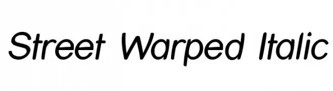
A modern, italicized font with smooth, rounded edges and a dynamic appearance.
![Street Warped Italic Frei Schriftart Herunterladen]() Herunterladen 235 Downloads@WebFont
Herunterladen 235 Downloads@WebFont -
-
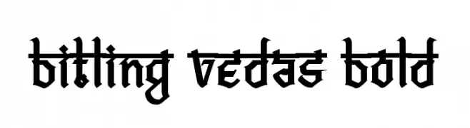
( Rajendra Bitling - www.rbitling.com )
A bold, blackletter font with sharp, angular lines and a medieval aesthetic.
![Bitling vedas Bold Frei Schriftart Herunterladen]() Herunterladen 235 Downloads@WebFont
Herunterladen 235 Downloads@WebFont -
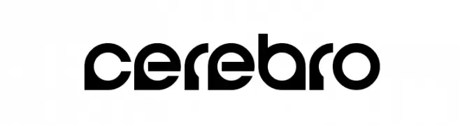
( Fonts by Michael Muranaka - muraknockout.com - Personal-use only. For commercial use please contact owner. )
A modern, geometric font with bold, angular shapes and a futuristic aesthetic.
![Cerebro Frei Schriftart Herunterladen]() Herunterladen 235 Downloads@WebFont
Herunterladen 235 Downloads@WebFont -
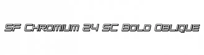
( Fonts by ShyFonts )
A bold, oblique, and futuristic outlined font with geometric precision.
![SF Chromium 24 SC Bold Oblique Frei Schriftart Herunterladen]() Herunterladen 235 Downloads@WebFont
Herunterladen 235 Downloads@WebFont -
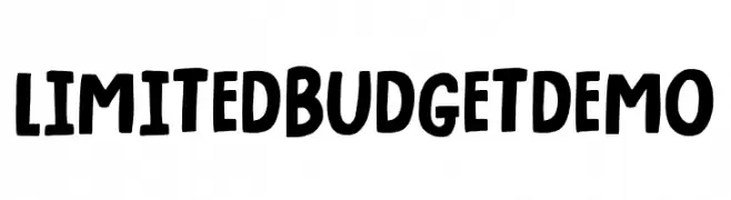
( Fonts by Pizzadude )
A bold, playful font with a hand-drawn, casual style.
![Limited Budget DEMO Frei Schriftart Herunterladen]() Herunterladen 235 Downloads@WebFont
Herunterladen 235 Downloads@WebFont -
( Fonts by www.blambot.com )
A playful, hand-drawn font with rounded, bold characters and a comic book style.
![Kid Kosmic Frei Schriftart Herunterladen]() Herunterladen 235 Downloads@WebFont
Herunterladen 235 Downloads@WebFont
Welche Schriften sind gerade am populärsten?
Poppins, Roboto, Montserrat, Open Sans und Lato sind wegen ihrer klaren Formen und breiten Einsetzbarkeit sehr gefragt – von Markenauftritt über Landingpages bis hin zu Postern.
Welche Fonts eignen sich für Logos?
Geometrische Sans‑Serifs (z. B. Poppins, Familien im Gotham‑Stil) sind ein häufiger Griff für sauberes, skalierbares Branding. Für eine persönlichere Note bleiben Scripts und Handschrift‑Stile beliebt. Kombinieren Sie einen prägnanten Headline‑Font mit einer neutralen Brotschrift für Wiedererkennung und Harmonie.
Wie oft wird die Top‑Liste aktualisiert?
Regelmäßig – basierend auf realen Downloads und Interaktionen. Schauen Sie öfter vorbei, um aufstrebende Favoriten früh zu entdecken.
💡 Tipp: Seite bookmarken – Trends wechseln schnell, und heutige Top‑Schriften inspirieren morgen vielleicht das Rebranding.