Willkommen bei den Top‑Schriften – hier treffen Beliebtheit und Qualität aufeinander. Das sind die in diesem Jahr am häufigsten heruntergeladenen und genutzten Fonts. Wenn Sie sichere Optionen für Logo, Web oder Social suchen, starten Sie hier.
Jeder Top‑Font überzeugt durch Balance, Lesbarkeit und Vielseitigkeit. Sie finden moderne Sans‑Serifs, elegante Scripts, Vintage‑Serifs und minimalistische Displays.
-
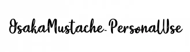
( Fonts by Typhoon Type - Suthi Srisopha - www.typhoontype.net - Personal-use only. For commercial use please contact owner. )
A playful, brush-textured script font with a handcrafted feel.
 Herunterladen 235 Downloads@WebFont
 -
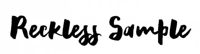
( Ana - www.anasfonts.com/ )
A bold, hand-painted style font with expressive, brush-like strokes.
![Reckless Sample Frei Schriftart Herunterladen]() Herunterladen 235 Downloads@WebFont
Herunterladen 235 Downloads@WebFont -
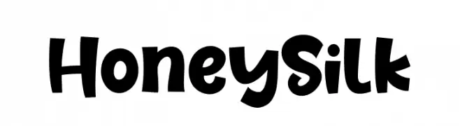
( Fonts by Khurasan )
A bold, playful font with rounded characters and a whimsical style.
![Honey Silk Frei Schriftart Herunterladen]() Herunterladen 235 Downloads@WebFont
Herunterladen 235 Downloads@WebFont -
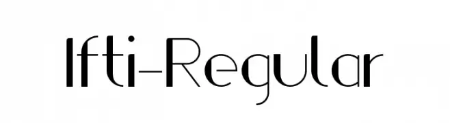
( Fonts by Raees Ahmad Khan )
A sleek, modern font with geometric shapes and clean lines.
![Ifti-Regular Frei Schriftart Herunterladen]() Herunterladen 235 Downloads@WebFont
Herunterladen 235 Downloads@WebFont -
![Pixel Block BB Regular Frei Schriftart Herunterladen]() Herunterladen 235 Downloads@WebFont
Herunterladen 235 Downloads@WebFont -
-
![Prof. Jorge Frei Schriftart Herunterladen]() Herunterladen 235 Downloads@WebFont
Herunterladen 235 Downloads@WebFont -
( Fonts by Omnibus Type )
A bold, condensed, and italic font with a modern and dynamic style.
![Saira Condensed ExtraBold Italic Frei Schriftart Herunterladen]() Herunterladen 235 Downloads@WebFont
Herunterladen 235 Downloads@WebFont -
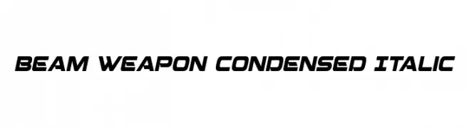
( Fonts by Iconian Fonts )
A futuristic, condensed italic font with bold, angular lines.
![Beam Weapon Condensed Italic Frei Schriftart Herunterladen]() Herunterladen 235 Downloads@WebFont
Herunterladen 235 Downloads@WebFont -
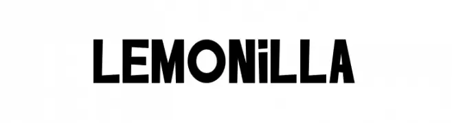
( Fonts by Tikara Sari )
A bold, playful font with a quirky, hand-drawn aesthetic.
![LEMONILLA Frei Schriftart Herunterladen]() Herunterladen 235 Downloads@WebFont
Herunterladen 235 Downloads@WebFont -
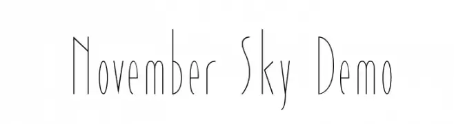
( Fonts by Roland Huse - rolandhuse.com )
A modern, ultra-thin, and elongated font with a sleek and elegant style.
![November Sky Demo Frei Schriftart Herunterladen]() Herunterladen 235 Downloads@WebFont
Herunterladen 235 Downloads@WebFont


Welche Schriften sind gerade am populärsten?
Poppins, Roboto, Montserrat, Open Sans und Lato sind wegen ihrer klaren Formen und breiten Einsetzbarkeit sehr gefragt – von Markenauftritt über Landingpages bis hin zu Postern.
Welche Fonts eignen sich für Logos?
Geometrische Sans‑Serifs (z. B. Poppins, Familien im Gotham‑Stil) sind ein häufiger Griff für sauberes, skalierbares Branding. Für eine persönlichere Note bleiben Scripts und Handschrift‑Stile beliebt. Kombinieren Sie einen prägnanten Headline‑Font mit einer neutralen Brotschrift für Wiedererkennung und Harmonie.
Wie oft wird die Top‑Liste aktualisiert?
Regelmäßig – basierend auf realen Downloads und Interaktionen. Schauen Sie öfter vorbei, um aufstrebende Favoriten früh zu entdecken.
💡 Tipp: Seite bookmarken – Trends wechseln schnell, und heutige Top‑Schriften inspirieren morgen vielleicht das Rebranding.