Willkommen bei den Top‑Schriften – hier treffen Beliebtheit und Qualität aufeinander. Das sind die in diesem Jahr am häufigsten heruntergeladenen und genutzten Fonts. Wenn Sie sichere Optionen für Logo, Web oder Social suchen, starten Sie hier.
Jeder Top‑Font überzeugt durch Balance, Lesbarkeit und Vielseitigkeit. Sie finden moderne Sans‑Serifs, elegante Scripts, Vintage‑Serifs und minimalistische Displays.
-
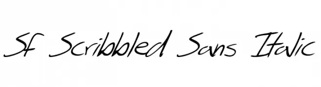
( Fonts by ShyFonts )
A lively, handwritten italic font with fluid strokes and an informal style.
 Herunterladen 235 Downloads@WebFont
 -
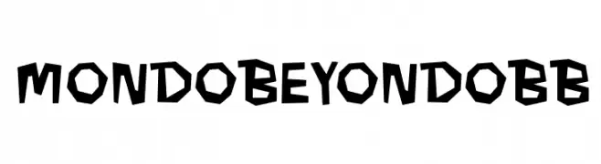
( Fonts by www.blambot.com )
A bold, playful font with irregular, angular characters and a hand-cut appearance.
![MondoBeyondoBB Frei Schriftart Herunterladen]() Herunterladen 235 Downloads@WebFont
Herunterladen 235 Downloads@WebFont -
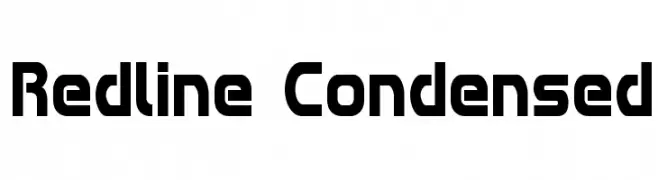
( Fonts by Iconian Fonts )
A bold, geometric, and condensed font with a modern and futuristic style.
![Redline Condensed Frei Schriftart Herunterladen]() Herunterladen 235 Downloads@WebFont
Herunterladen 235 Downloads@WebFont -
( Fonts by a Des Gomez. Personal-use only. For commercial use please contact owner. )
A playful handwritten font with rounded, irregular letterforms.
![EstaNoche Frei Schriftart Herunterladen]() Herunterladen 235 Downloads@WebFont
Herunterladen 235 Downloads@WebFont -
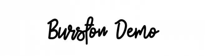
![Burston Demo Frei Schriftart Herunterladen]() Herunterladen 235 Downloads@WebFont
Herunterladen 235 Downloads@WebFont -
-
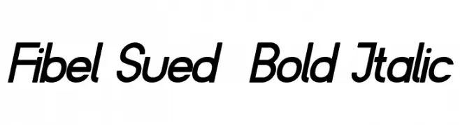
( Fonts by www.peter-wiegel.de. Personal-use only. For commercial use please contact owner. )
A bold, italicized font with a modern and dynamic style.
![Fibel Sued Bold Italic Frei Schriftart Herunterladen]() Herunterladen 235 Downloads@WebFont
Herunterladen 235 Downloads@WebFont -
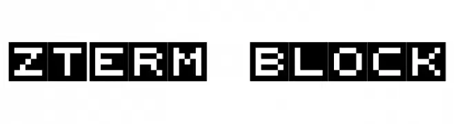
![zTerm Block Frei Schriftart Herunterladen]() Herunterladen 235 Downloads@WebFont
Herunterladen 235 Downloads@WebFont -
( Fonts by www.blambot.com )
A bold, italic font with a dynamic and modern style, perfect for impactful headlines.
![CryptCreep Heavy BB Italic Frei Schriftart Herunterladen]() Herunterladen 235 Downloads@WebFont
Herunterladen 235 Downloads@WebFont -
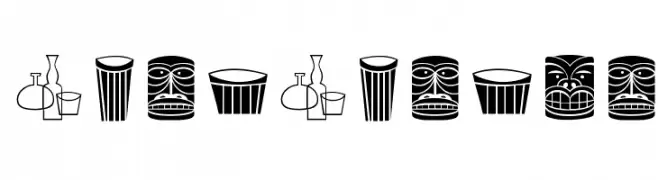
Schriftart von NicholasJudy456. For commercial use please contact the owner.
( Here )
A playful, retro icon set with a tiki-inspired, mid-century modern aesthetic.
![Shag-Shagbats Frei Schriftart Herunterladen]() Herunterladen 235 Downloads@WebFont
Herunterladen 235 Downloads@WebFont -
( Fonts by Skiiller Studio )
A bold, handwritten font with a playful and energetic style.
![Apmonse Frei Schriftart Herunterladen]() Herunterladen 235 Downloads@WebFont
Herunterladen 235 Downloads@WebFont


Welche Schriften sind gerade am populärsten?
Poppins, Roboto, Montserrat, Open Sans und Lato sind wegen ihrer klaren Formen und breiten Einsetzbarkeit sehr gefragt – von Markenauftritt über Landingpages bis hin zu Postern.
Welche Fonts eignen sich für Logos?
Geometrische Sans‑Serifs (z. B. Poppins, Familien im Gotham‑Stil) sind ein häufiger Griff für sauberes, skalierbares Branding. Für eine persönlichere Note bleiben Scripts und Handschrift‑Stile beliebt. Kombinieren Sie einen prägnanten Headline‑Font mit einer neutralen Brotschrift für Wiedererkennung und Harmonie.
Wie oft wird die Top‑Liste aktualisiert?
Regelmäßig – basierend auf realen Downloads und Interaktionen. Schauen Sie öfter vorbei, um aufstrebende Favoriten früh zu entdecken.
💡 Tipp: Seite bookmarken – Trends wechseln schnell, und heutige Top‑Schriften inspirieren morgen vielleicht das Rebranding.