Willkommen bei den Top‑Schriften – hier treffen Beliebtheit und Qualität aufeinander. Das sind die in diesem Jahr am häufigsten heruntergeladenen und genutzten Fonts. Wenn Sie sichere Optionen für Logo, Web oder Social suchen, starten Sie hier.
Jeder Top‑Font überzeugt durch Balance, Lesbarkeit und Vielseitigkeit. Sie finden moderne Sans‑Serifs, elegante Scripts, Vintage‑Serifs und minimalistische Displays.
-
( Fonts by Arialdy Nurazmi - Personal-use only. For commercial use please contact owner. )
A playful, casual handwritten font with smooth, rounded edges.
 Herunterladen 236 Downloads@WebFont
 -
![Yantiq Frei Schriftart Herunterladen]() Herunterladen 236 Downloads@WebFont
Herunterladen 236 Downloads@WebFont -
( Frogii`s Fonts )
A bold, geometric font with framed characters, ideal for modern and tech designs.
![26 Famous Peeps Frei Schriftart Herunterladen]() Herunterladen 236 Downloads@WebFont
Herunterladen 236 Downloads@WebFont -
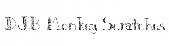
( Fonts by Darcy Baldwin - darcybaldwin.com. Free for personal use only )
A playful, hand-drawn font with a sketch-like, whimsical style.
![DJB Monkey Scratches Frei Schriftart Herunterladen]() Herunterladen 236 Downloads@WebFont
Herunterladen 236 Downloads@WebFont -
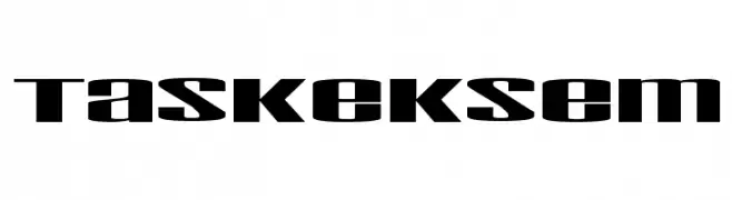
( Fonts by TarmSaft Font Factory - http://www.aska.nu/tarmsaft/ )
A bold, modern font with a geometric and futuristic style.
![Taskeksem Frei Schriftart Herunterladen]() Herunterladen 236 Downloads@WebFont
Herunterladen 236 Downloads@WebFont -
-
![Snowfall Black Oblique Frei Schriftart Herunterladen]() Herunterladen 236 Downloads@WebFont
Herunterladen 236 Downloads@WebFont -
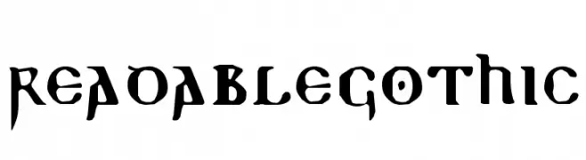
( Fonts by Manfred Klein - manfred-klein.ina-mar.com )
A Gothic-style font with sharp serifs and medieval flair.
![ReadableGothic Frei Schriftart Herunterladen]() Herunterladen 236 Downloads@WebFont
Herunterladen 236 Downloads@WebFont -
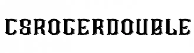
( Craft Supply Co. - creativemarket.com/craftsupplyco )
A bold, double-outlined font with a vintage, Western-inspired style.
![CS Roger Double Frei Schriftart Herunterladen]() Herunterladen 236 Downloads@WebFont
Herunterladen 236 Downloads@WebFont -
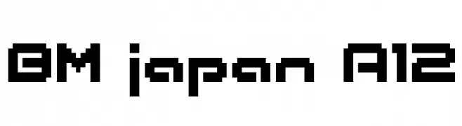
![BM japan A12 Frei Schriftart Herunterladen]() Herunterladen 236 Downloads@WebFont
Herunterladen 236 Downloads@WebFont -
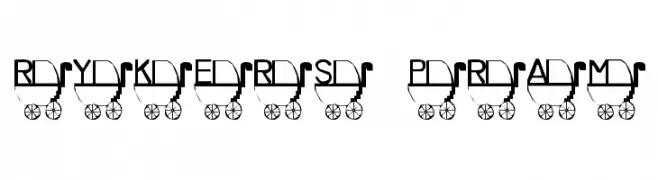
![Rykers Pram Frei Schriftart Herunterladen]() Herunterladen 236 Downloads@WebFont
Herunterladen 236 Downloads@WebFont


Welche Schriften sind gerade am populärsten?
Poppins, Roboto, Montserrat, Open Sans und Lato sind wegen ihrer klaren Formen und breiten Einsetzbarkeit sehr gefragt – von Markenauftritt über Landingpages bis hin zu Postern.
Welche Fonts eignen sich für Logos?
Geometrische Sans‑Serifs (z. B. Poppins, Familien im Gotham‑Stil) sind ein häufiger Griff für sauberes, skalierbares Branding. Für eine persönlichere Note bleiben Scripts und Handschrift‑Stile beliebt. Kombinieren Sie einen prägnanten Headline‑Font mit einer neutralen Brotschrift für Wiedererkennung und Harmonie.
Wie oft wird die Top‑Liste aktualisiert?
Regelmäßig – basierend auf realen Downloads und Interaktionen. Schauen Sie öfter vorbei, um aufstrebende Favoriten früh zu entdecken.
💡 Tipp: Seite bookmarken – Trends wechseln schnell, und heutige Top‑Schriften inspirieren morgen vielleicht das Rebranding.