Willkommen bei den Top‑Schriften – hier treffen Beliebtheit und Qualität aufeinander. Das sind die in diesem Jahr am häufigsten heruntergeladenen und genutzten Fonts. Wenn Sie sichere Optionen für Logo, Web oder Social suchen, starten Sie hier.
Jeder Top‑Font überzeugt durch Balance, Lesbarkeit und Vielseitigkeit. Sie finden moderne Sans‑Serifs, elegante Scripts, Vintage‑Serifs und minimalistische Displays.
-
( Fonts by ingoFonts - Ingo Zimmermann - Personal-use only. For commercial use please contact owner. )
A classic serif font with strong, elegant characters and sharp serifs.
 Herunterladen 236 Downloads@WebFont
 -
![NBP Informa FiveSix Frei Schriftart Herunterladen]() Herunterladen 236 Downloads@WebFont
Herunterladen 236 Downloads@WebFont -
( Fonts by www.woodcutter.es - woodcutter Manero - Personal-use only. For commercial use please contact owner. )
A decorative, sketch-like font with a hand-drawn appearance.
![Manero Frei Schriftart Herunterladen]() Herunterladen 236 Downloads@WebFont
Herunterladen 236 Downloads@WebFont -
![Pixelzim 3x5 Bold Frei Schriftart Herunterladen]() Herunterladen 236 Downloads@WebFont
Herunterladen 236 Downloads@WebFont -
( Fonts by dartcanada.tripod.com - Darren Rigby )
A modern, geometric font with a bold, futuristic style.
![Yerevan Regular Frei Schriftart Herunterladen]() Herunterladen 236 Downloads@WebFont
Herunterladen 236 Downloads@WebFont -
-
( Fonts by Daniel Zadorozny - www.iconian.com )
A bold, condensed, and italic font with a modern, dynamic style.
![Mobile Infantry Condensed Italic Frei Schriftart Herunterladen]() Herunterladen 236 Downloads@WebFont
Herunterladen 236 Downloads@WebFont -
( Fonts by Manfred Klein. Free for private and charity use. Free for commercial with donation to organizations )
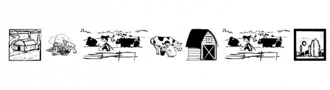
Farm-themed dingbat font with detailed rural illustrations.
![Farmers Frei Schriftart Herunterladen]() Herunterladen 236 Downloads@WebFont
Herunterladen 236 Downloads@WebFont -
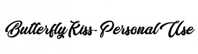
( Fonts by Typhoon Type - Suthi Srisopha - www.typhoontype.net - Personal-use only. For commercial use please contact owner. )
A flowing, cursive font with elegant, interconnected letters.
![Butterfly Kiss - Personal Use Frei Schriftart Herunterladen]() Herunterladen 236 Downloads@WebFont
Herunterladen 236 Downloads@WebFont -
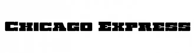
( Iconian Fonts - Daniel Zadorozny - www.iconian.com )
A bold, blocky typeface perfect for headlines and impactful designs.
![Chicago Express Frei Schriftart Herunterladen]() Herunterladen 236 Downloads@WebFont
Herunterladen 236 Downloads@WebFont -
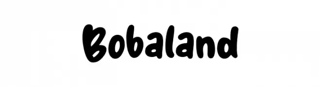
( Fonts by Khurasan )
A bold, playful handwritten font with rounded edges and a casual style.
![Bobaland Frei Schriftart Herunterladen]() Herunterladen 236 Downloads@WebFont
Herunterladen 236 Downloads@WebFont


Welche Schriften sind gerade am populärsten?
Poppins, Roboto, Montserrat, Open Sans und Lato sind wegen ihrer klaren Formen und breiten Einsetzbarkeit sehr gefragt – von Markenauftritt über Landingpages bis hin zu Postern.
Welche Fonts eignen sich für Logos?
Geometrische Sans‑Serifs (z. B. Poppins, Familien im Gotham‑Stil) sind ein häufiger Griff für sauberes, skalierbares Branding. Für eine persönlichere Note bleiben Scripts und Handschrift‑Stile beliebt. Kombinieren Sie einen prägnanten Headline‑Font mit einer neutralen Brotschrift für Wiedererkennung und Harmonie.
Wie oft wird die Top‑Liste aktualisiert?
Regelmäßig – basierend auf realen Downloads und Interaktionen. Schauen Sie öfter vorbei, um aufstrebende Favoriten früh zu entdecken.
💡 Tipp: Seite bookmarken – Trends wechseln schnell, und heutige Top‑Schriften inspirieren morgen vielleicht das Rebranding.