Willkommen bei den Top‑Schriften – hier treffen Beliebtheit und Qualität aufeinander. Das sind die in diesem Jahr am häufigsten heruntergeladenen und genutzten Fonts. Wenn Sie sichere Optionen für Logo, Web oder Social suchen, starten Sie hier.
Jeder Top‑Font überzeugt durch Balance, Lesbarkeit und Vielseitigkeit. Sie finden moderne Sans‑Serifs, elegante Scripts, Vintage‑Serifs und minimalistische Displays.
-
 Herunterladen 236 Downloads@WebFont
 -
![invader Frei Schriftart Herunterladen]() Herunterladen 236 Downloads@WebFont
Herunterladen 236 Downloads@WebFont -
( Fonts by Woodcutter )
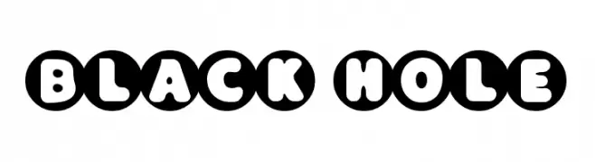
A bold, circular font with playful, enclosed characters.
![Black Hole Frei Schriftart Herunterladen]() Herunterladen 236 Downloads@WebFont
Herunterladen 236 Downloads@WebFont -
![Eldora Frei Schriftart Herunterladen]() Herunterladen 236 Downloads@WebFont
Herunterladen 236 Downloads@WebFont -
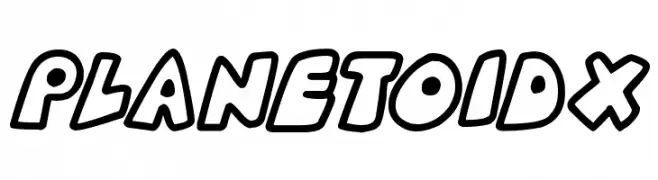
![Planetoid X Frei Schriftart Herunterladen]() Herunterladen 236 Downloads@WebFont
Herunterladen 236 Downloads@WebFont -
-
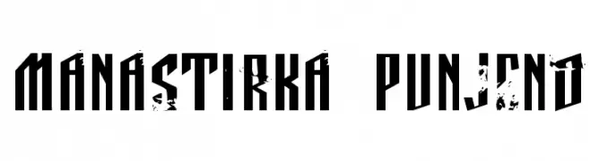
( Fonts by Daniel Zadorozny - www.iconian.com )
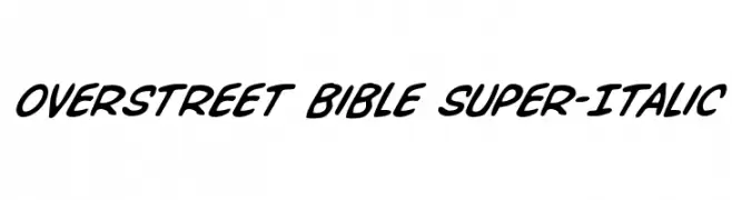
A bold, italicized font with a dynamic and playful style.
![Overstreet Bible Super-Italic Frei Schriftart Herunterladen]() Herunterladen 236 Downloads@WebFont
Herunterladen 236 Downloads@WebFont -
![Manastirka punjeno Frei Schriftart Herunterladen]() Herunterladen 236 Downloads@WebFont
Herunterladen 236 Downloads@WebFont -
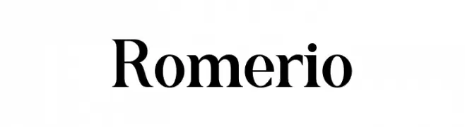
( Fonts by Rivo Dwi Adriansyah - Personal-use only. For commercial use please contact owner. )
A classic serif font with elegant strokes and sharp serifs.
![Romerio Frei Schriftart Herunterladen]() Herunterladen 236 Downloads@WebFont
Herunterladen 236 Downloads@WebFont -
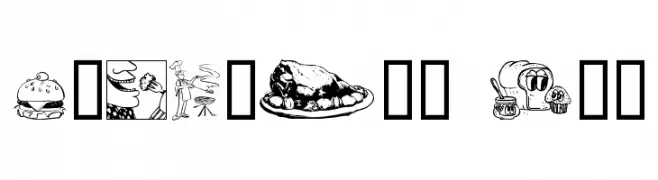
( Fonts by Graham Meade - GemFonts )
Food-themed dingbat font with detailed culinary illustrations.
![Culinary Art Frei Schriftart Herunterladen]() Herunterladen 236 Downloads@WebFont
Herunterladen 236 Downloads@WebFont -
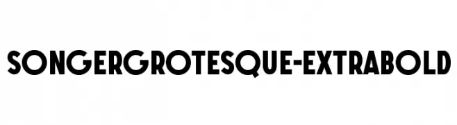
( Alexander Pravdin )
A bold, geometric font with thick strokes and a modern, clean appearance.
![SONGERGrotesque-ExtraBold Frei Schriftart Herunterladen]() Herunterladen 236 Downloads@WebFont
Herunterladen 236 Downloads@WebFont


Welche Schriften sind gerade am populärsten?
Poppins, Roboto, Montserrat, Open Sans und Lato sind wegen ihrer klaren Formen und breiten Einsetzbarkeit sehr gefragt – von Markenauftritt über Landingpages bis hin zu Postern.
Welche Fonts eignen sich für Logos?
Geometrische Sans‑Serifs (z. B. Poppins, Familien im Gotham‑Stil) sind ein häufiger Griff für sauberes, skalierbares Branding. Für eine persönlichere Note bleiben Scripts und Handschrift‑Stile beliebt. Kombinieren Sie einen prägnanten Headline‑Font mit einer neutralen Brotschrift für Wiedererkennung und Harmonie.
Wie oft wird die Top‑Liste aktualisiert?
Regelmäßig – basierend auf realen Downloads und Interaktionen. Schauen Sie öfter vorbei, um aufstrebende Favoriten früh zu entdecken.
💡 Tipp: Seite bookmarken – Trends wechseln schnell, und heutige Top‑Schriften inspirieren morgen vielleicht das Rebranding.